Saga Swimwear
A Nordic take on the swimwear industry
Client: Saga Swimwear
Key Focus: Branding
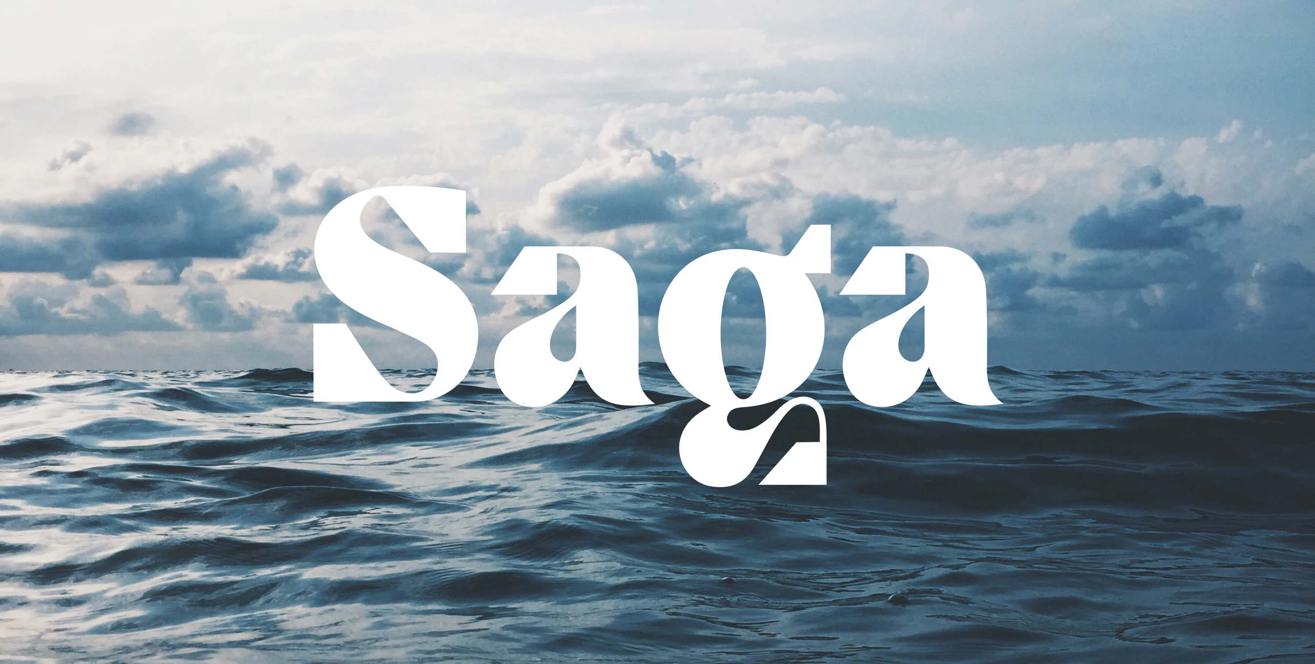
The name Saga stems from the Norse goddess that represents foresight, wisdom, inspiration, femininity, and kindness.
Saga is a soft yet bold name that creates a fun contrast between femininity and the more masculine, edgier universe of the brand.

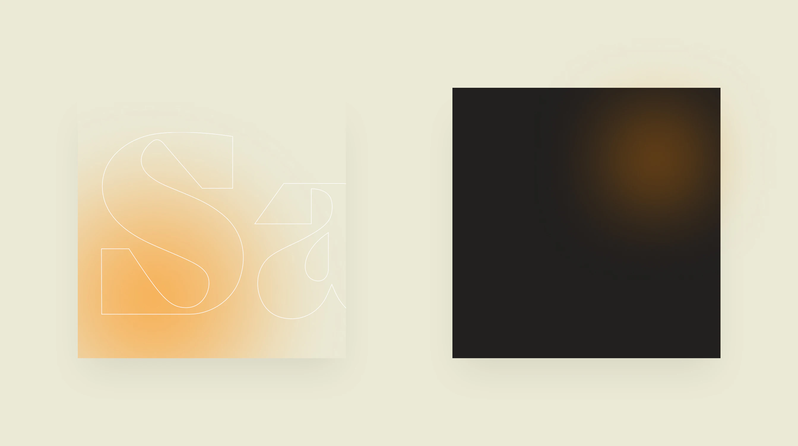
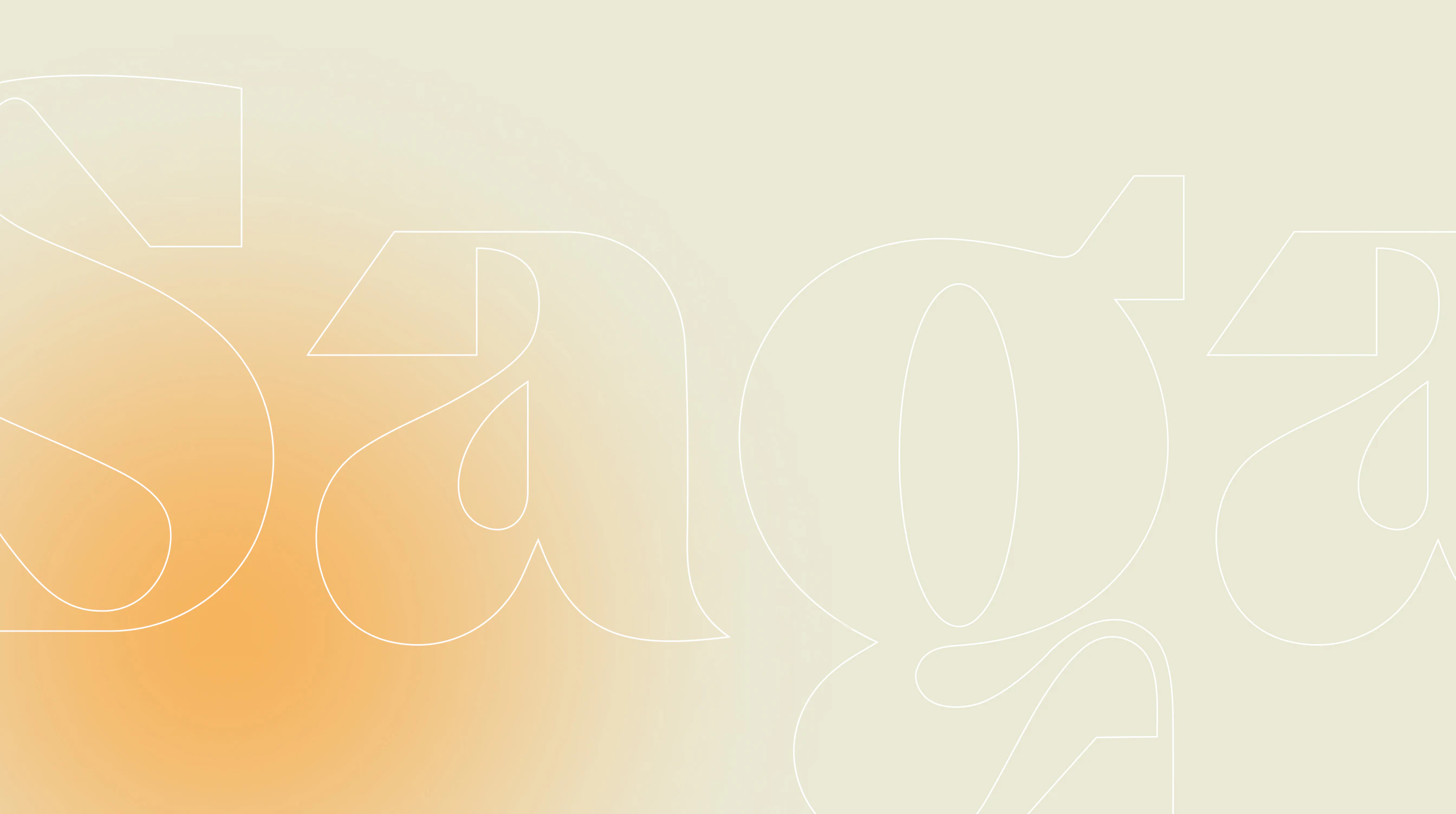
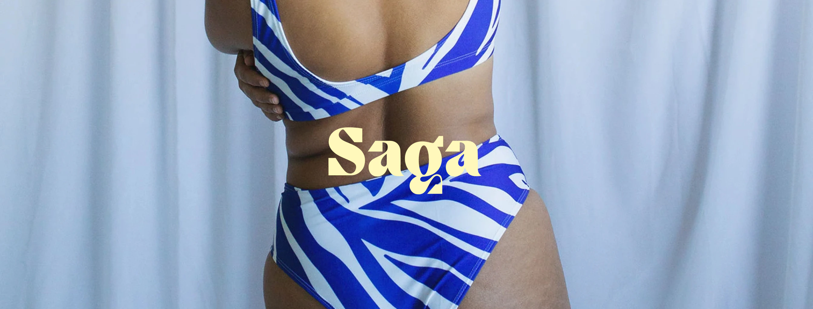
The logo is strongly inspired by the Scandinavian landscape, featuring raw, hard edges from the mountains and rocks, and soft, organic shapes from the sea.
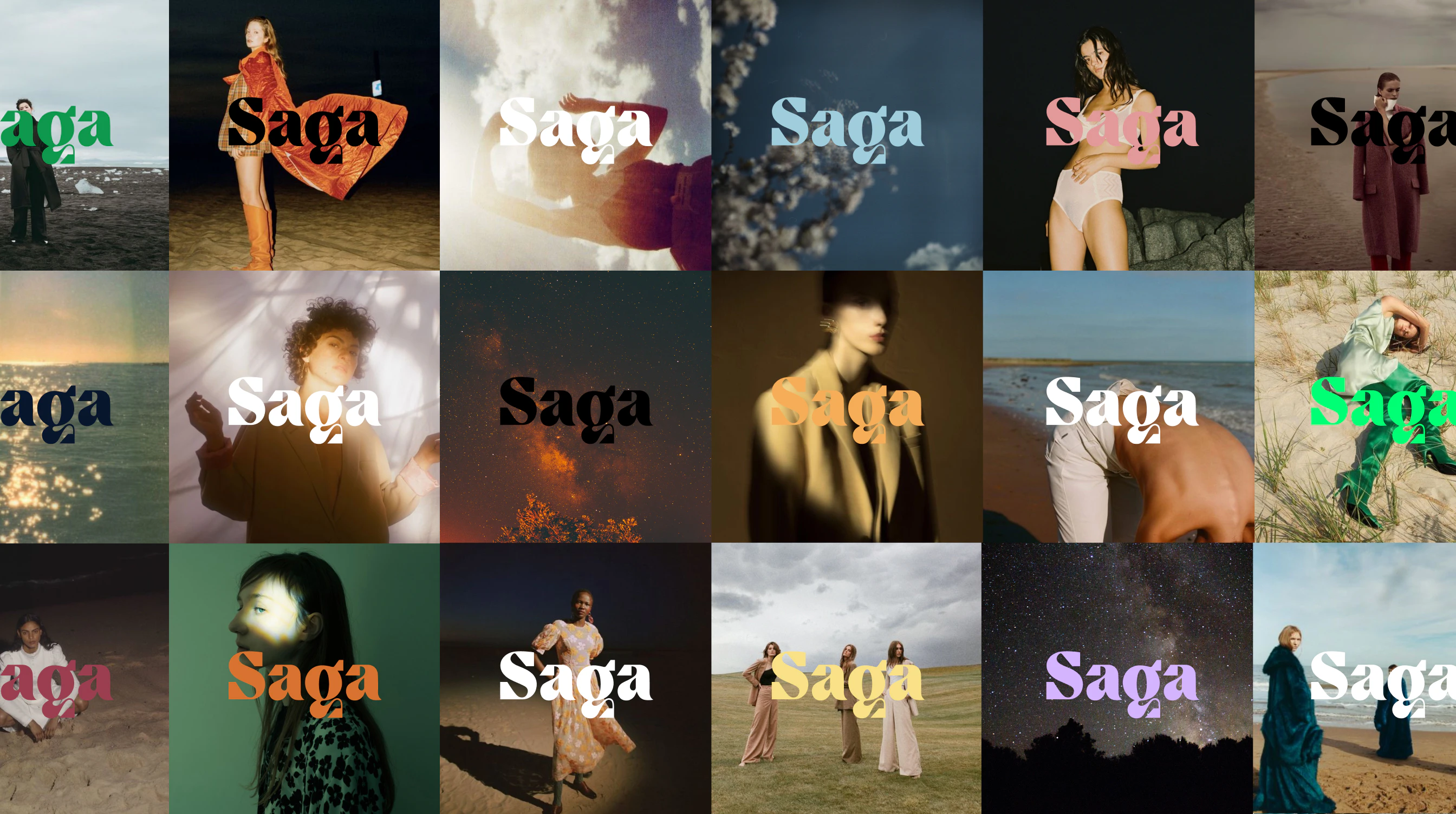

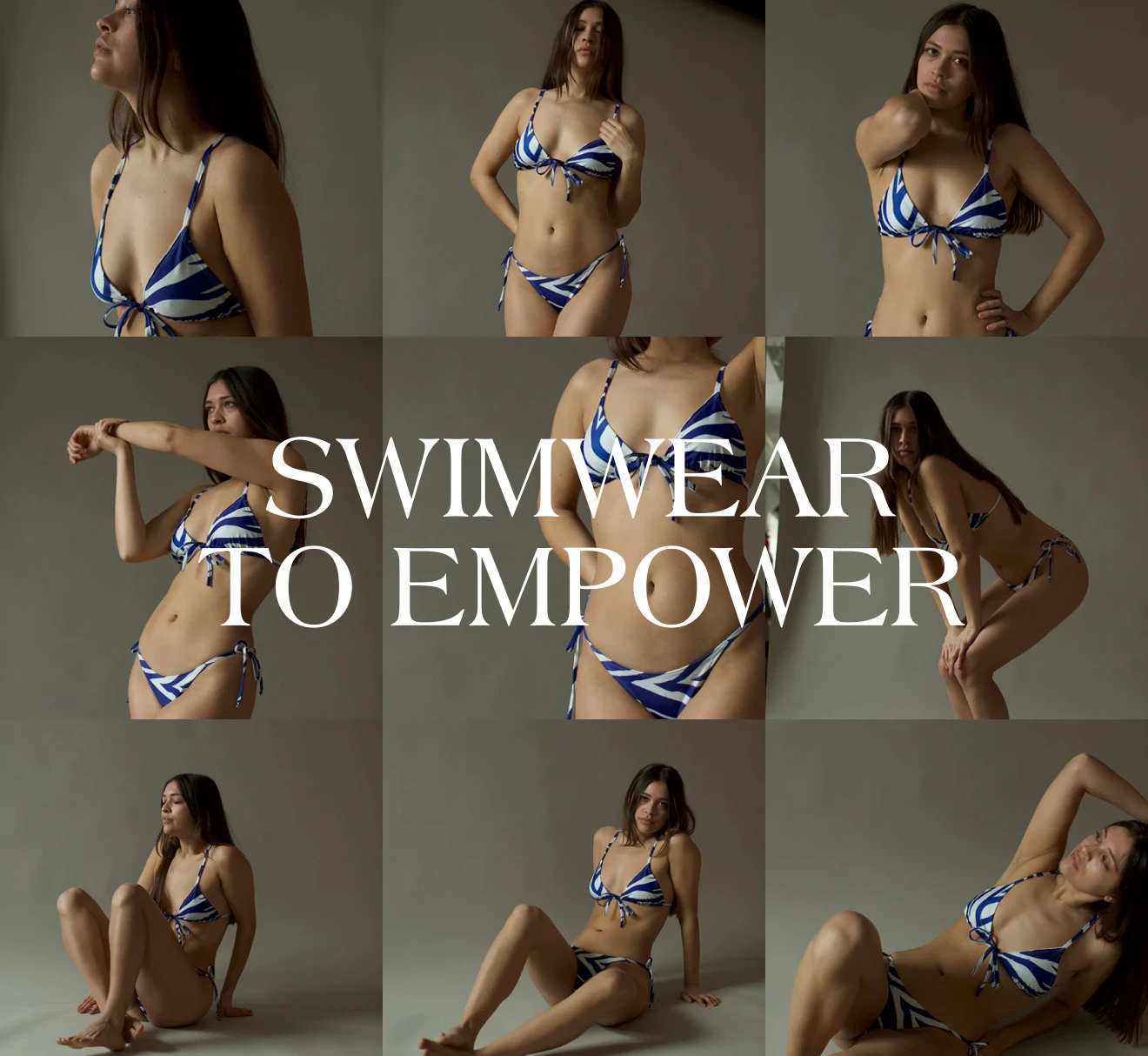
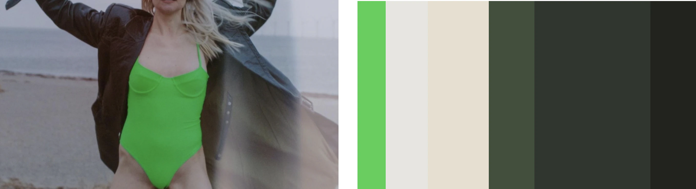
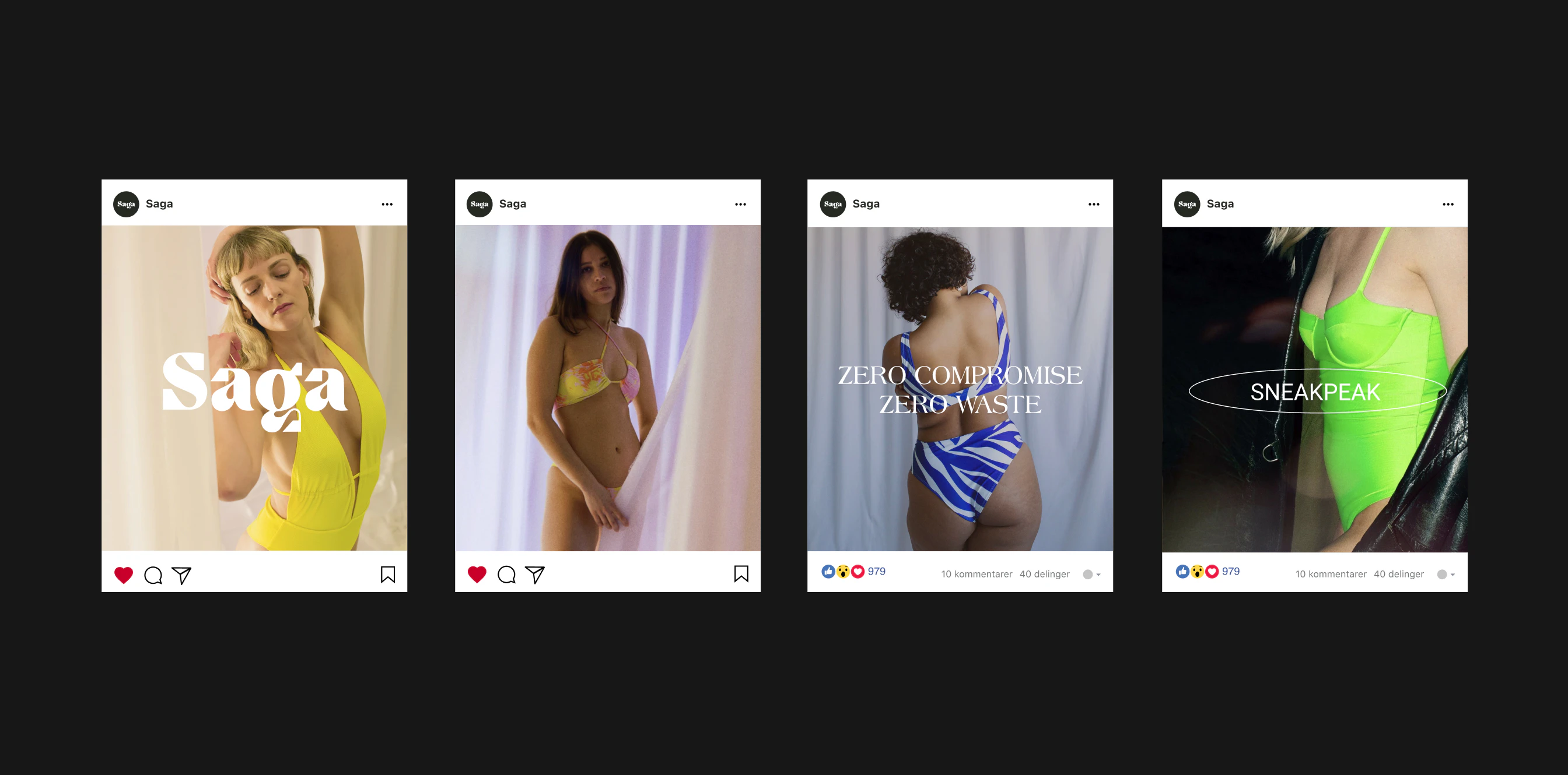
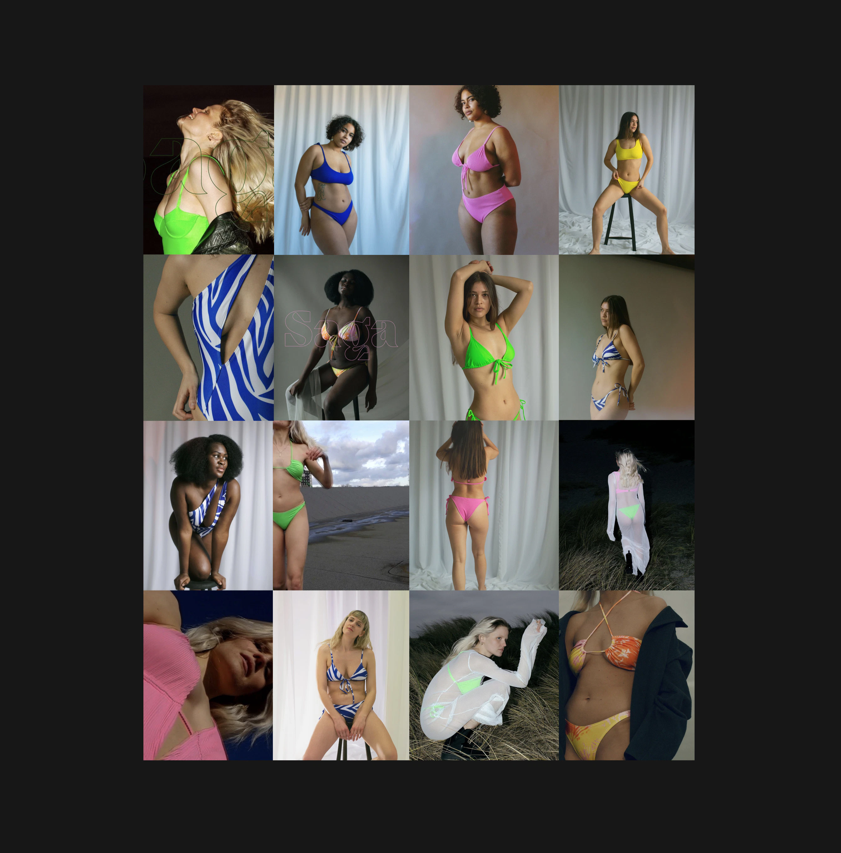
To create a cohesive look on the website, the art direction was defined to guide Saga's photoshoots.

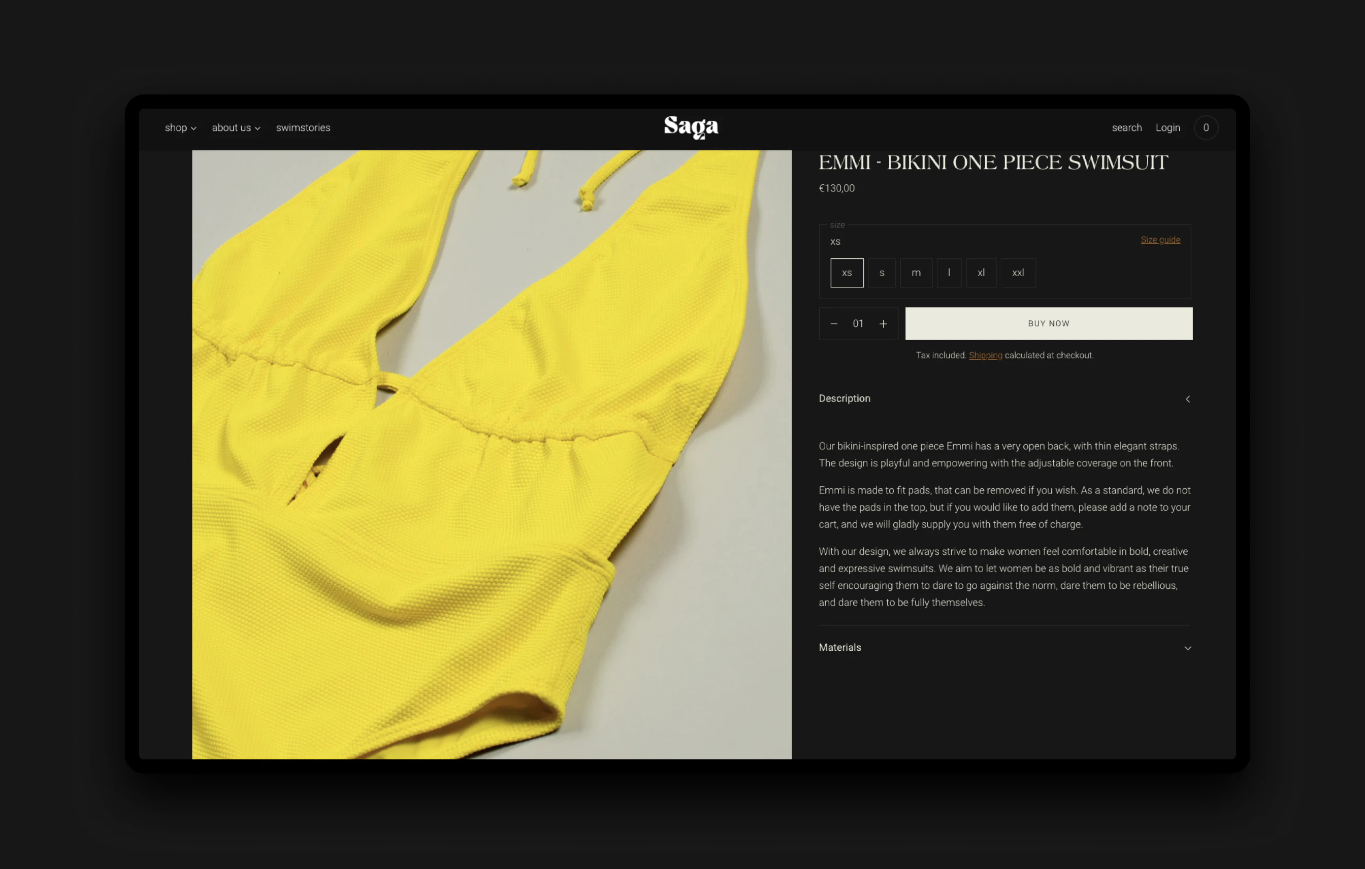
Saga’s universe turns the tropic paradise trope on its head by highlighting the natural beauty of the Scandinavian landscape. The raw environment helps contrast the bright, playful products, and allows the featured models to stand out.

Kudos to
Innovation and Strategy lead / Mathilde Lundgreen
Lead designer / Trine Rønsholdt