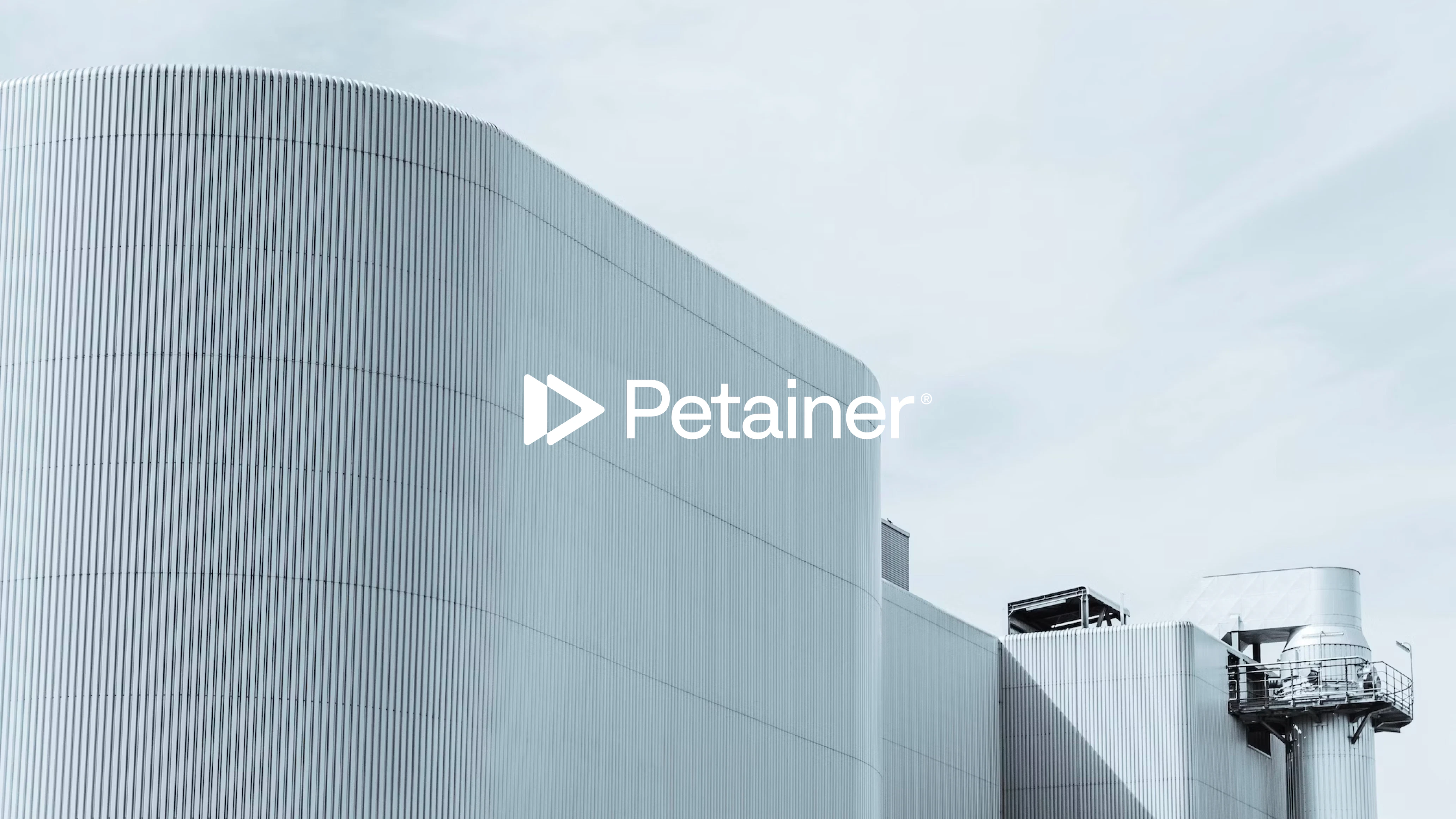
Petainer
PET Packaging Solutions
Client: Petainer
Key Focus: Branding
How do you transform a brand’s visual identity without losing the elements at the core of consumer recognition?
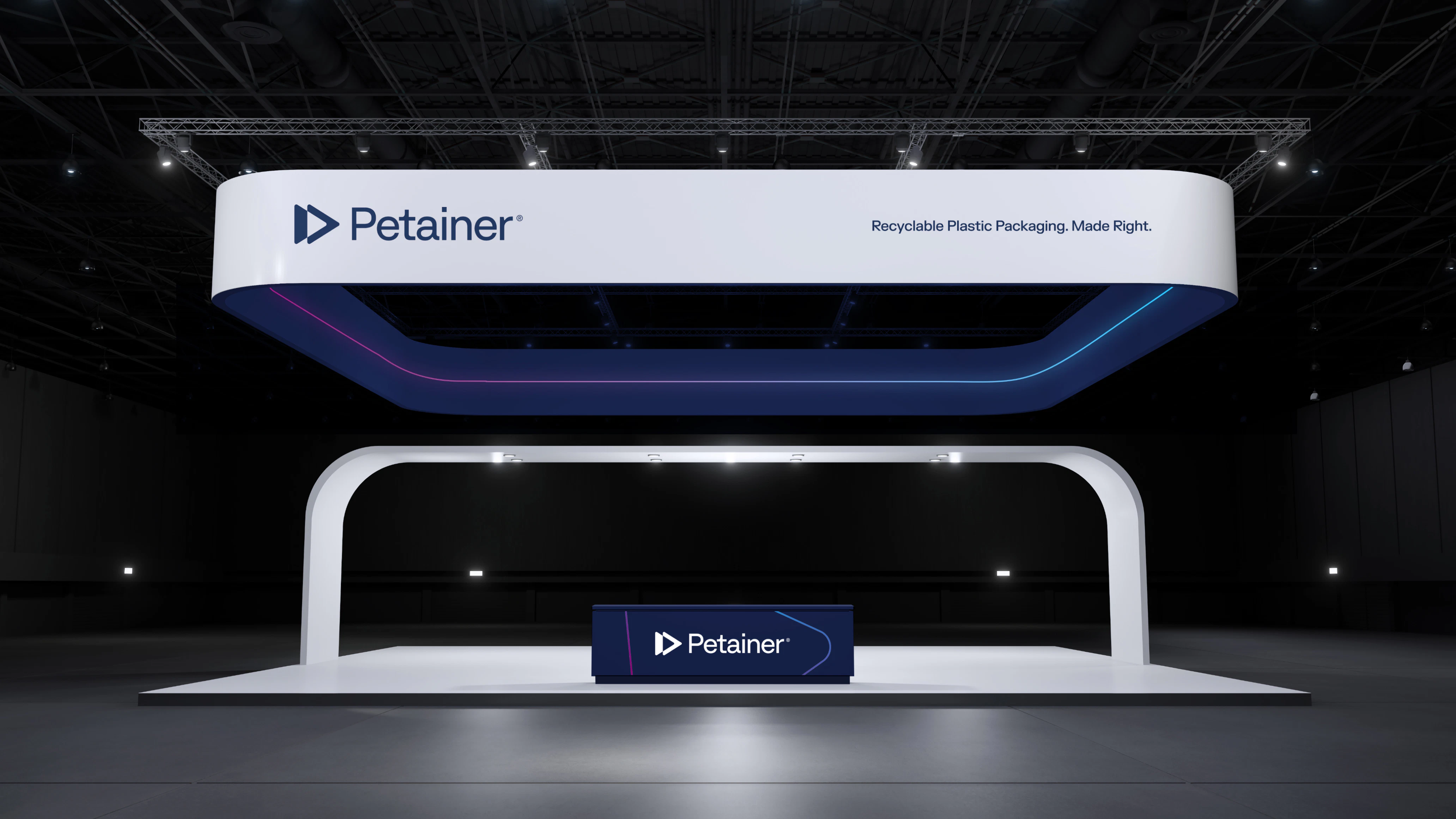
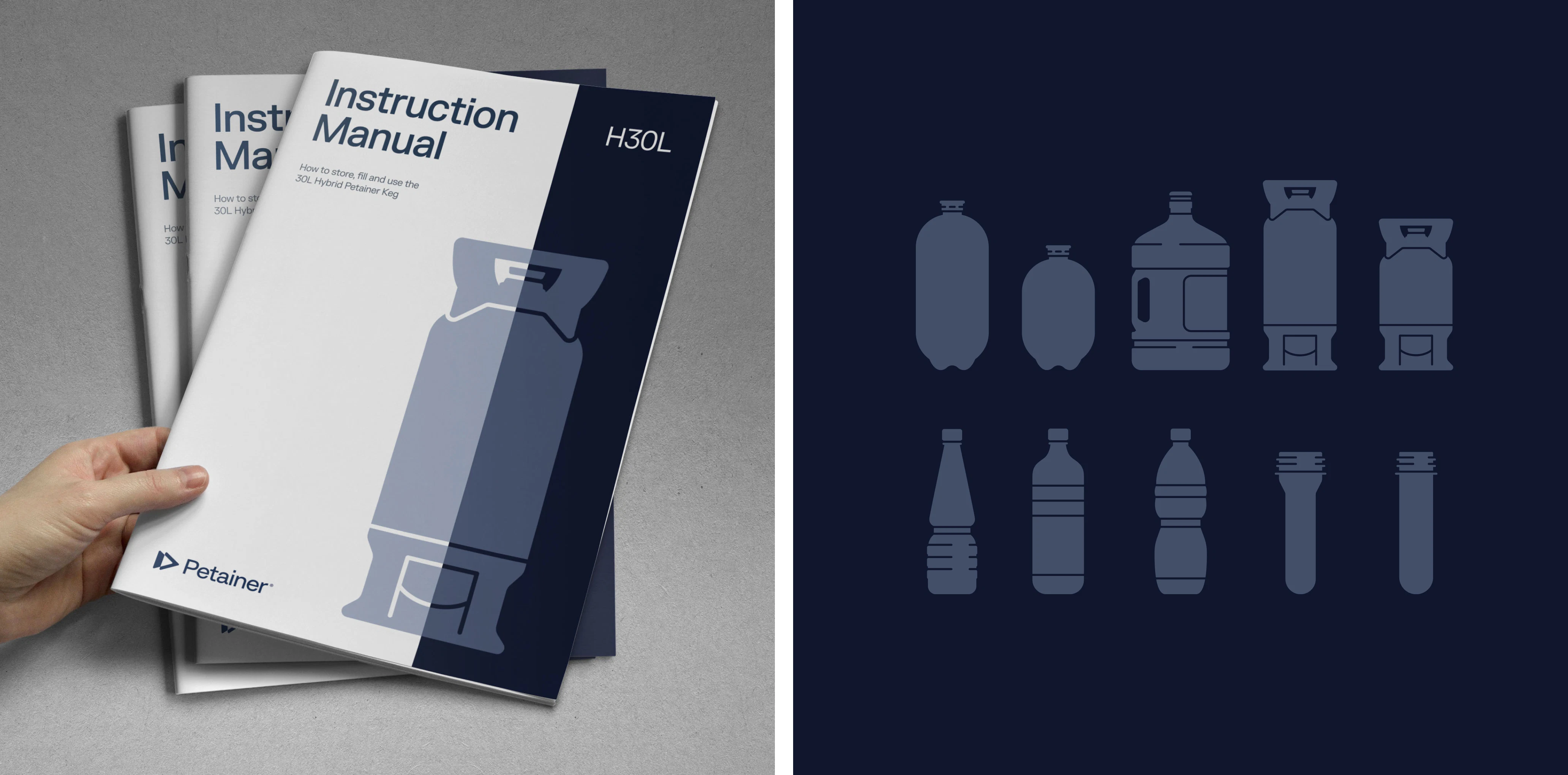
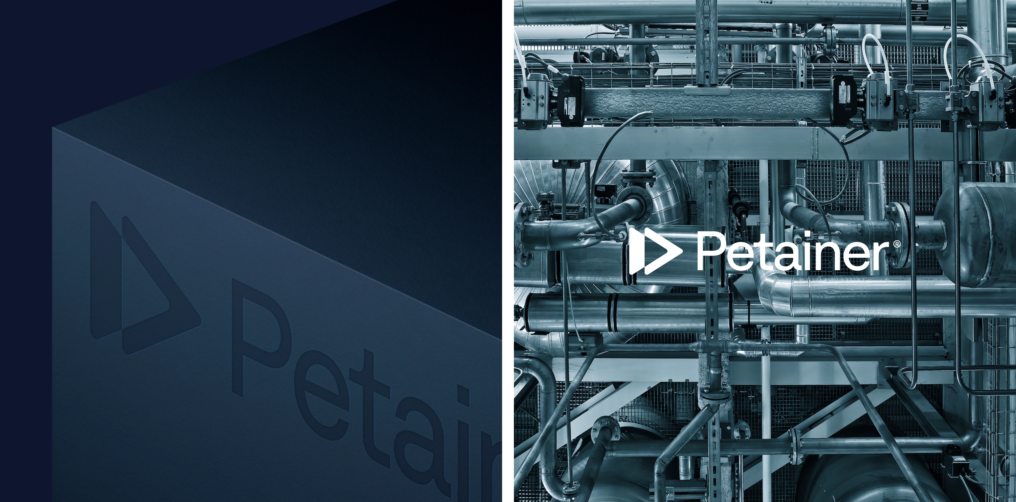
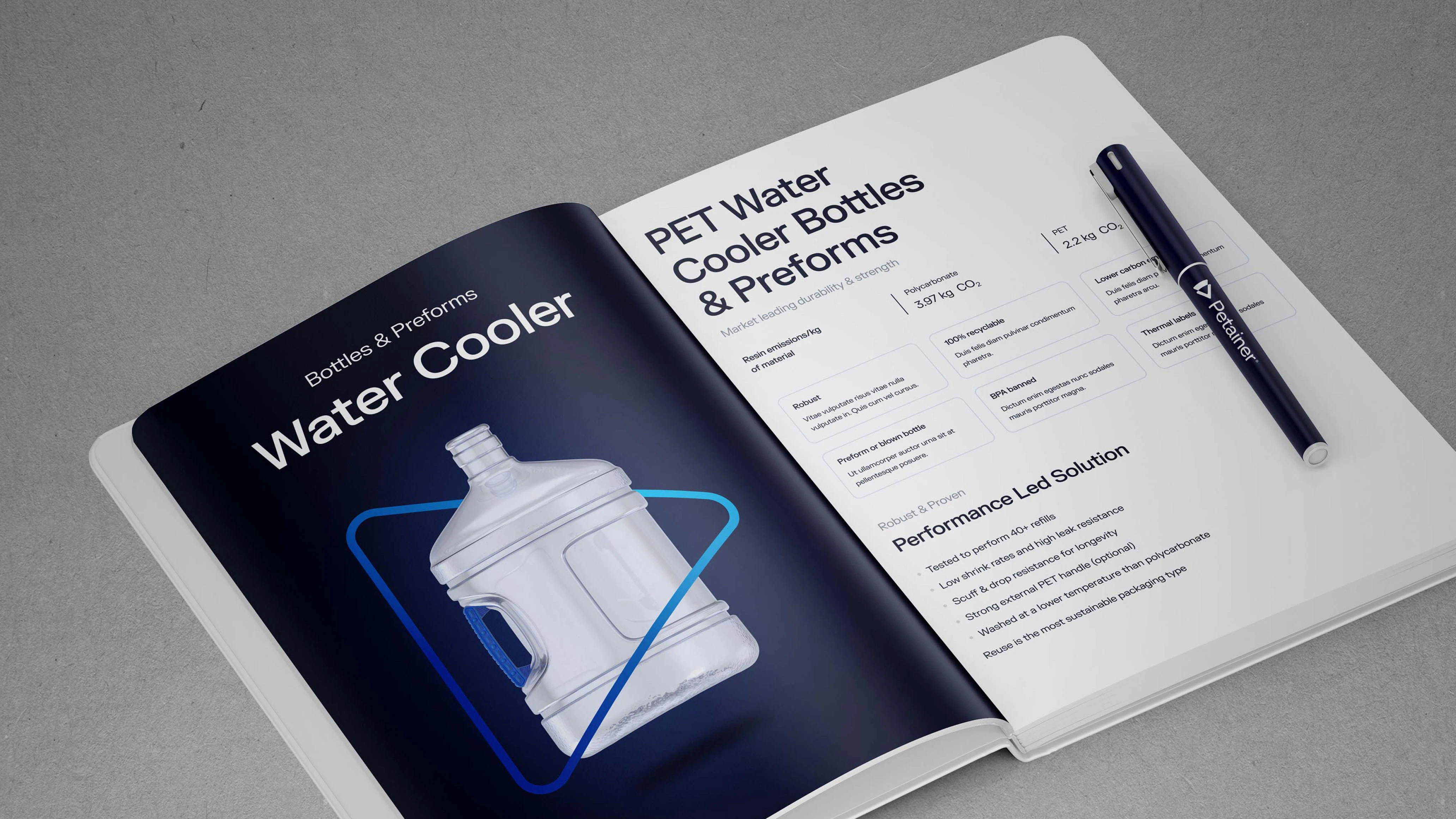
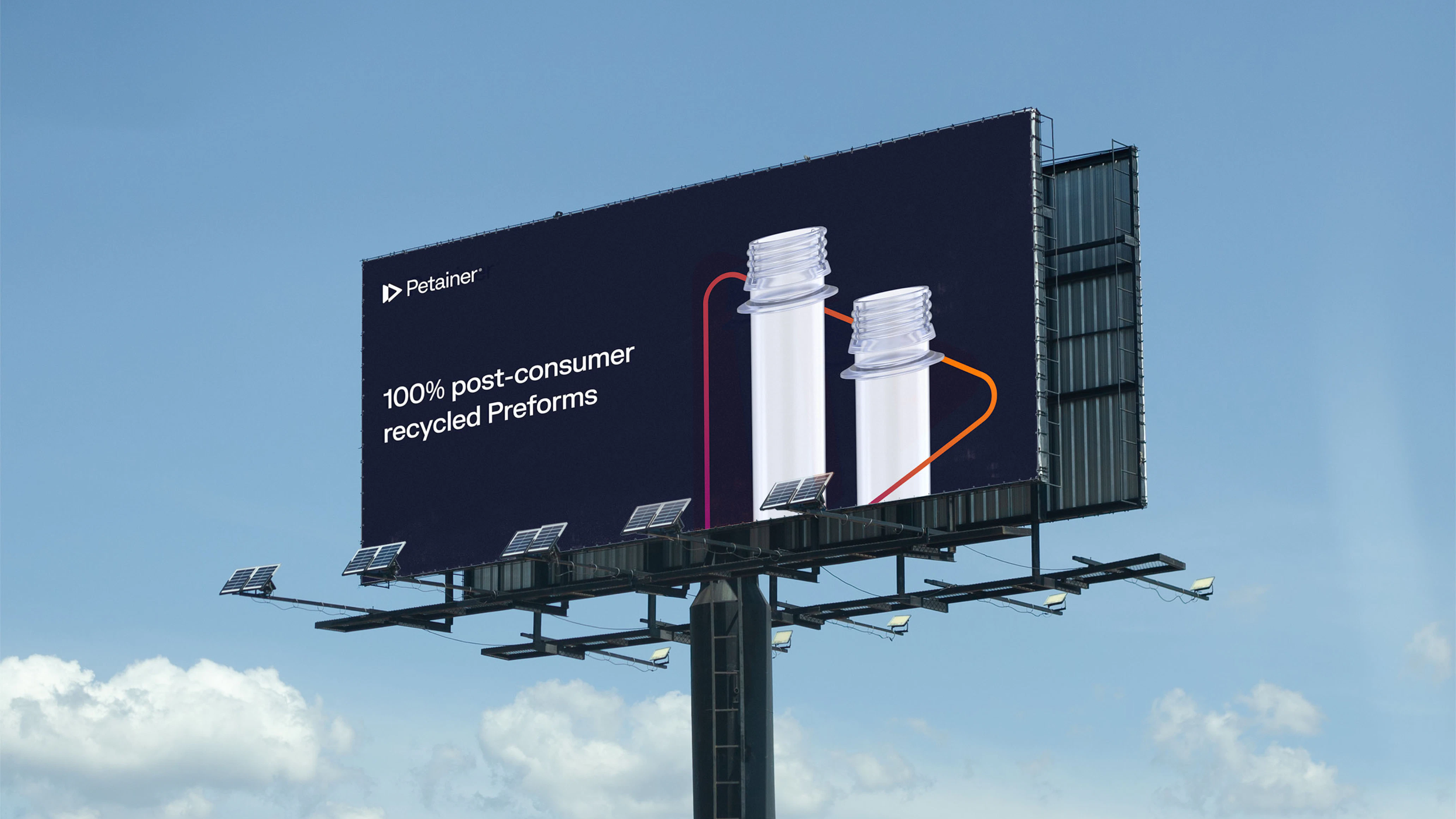
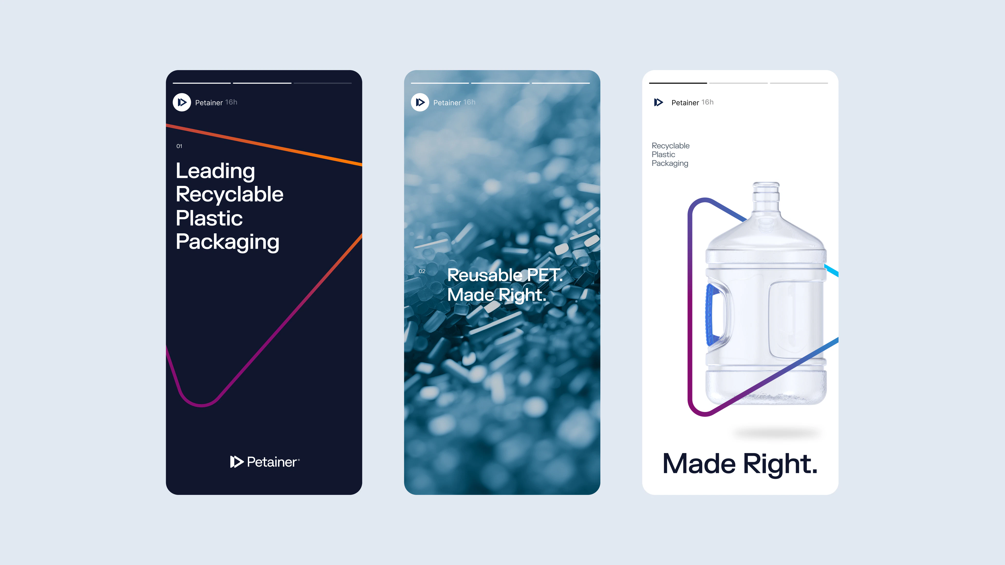
As a premium supplier of various PET packaging solutions for leading brands such as Coca-Cola, Carlsberg and Super Bock, Petainer had already earned brand equity and gained recognition due to their well-established reputation and dedication to sustainable plastic development. However, their visual identity felt flat rather than bubbled, so Petainer needed a refresh that instead embodied their feel, reflecting consistency, coherence and intention.
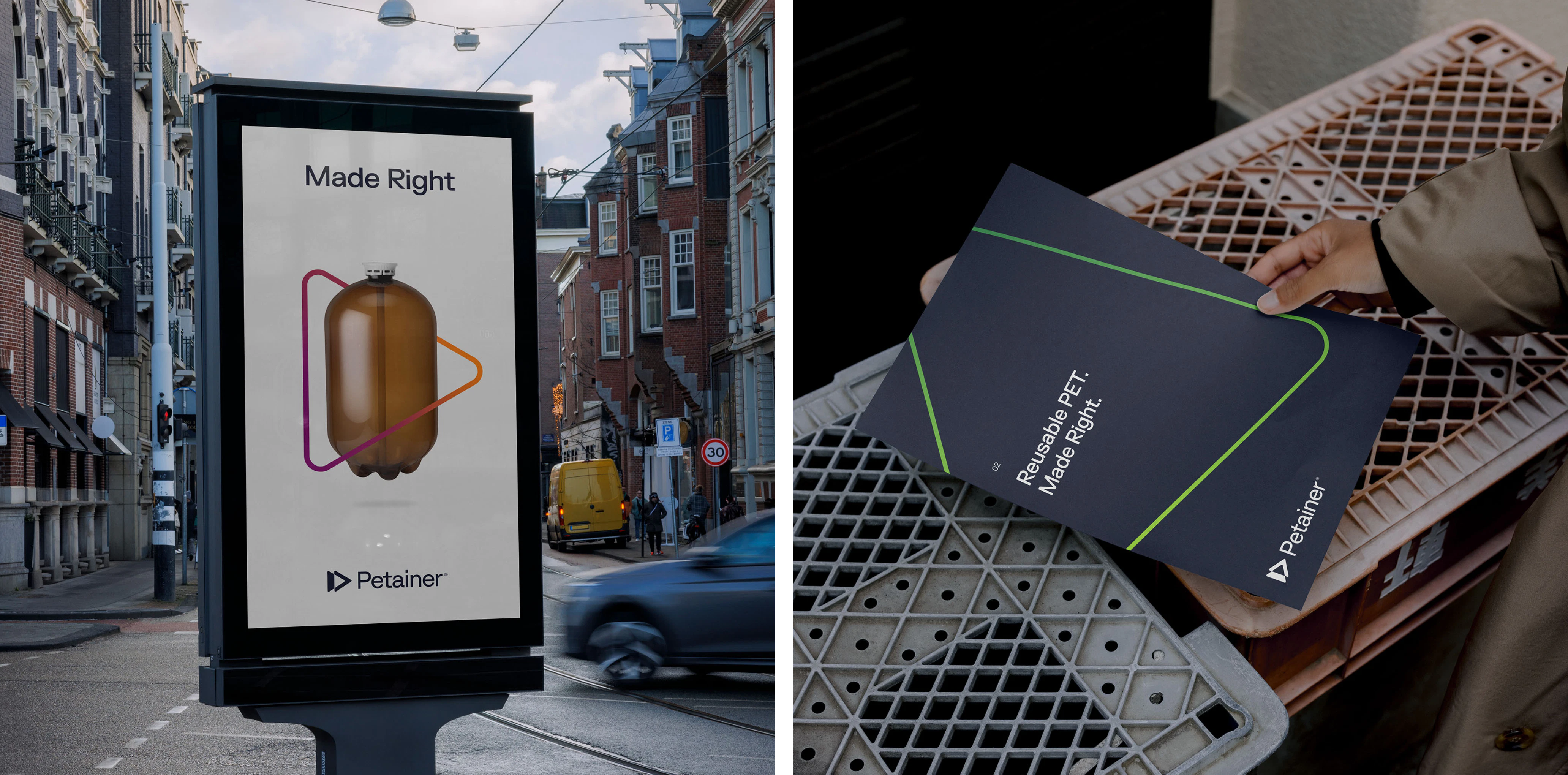
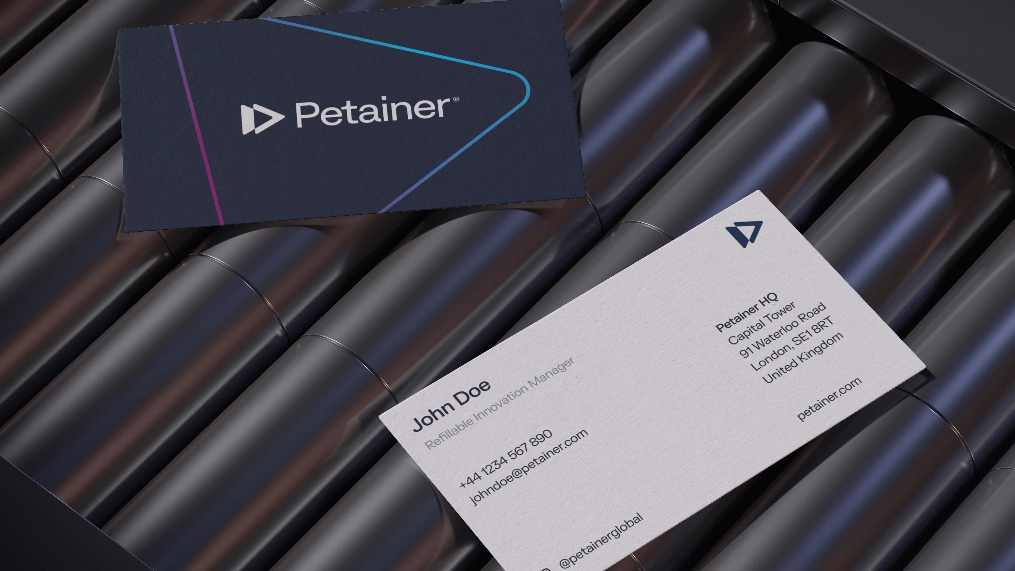
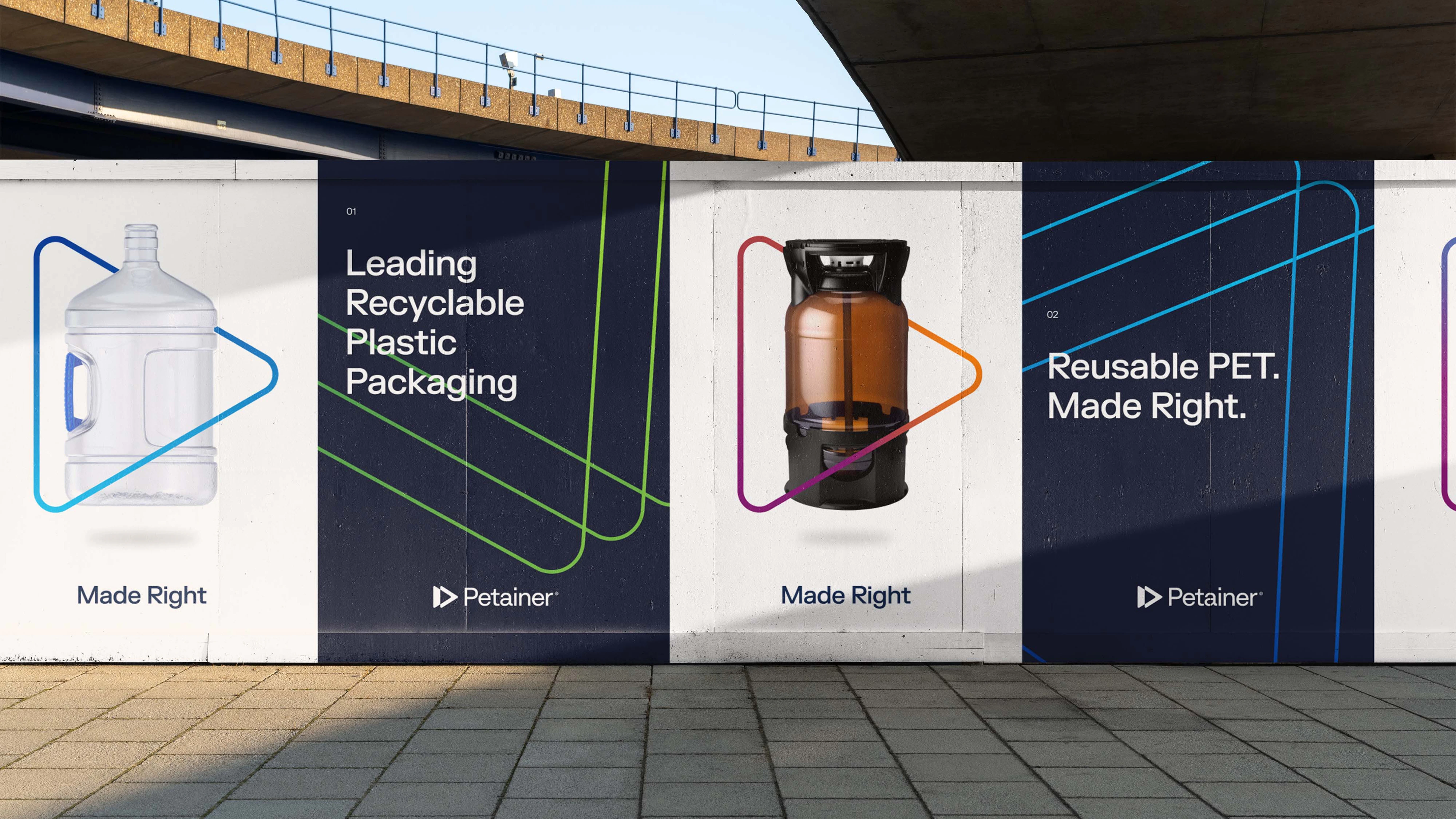
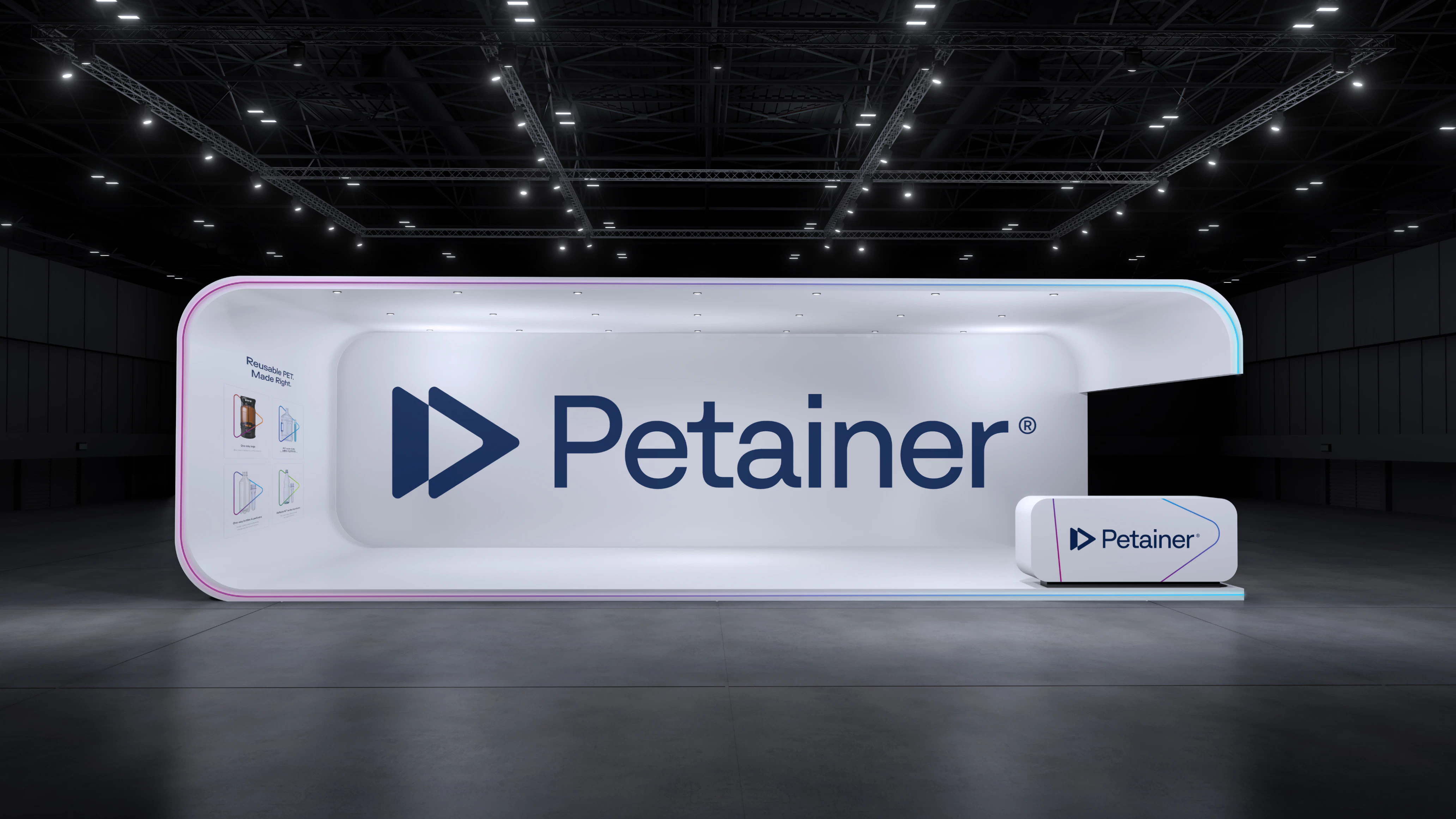
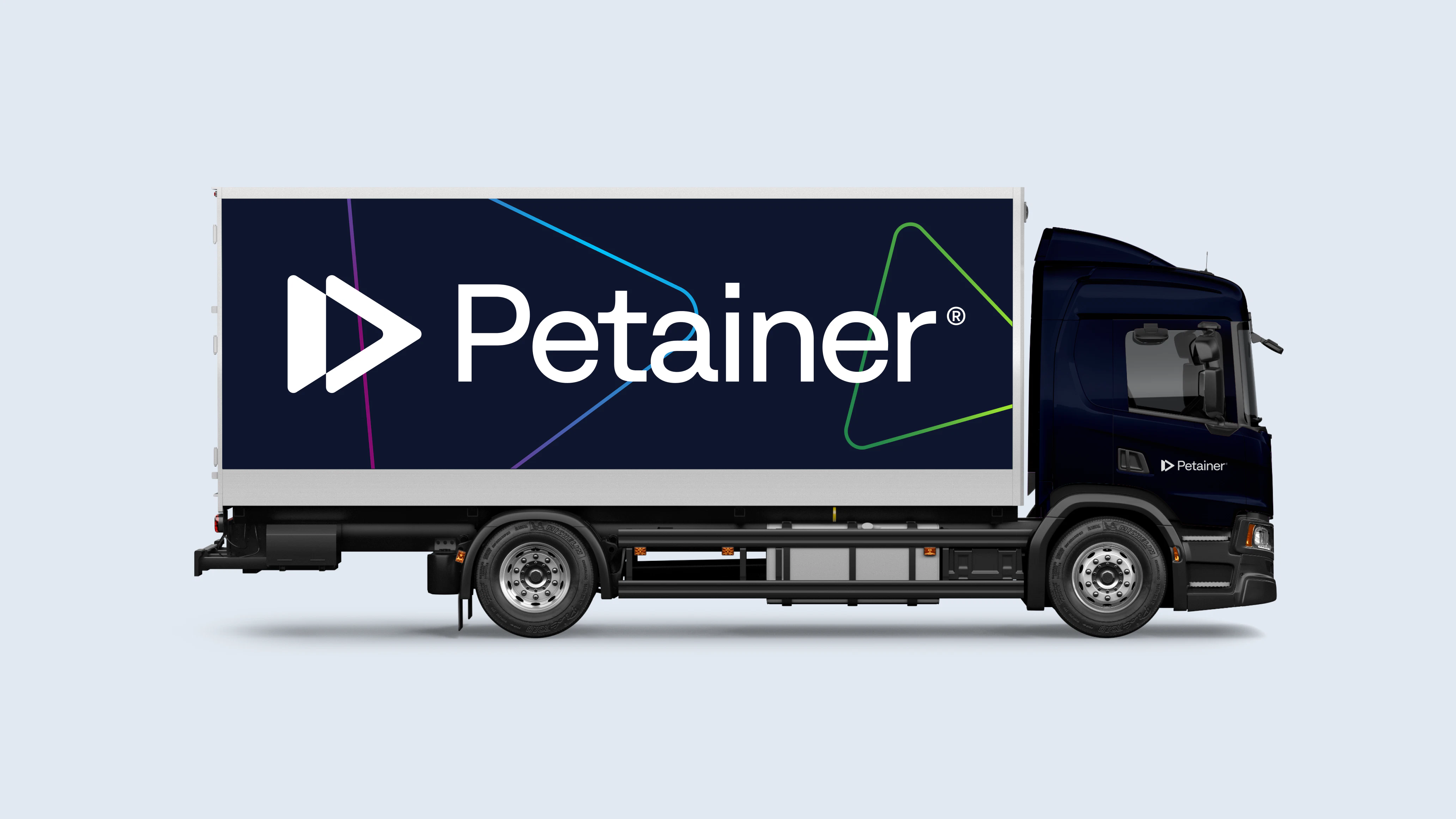
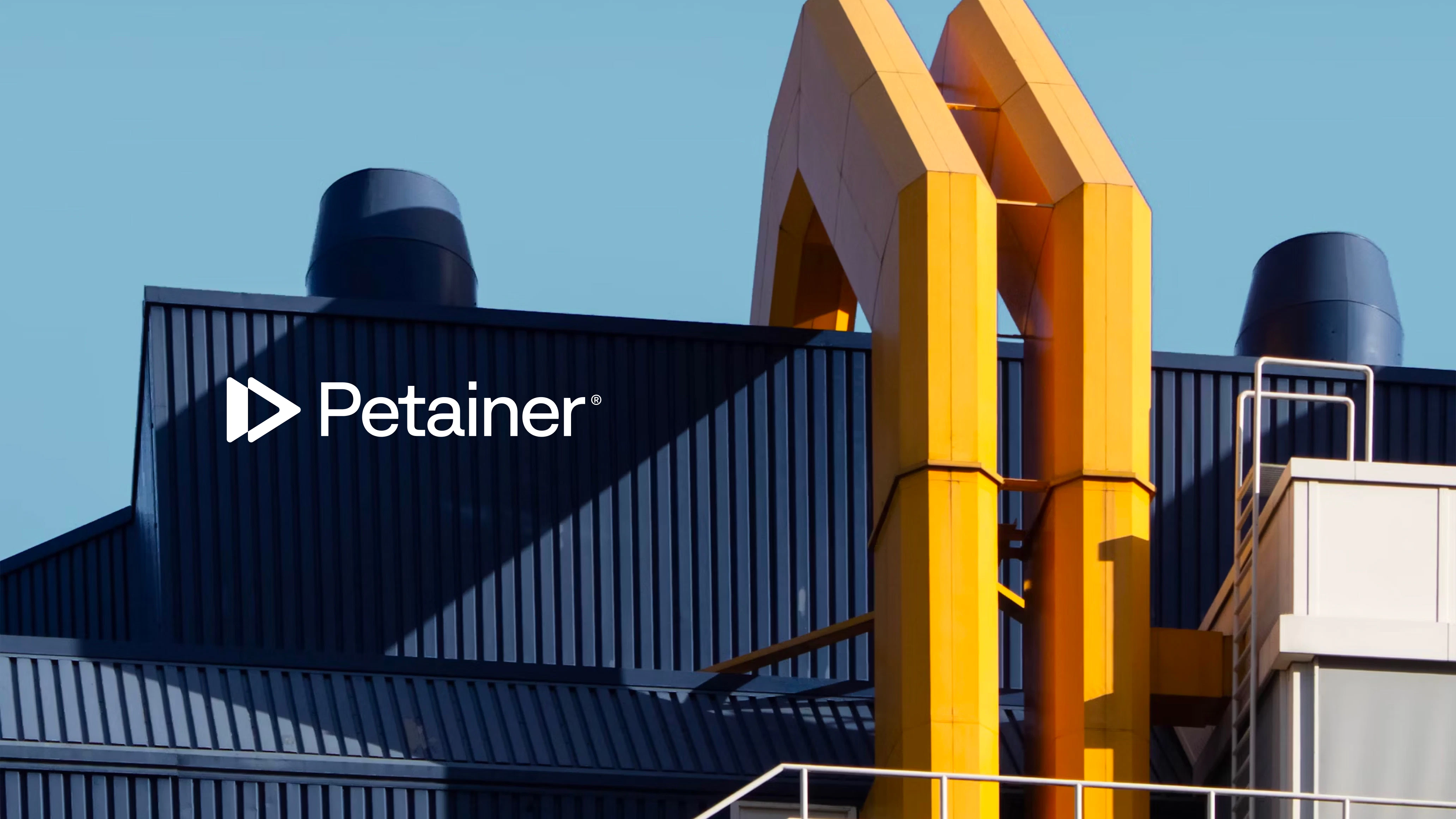
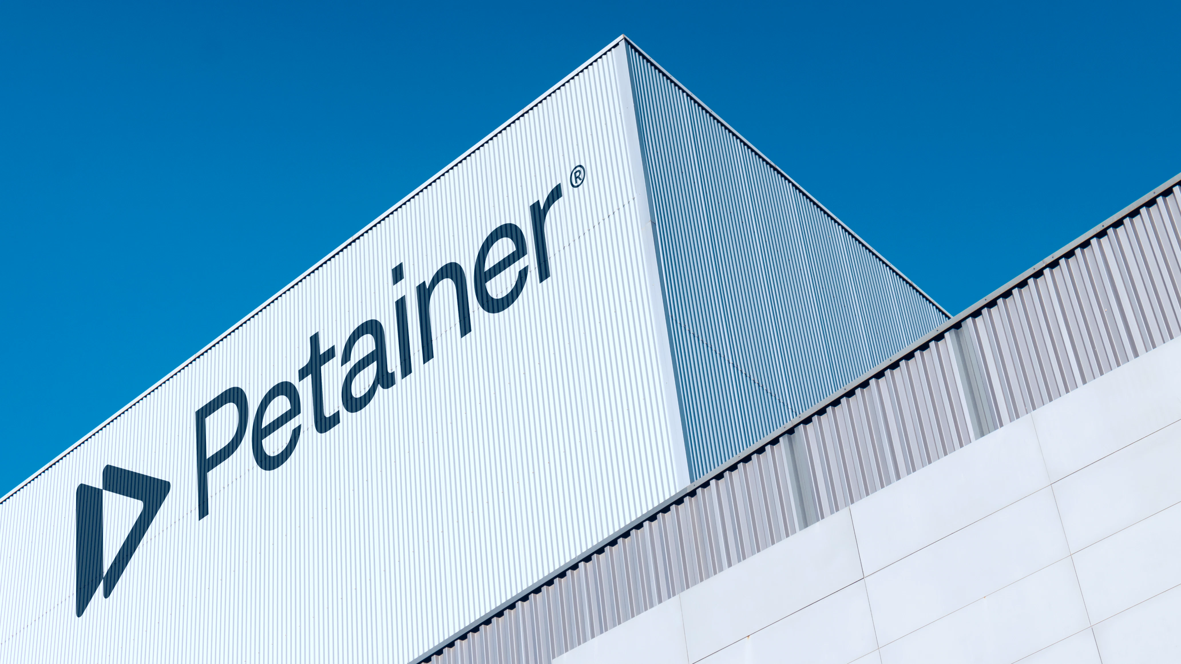
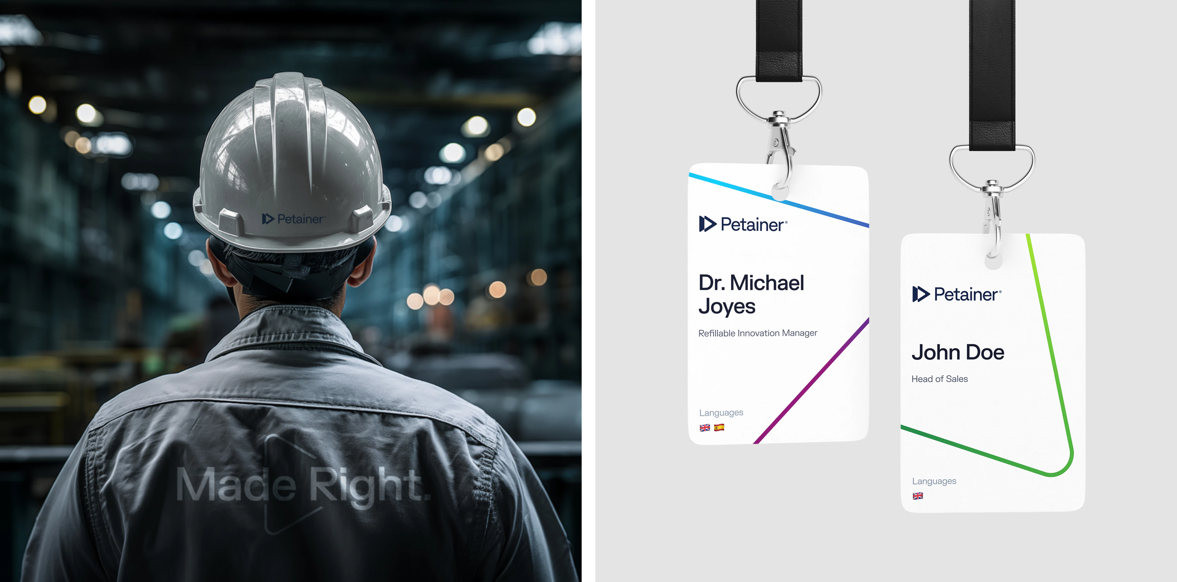
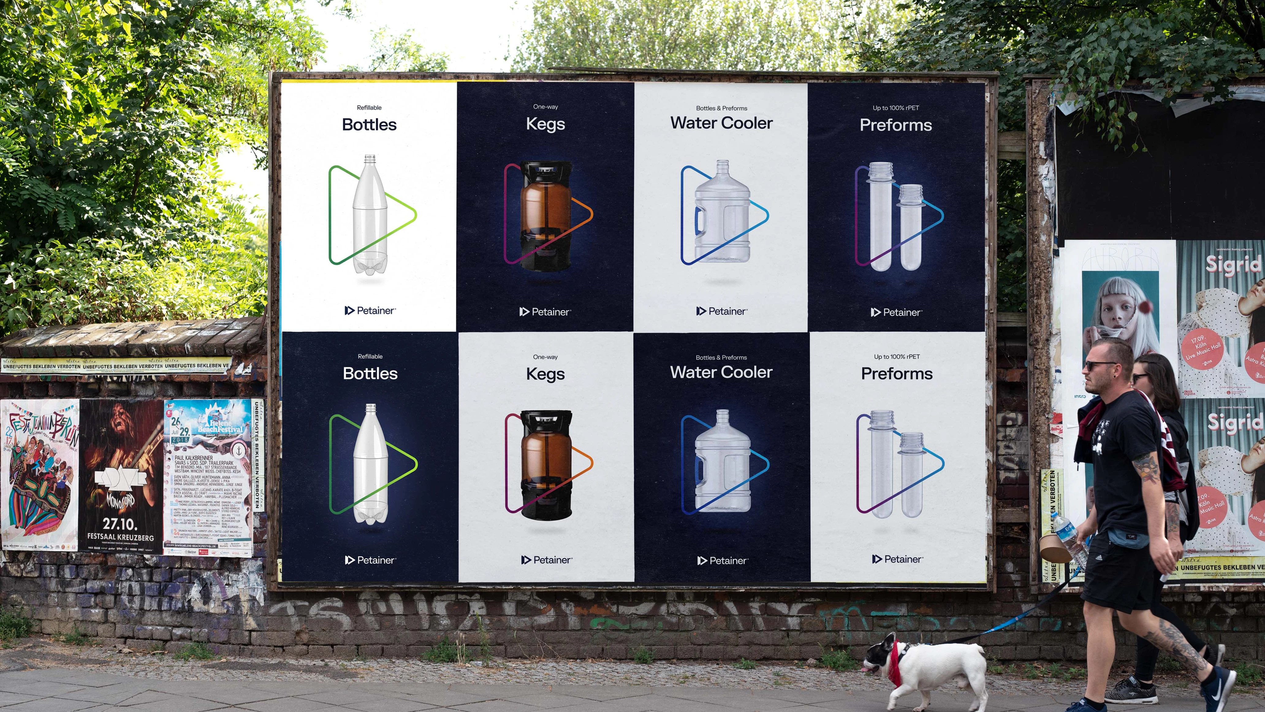
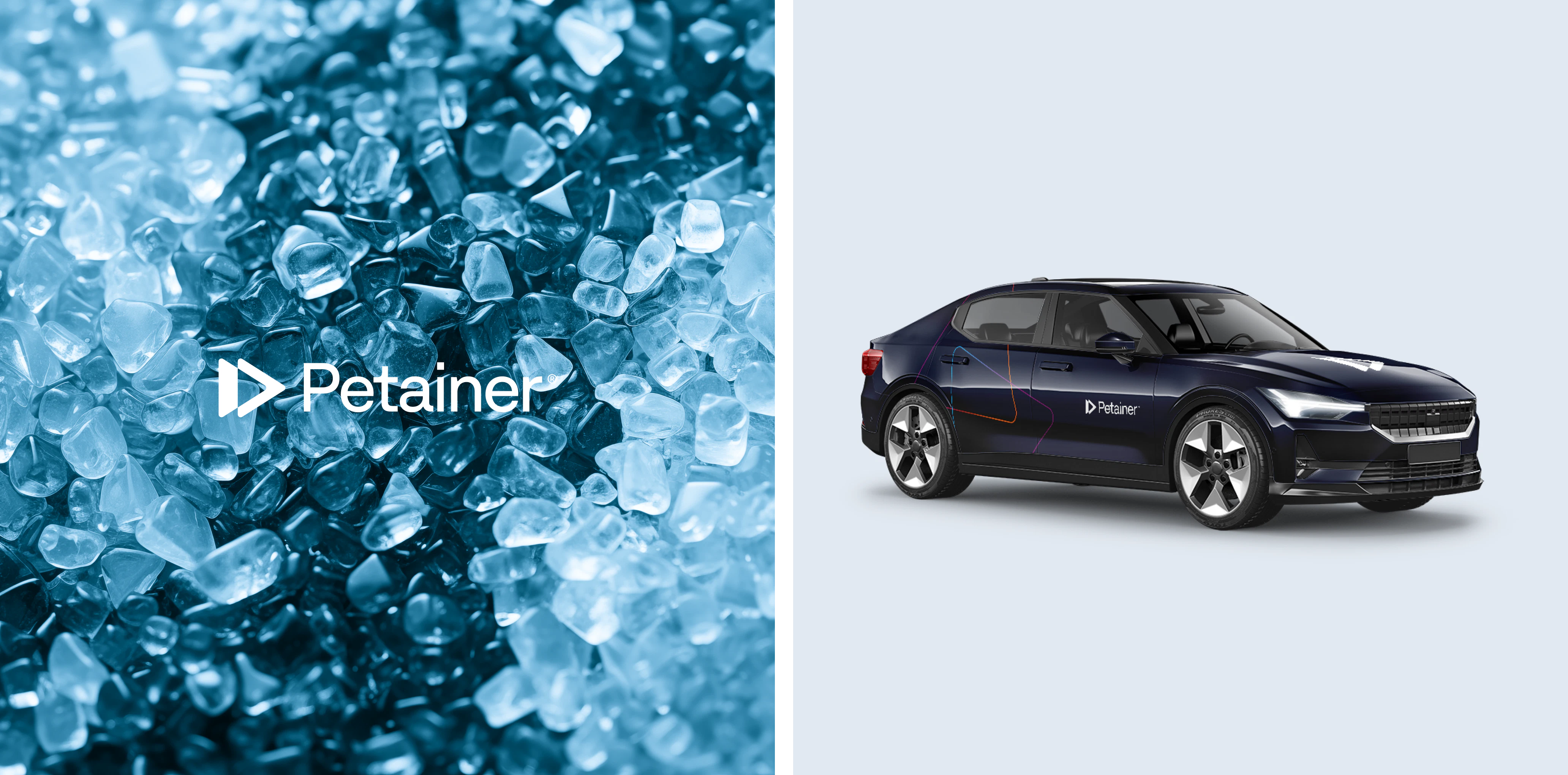
Today, Petainer’s logo, colour scheme, product illustrations and company brochure have more of a pop to them. They’ve been modernised to reflect a uniform feel, whilst still maintaining aspects of their original brand identity.
We'll drink to that!
By
transforming
the
core
brand
colours,
Petainer’s
Visual
Identity
raised
the
bar
from
juvenile
to
premium.
The
continued
use
of
the
sleek
triangle
icon
makes
Petainer
instantly
identifiable.
Moreover,
Petainer
now
has
a
Brand
Hub,
accessible
digitally,
that
specifies
a
clear
set
of
brand
rules
that
the
client
can
refer
to
when
producing
branded
content
in
the
future.
Kudos to
Client Lead / Dženita Džindo
Client Lead / Jamie Vaughan
Designer / Alexander Spliid
Designer / Christopher Ashton
Brand Hub Developer / Lukas Jurcik