Episode one Ventures
Born to found - Raised to fund
Client: Episode one
Timespan: August - December '23
Key Focus: Website and Brand
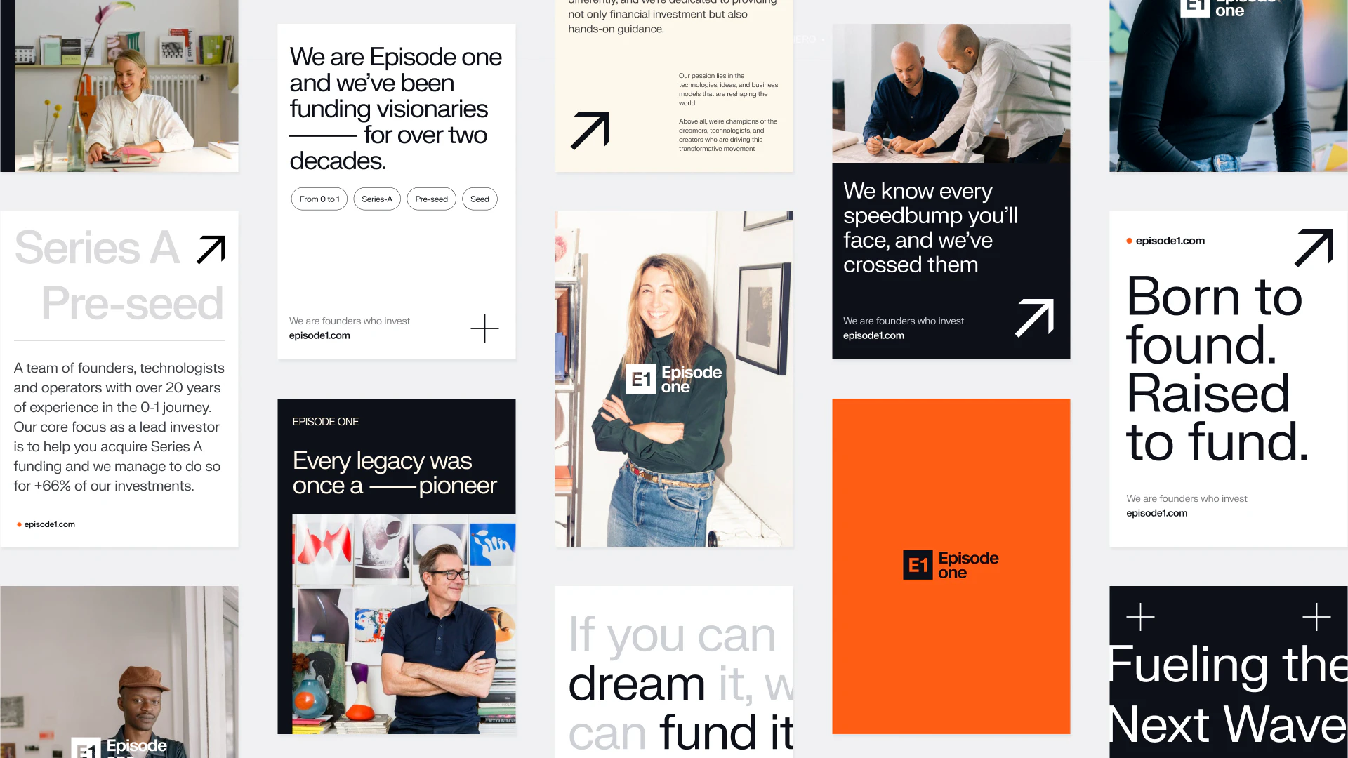
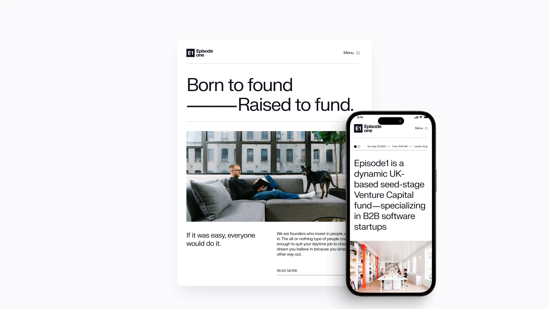
We developed a positioning strategy, new communications, a rebrand and a fresh website to better tell the stories of who they are and their track record.
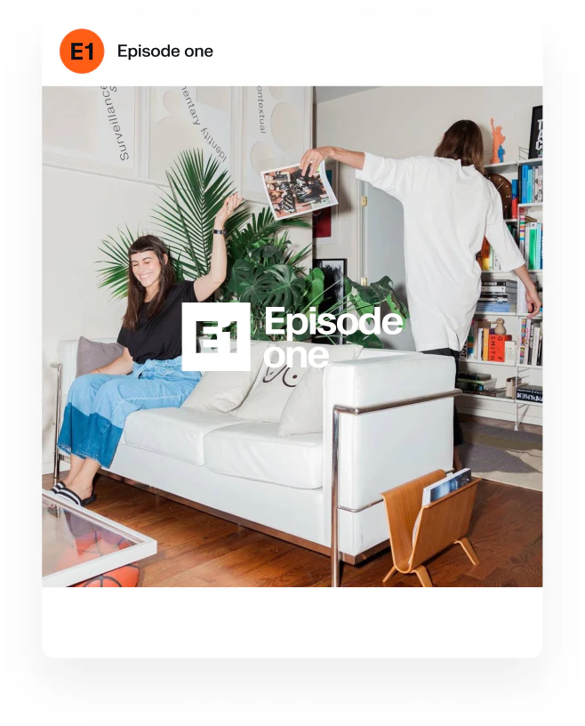
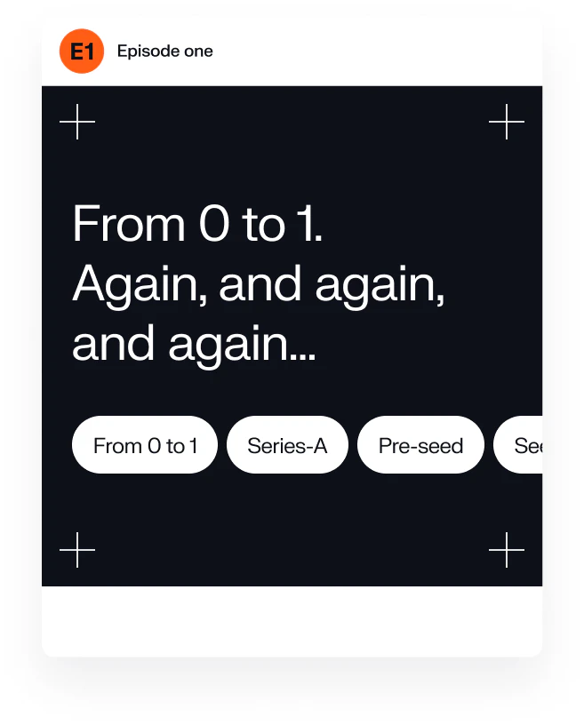
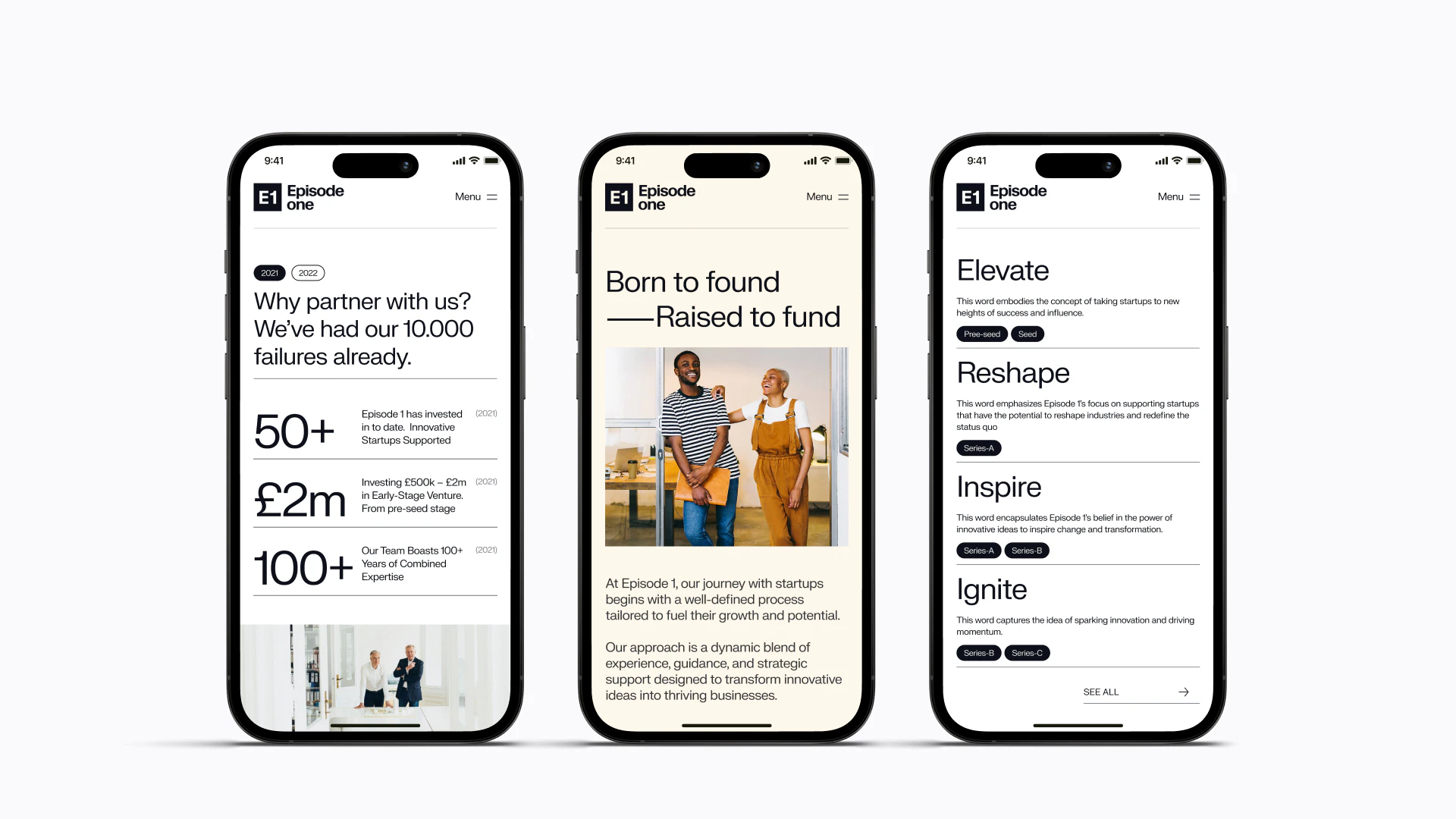
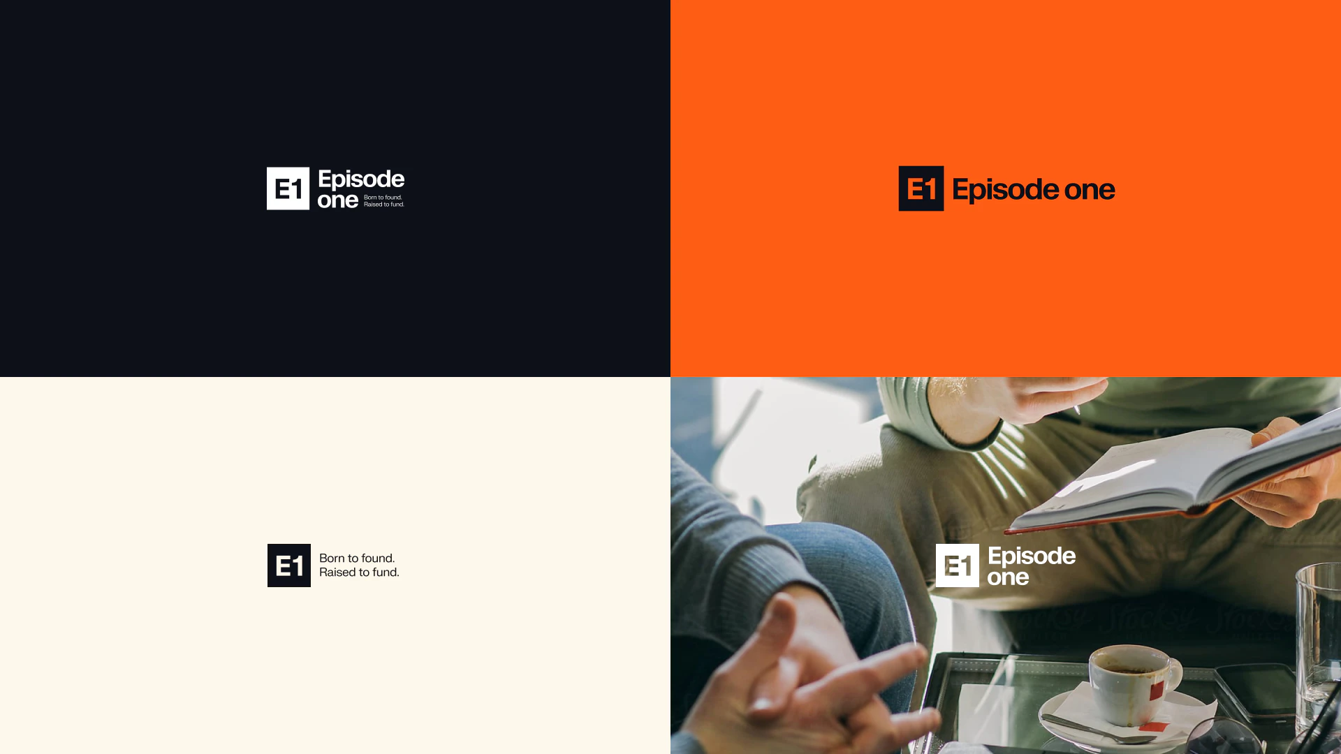
The new website experience reflects the idea - of “born to found - raised to fund”, balancing the fine line between relatability and expertise. E1’s visual identity is crafted with a timeless and professional touch, mirroring the values that define them. With a palette of steadfast hues and clean lines, we evoke a sense of stability, aiming to add trust and welcome founders into a relationship rooted in a shared vision.
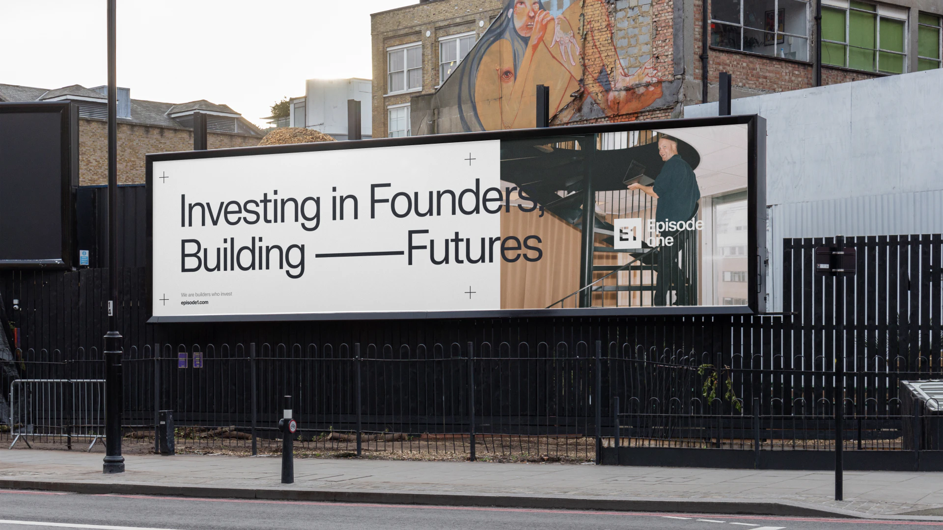
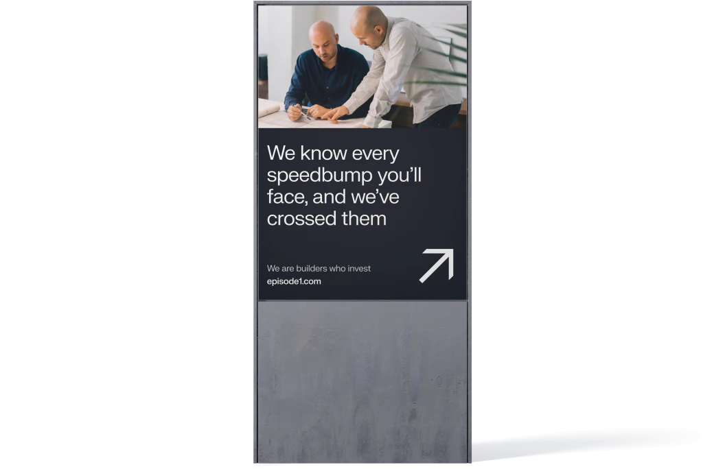
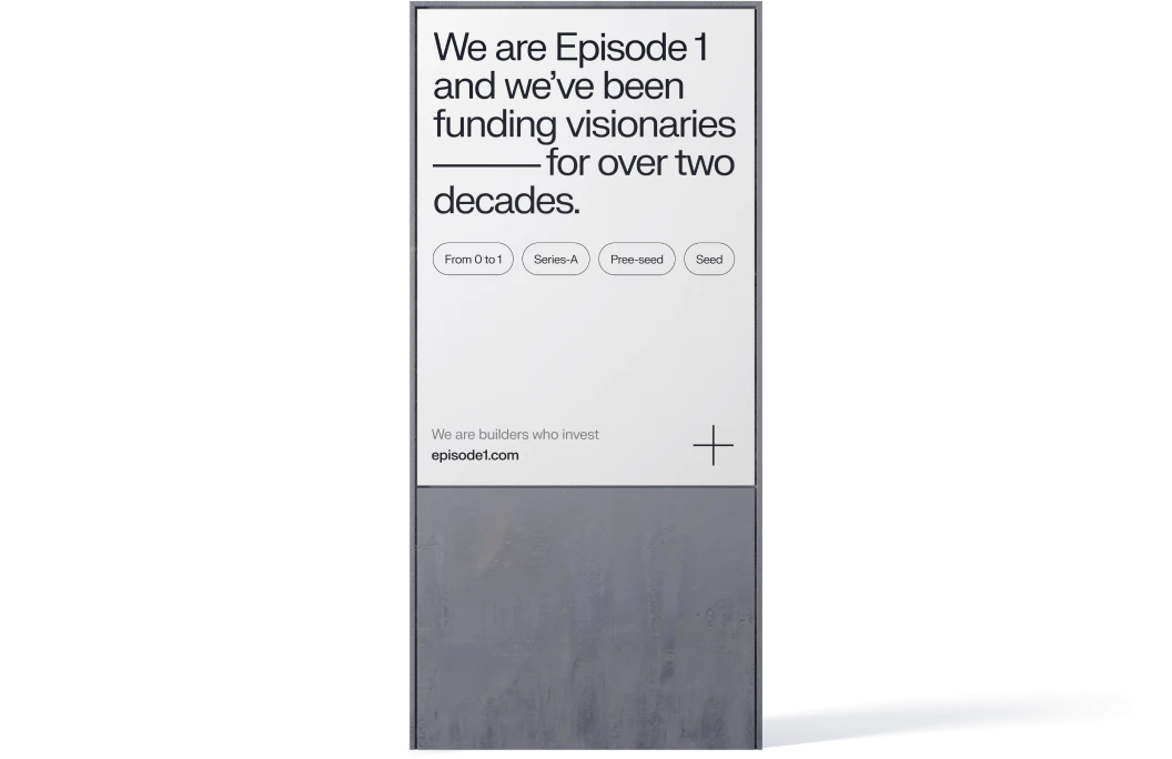
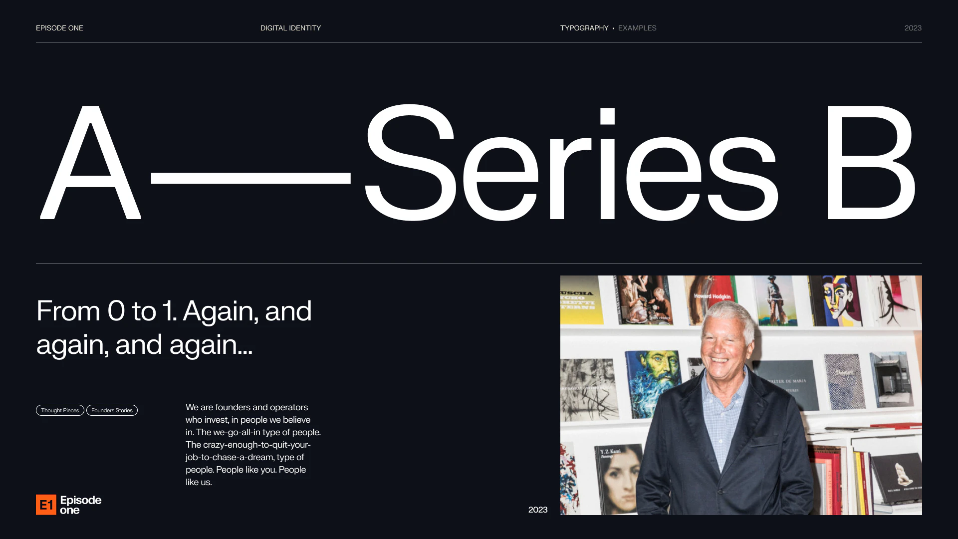
The connection from “0 to 1” is the evolution from seed to Series A, and beyond. We used that as a visual guideline of growth and put it at the centre of our brand activation strategy.
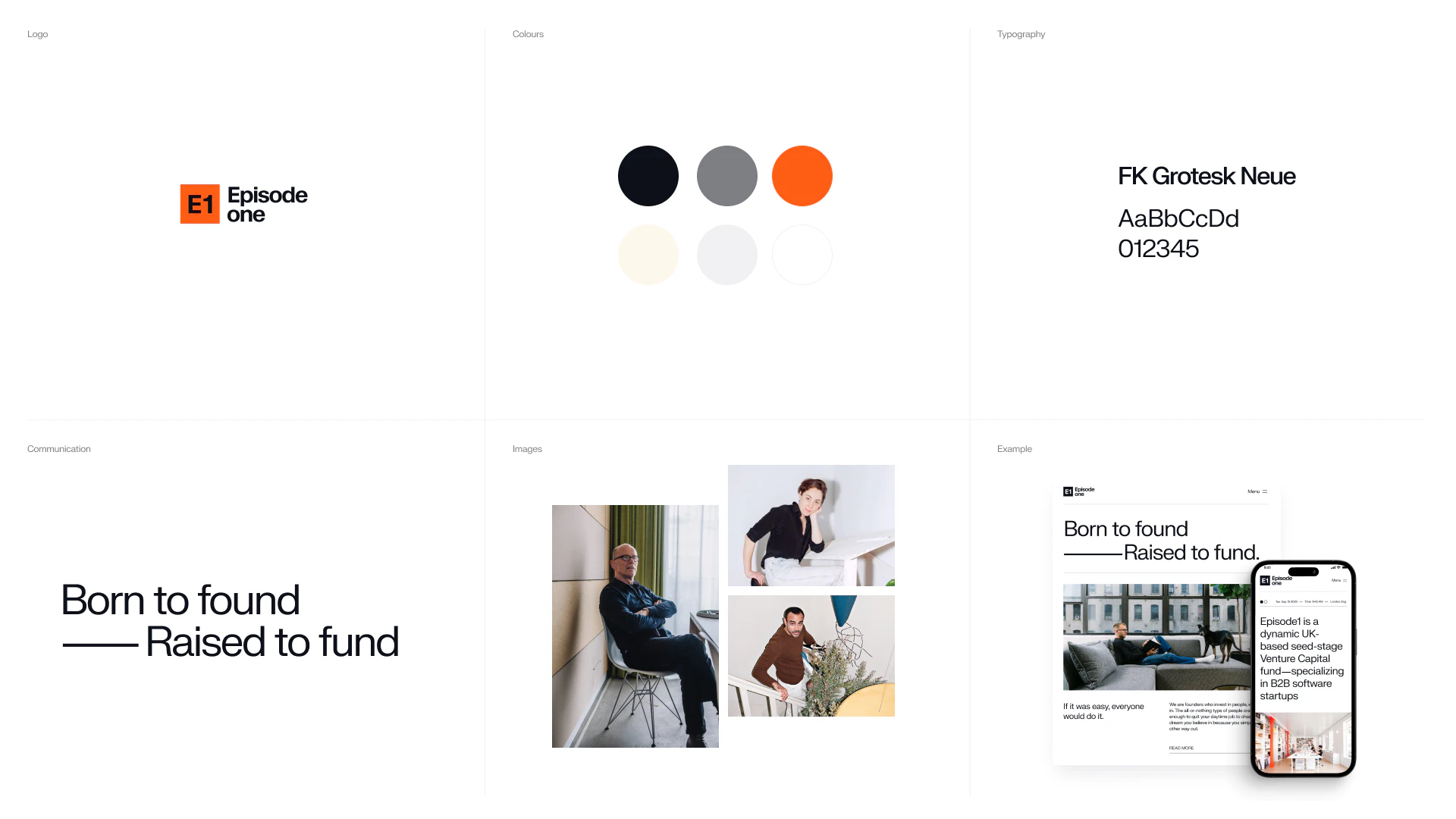
Our colour palette is a testament to simplicity and modernity. However, when it’s time to call attention to key elements, we deploy a distinct and vibrant orange.
Kudos to
Client Lead / Jamie Vaughan
Client Lead / Dženita Džindo
Strategist / Sofie Henriksen
Designer / Kristoffer Balzer Nielsen
Designer / Julie Elgaard
