Eesy
No binding agreement. No fees. Eeeeesy.
Client: Eesy
Timespan: Jul '22 - Sep '22
Key Focus: Web App design
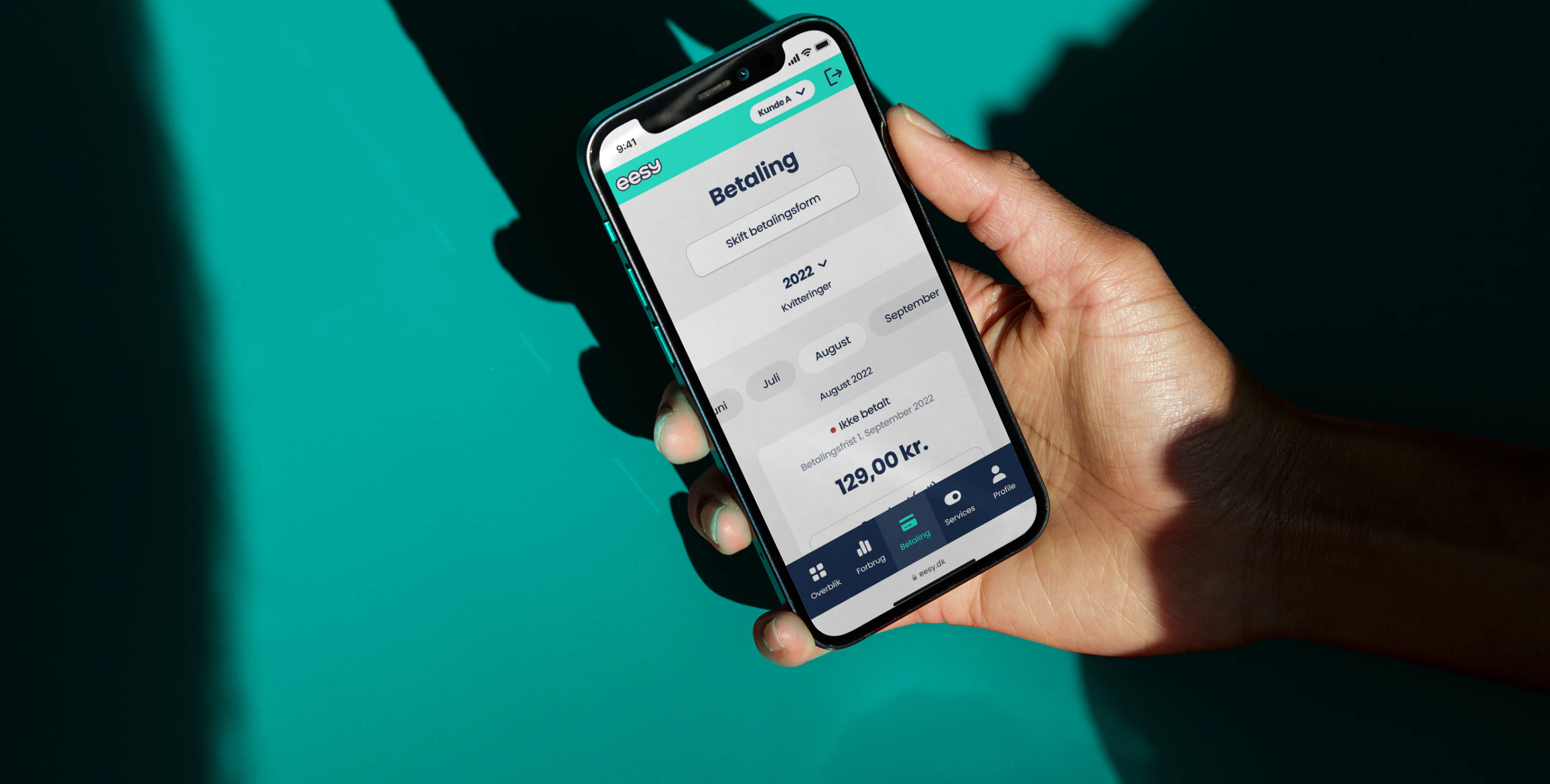
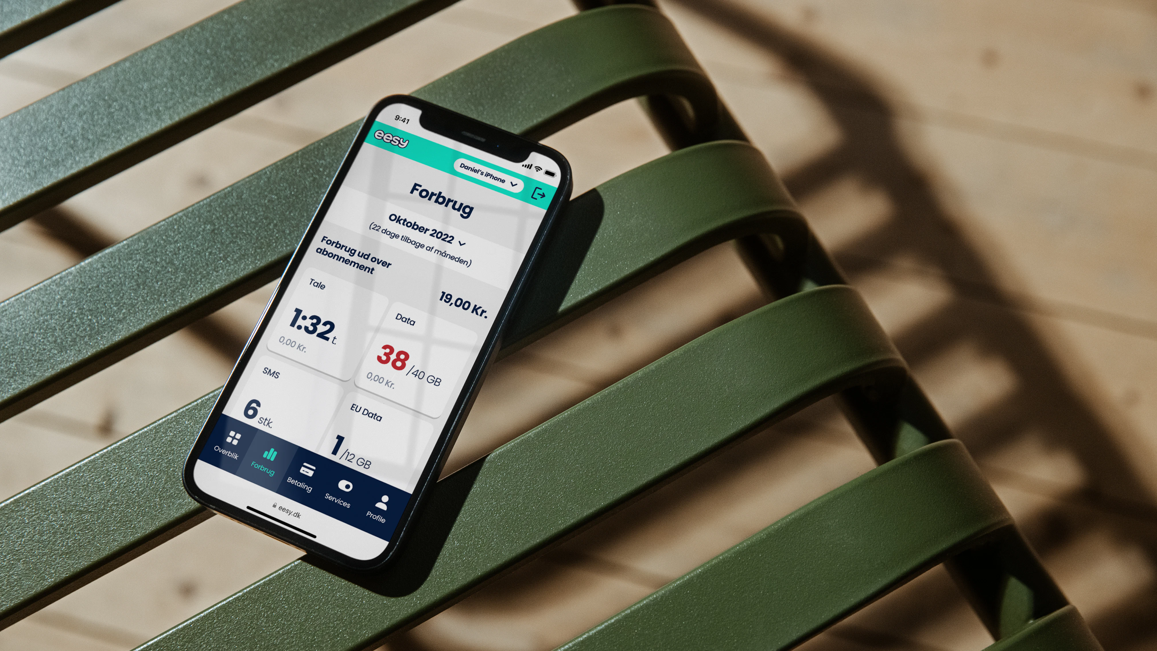
Eesy had a dream of being the no-nonsense, straightforward choice when it came to mobile service providers. The problem? Their online self-service portal didn't align with this vision. It was complex, user-unfriendly, and in need of a rapid overhaul.
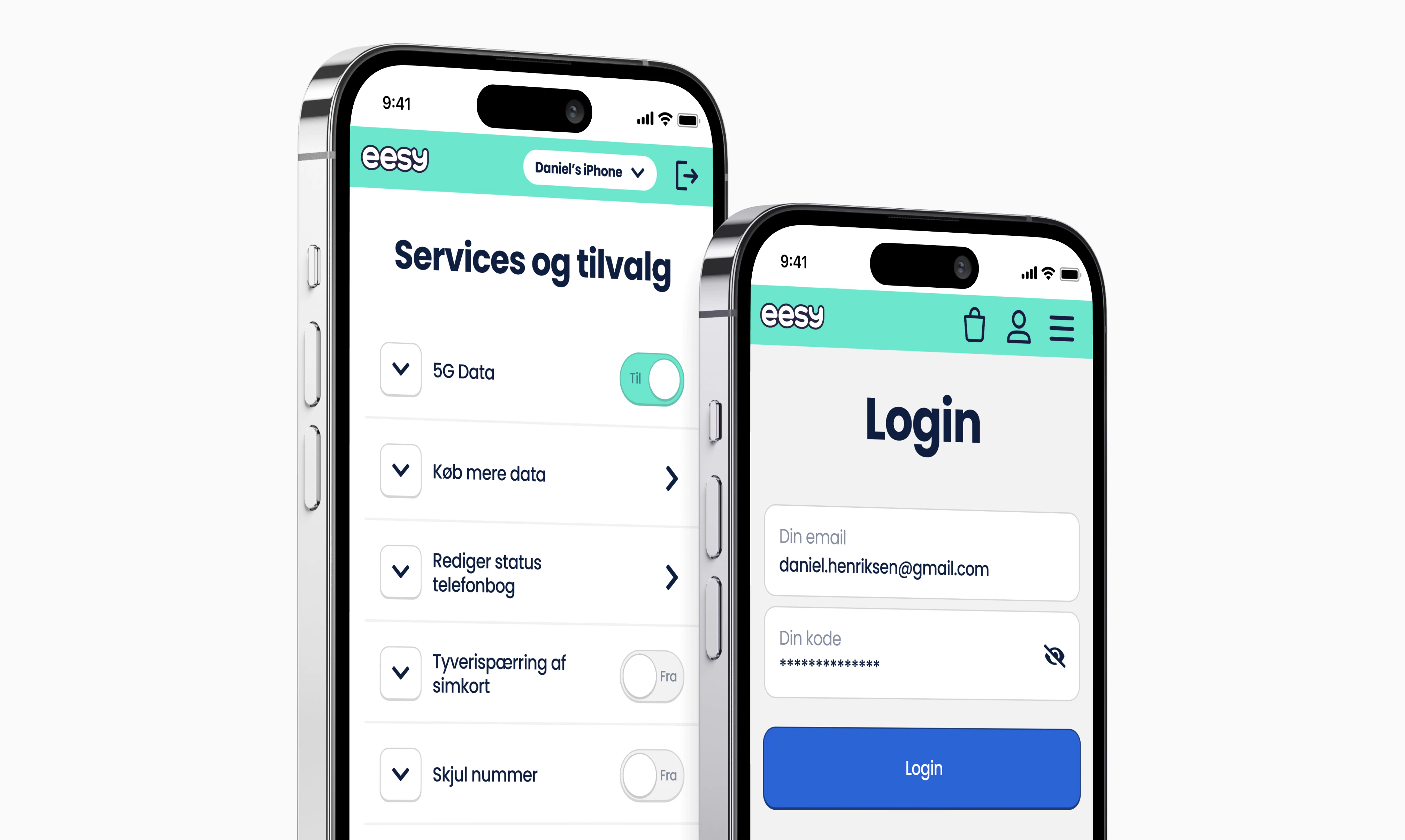
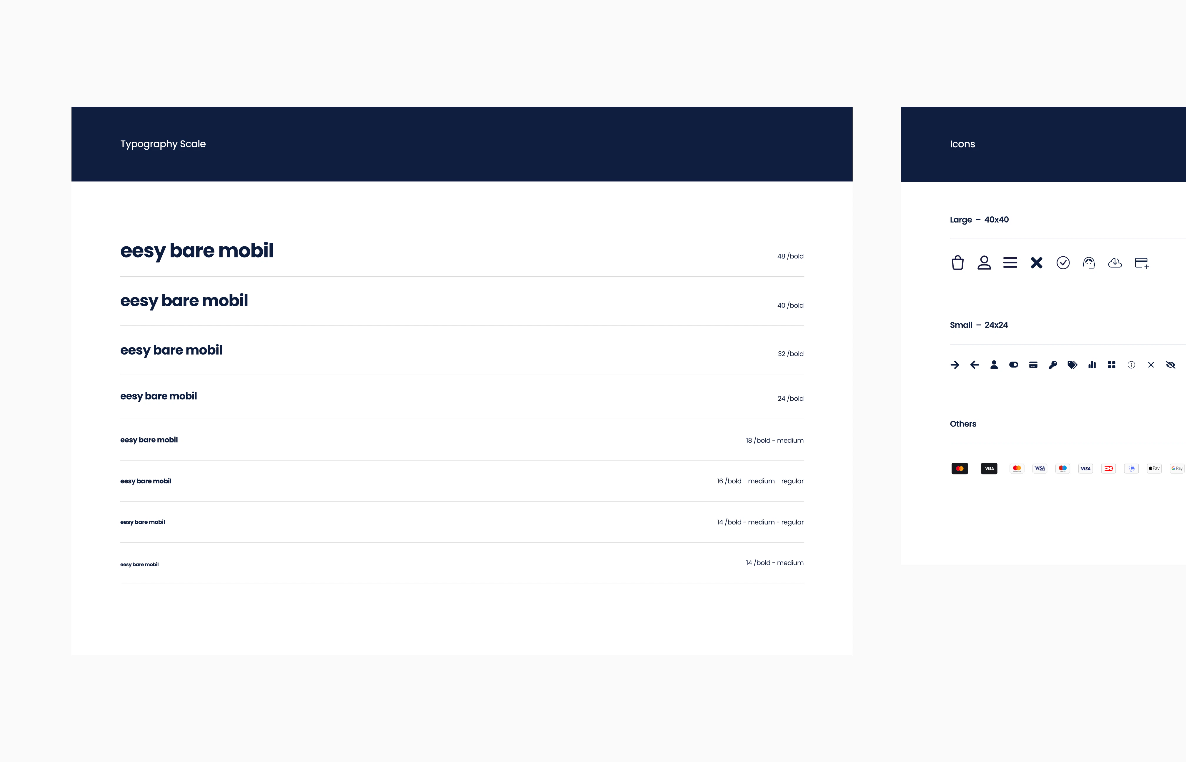
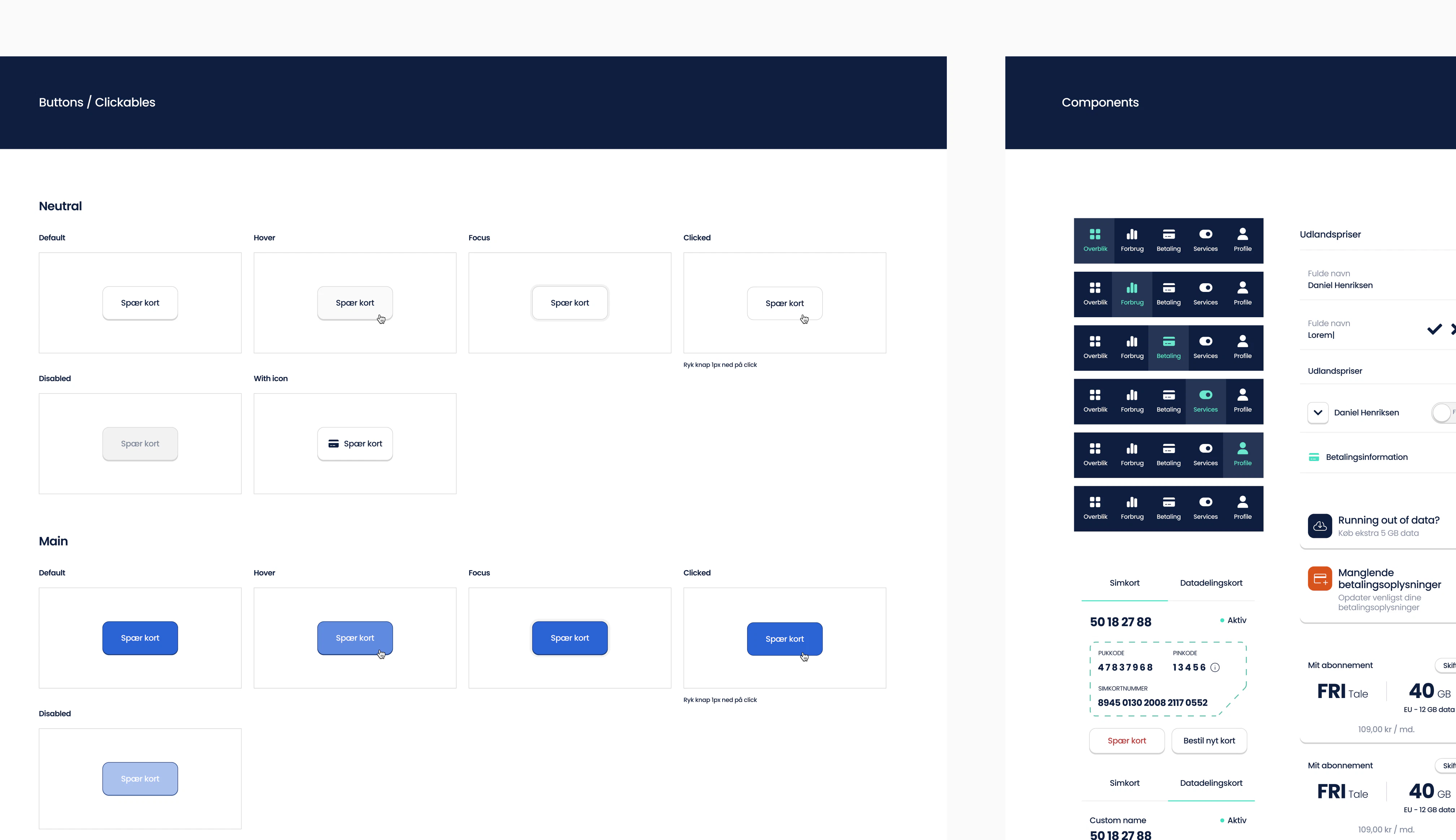
To build a UX experience worthy of the Eesy name, the approach started with a research phase on both the market and the end-user. Collaborating closely with Eesy, Signifly then began site mapping and wireframing - with a "mobile-first" mindset throughout the entire process, ensuring a design that was both web and app-ready.
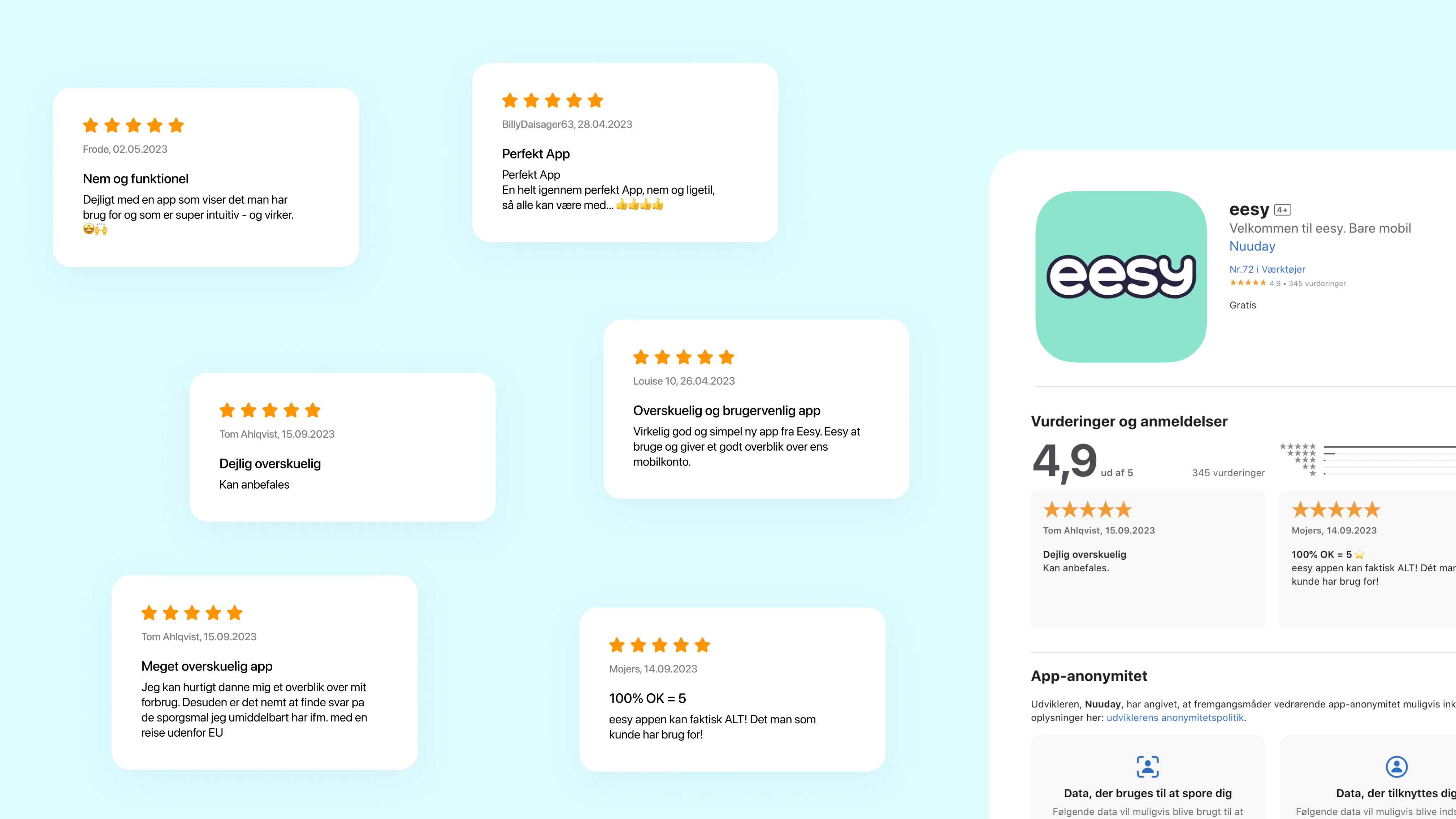
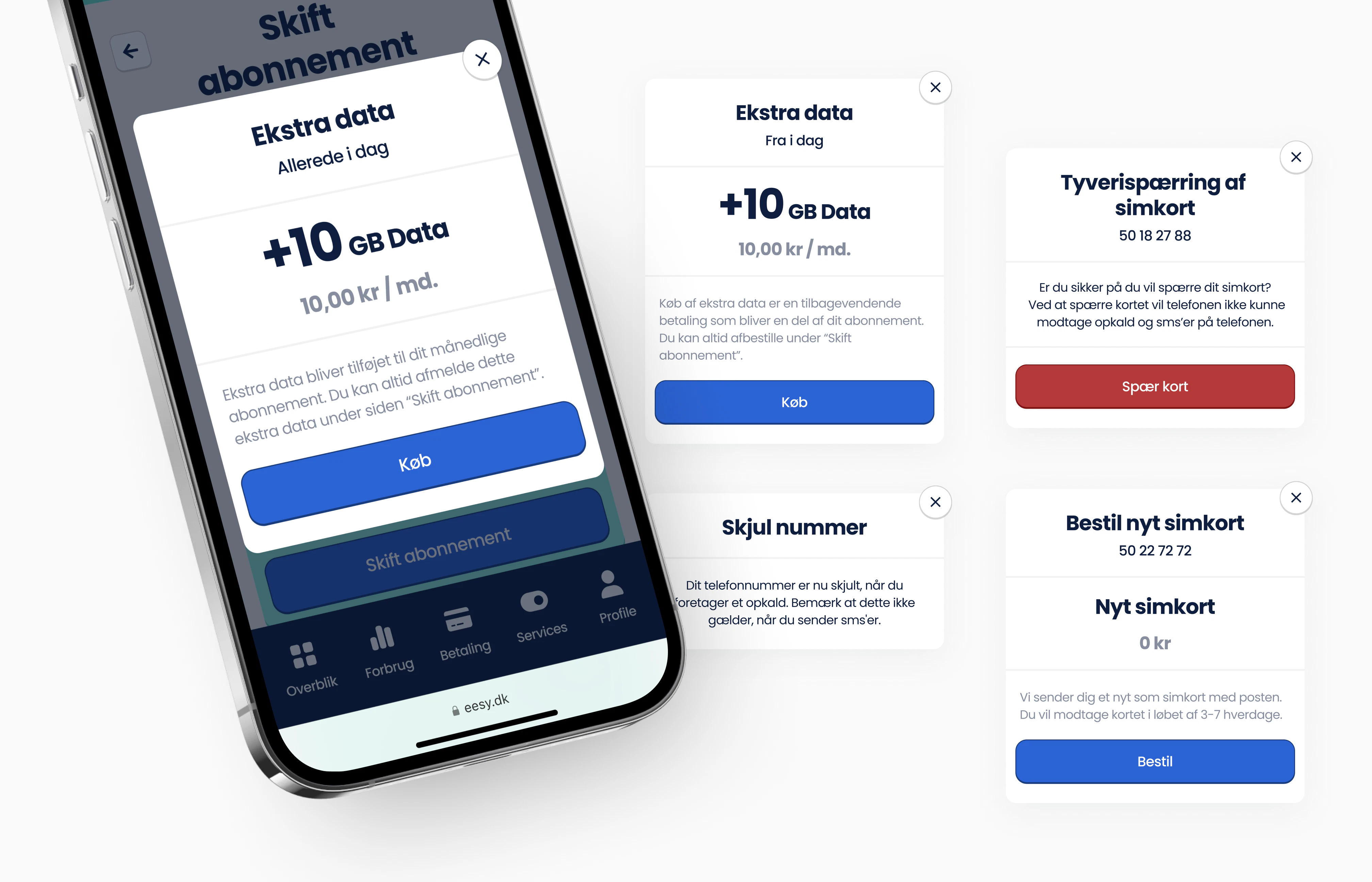
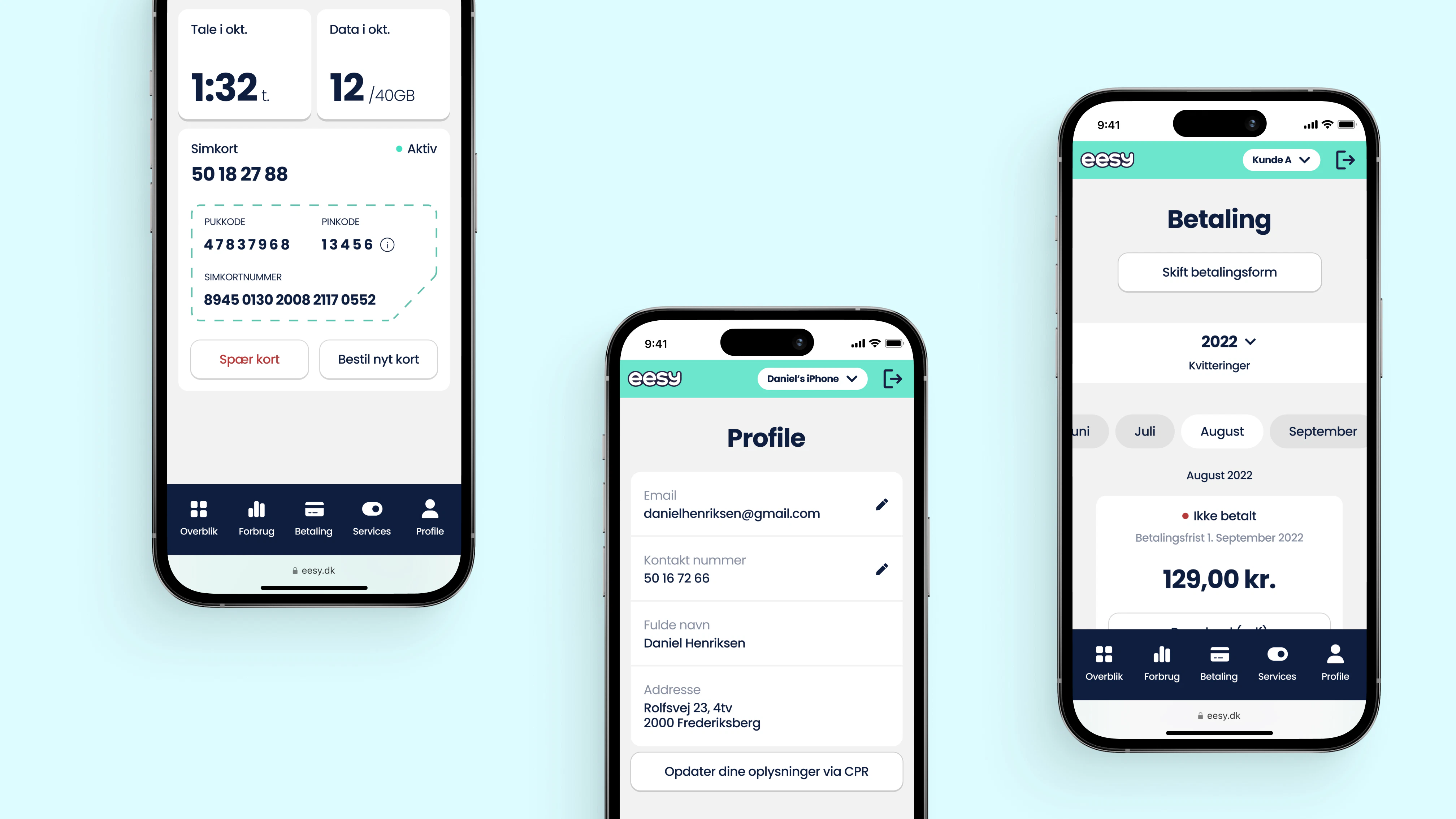
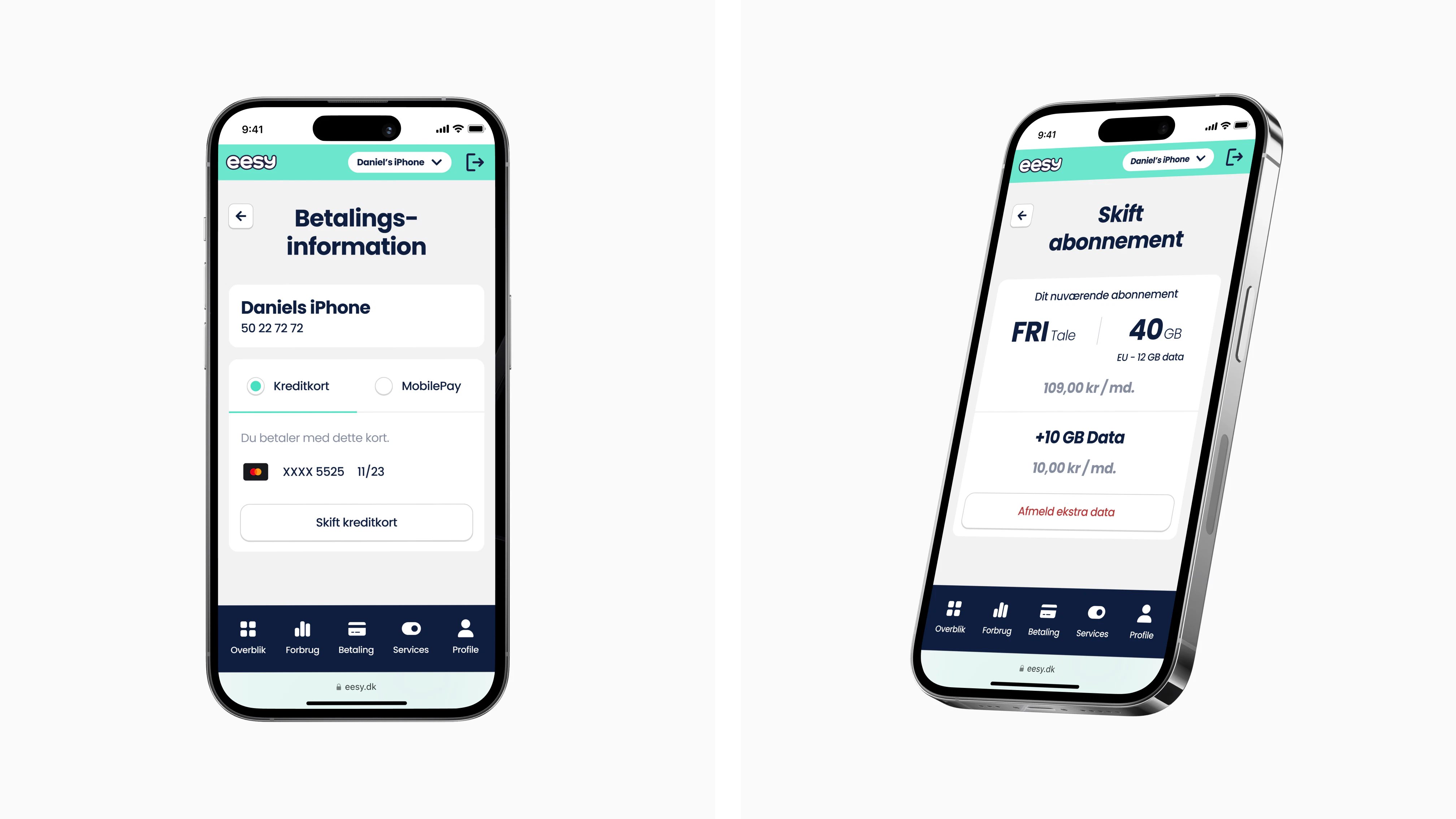
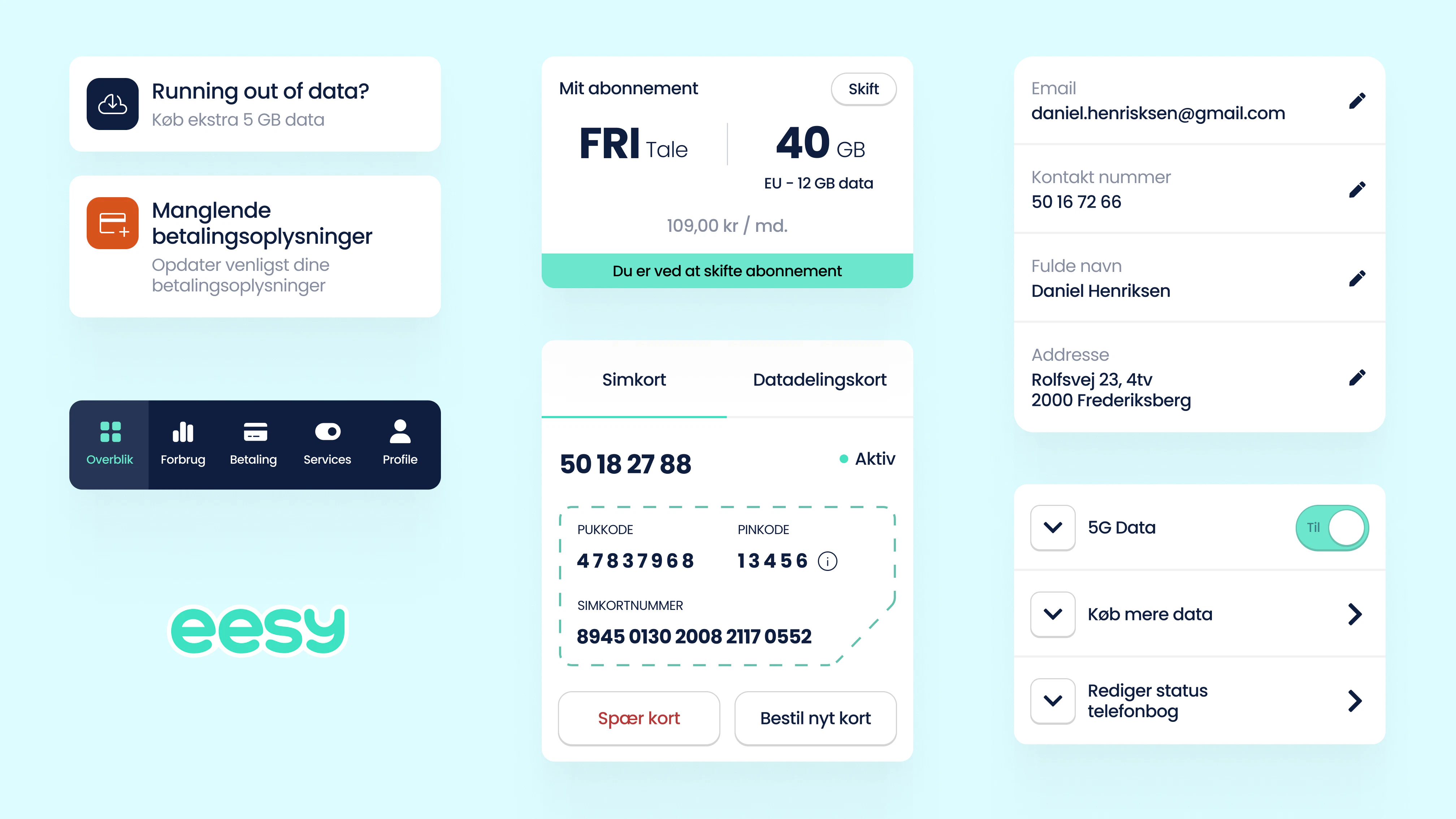
In just two weeks, the solution was built, earning its place as the highest-rated app for mobile service providers. Through this reformed design, Eesy now has an intuitive, user-friendly app that embodies its vision of simplicity while also accommodating complex functions.
2
weeks to launch
4.9
average rating on App store

Kudos to
Project Lead / Gijs Millenaar
Design / Lukas Jurcik
Design / Søren Schrøder
