Diva
For all your periods.
Client: Diva International Inc.
Timespan: Dec '21 - Jan '23
Key Focus: Rebrand and ecomm build
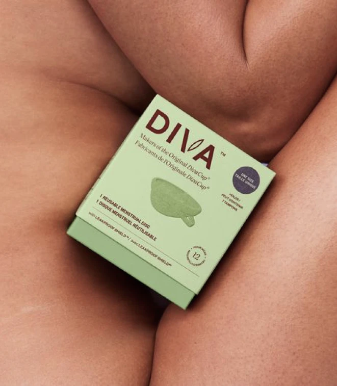
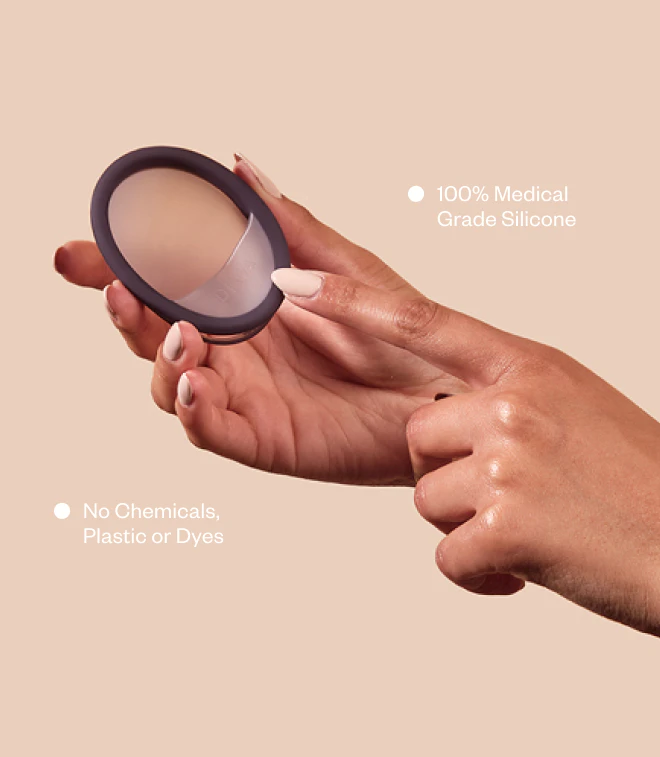
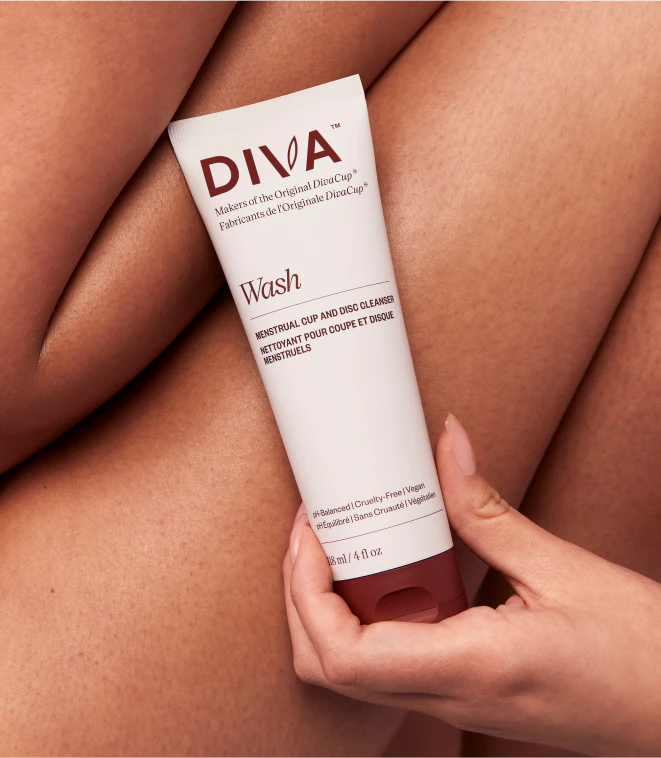
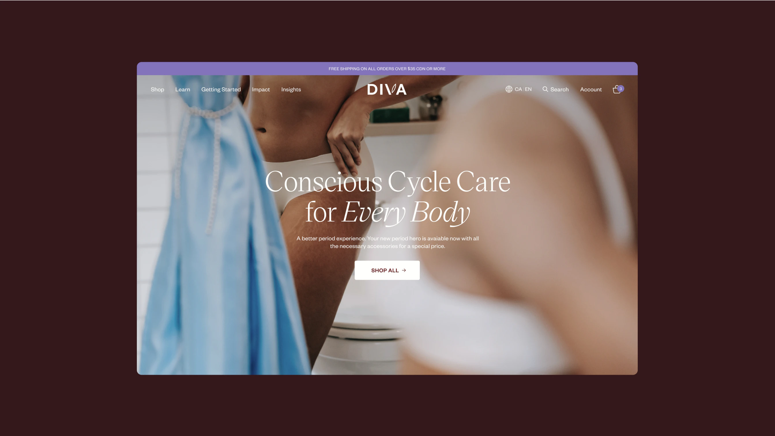
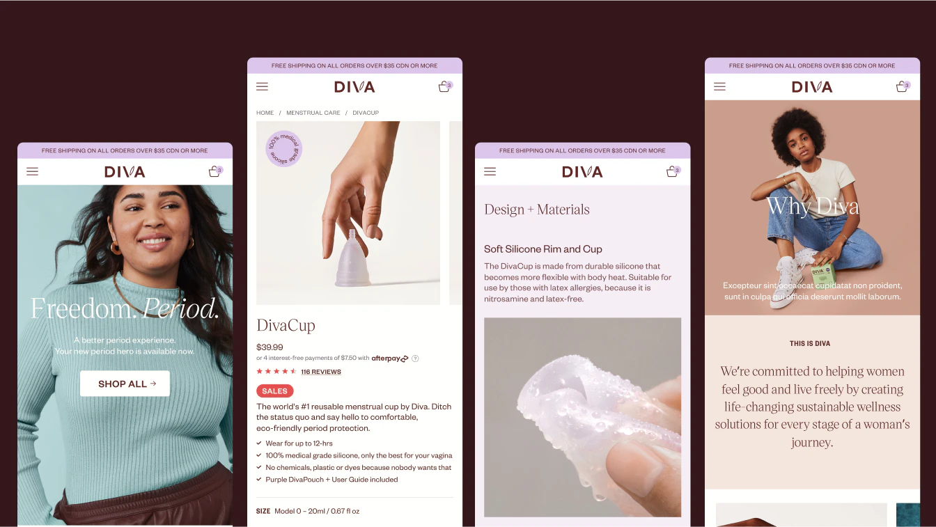
Diva is a legacy brand best known for paving the way within the modern cycle care industry through the global adoption of their product, the DivaCup. As new competitors emerge within the category, the timing for a brand and platform refresh was critical to Diva reclaiming its stance as the leader.
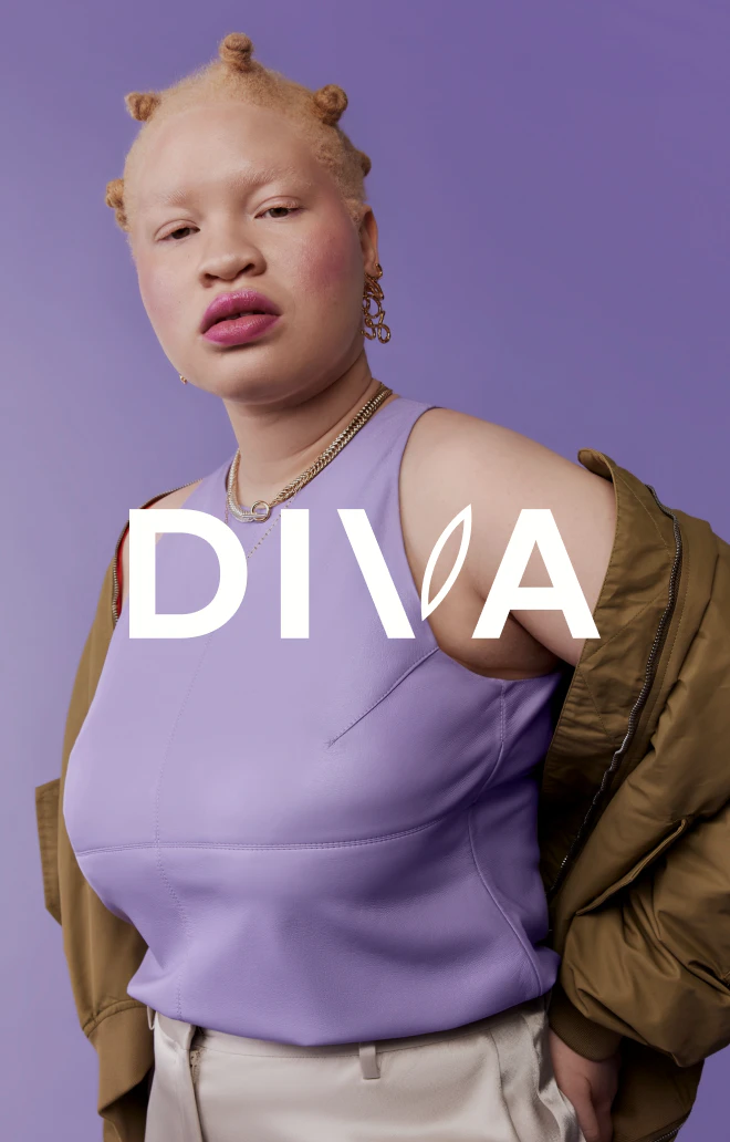
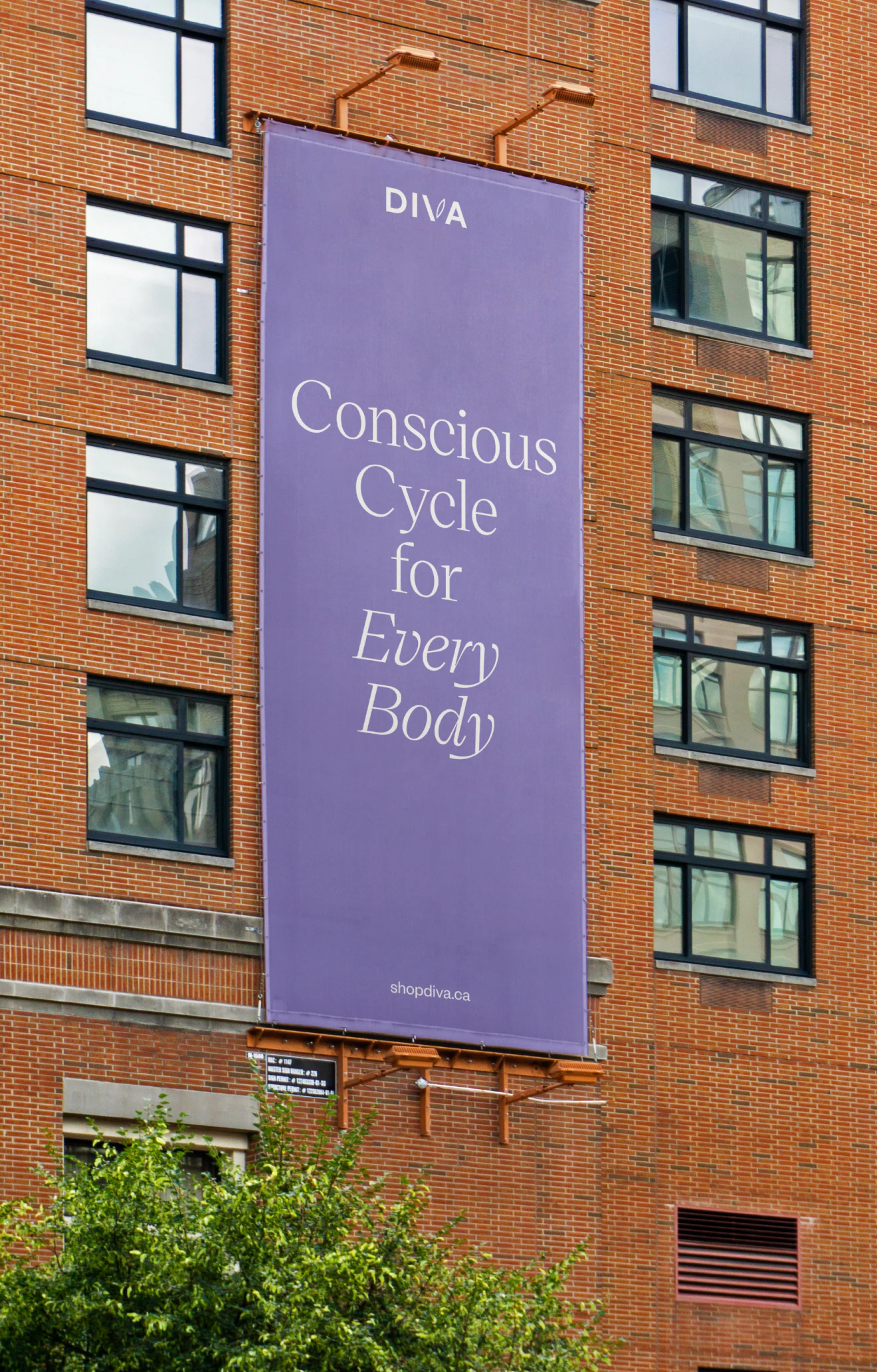
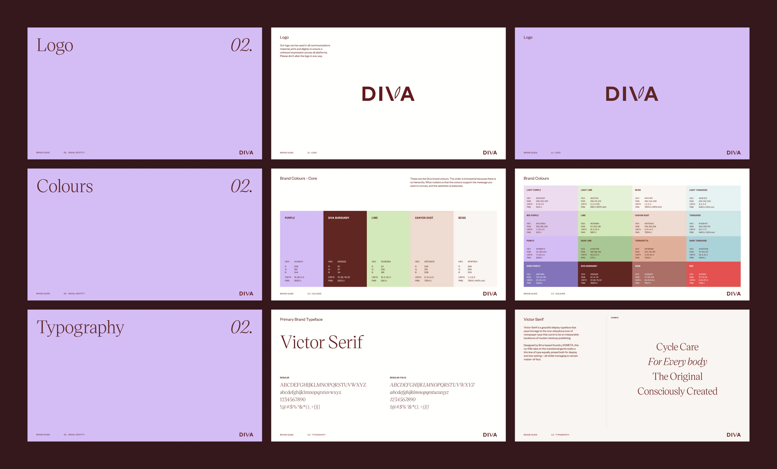
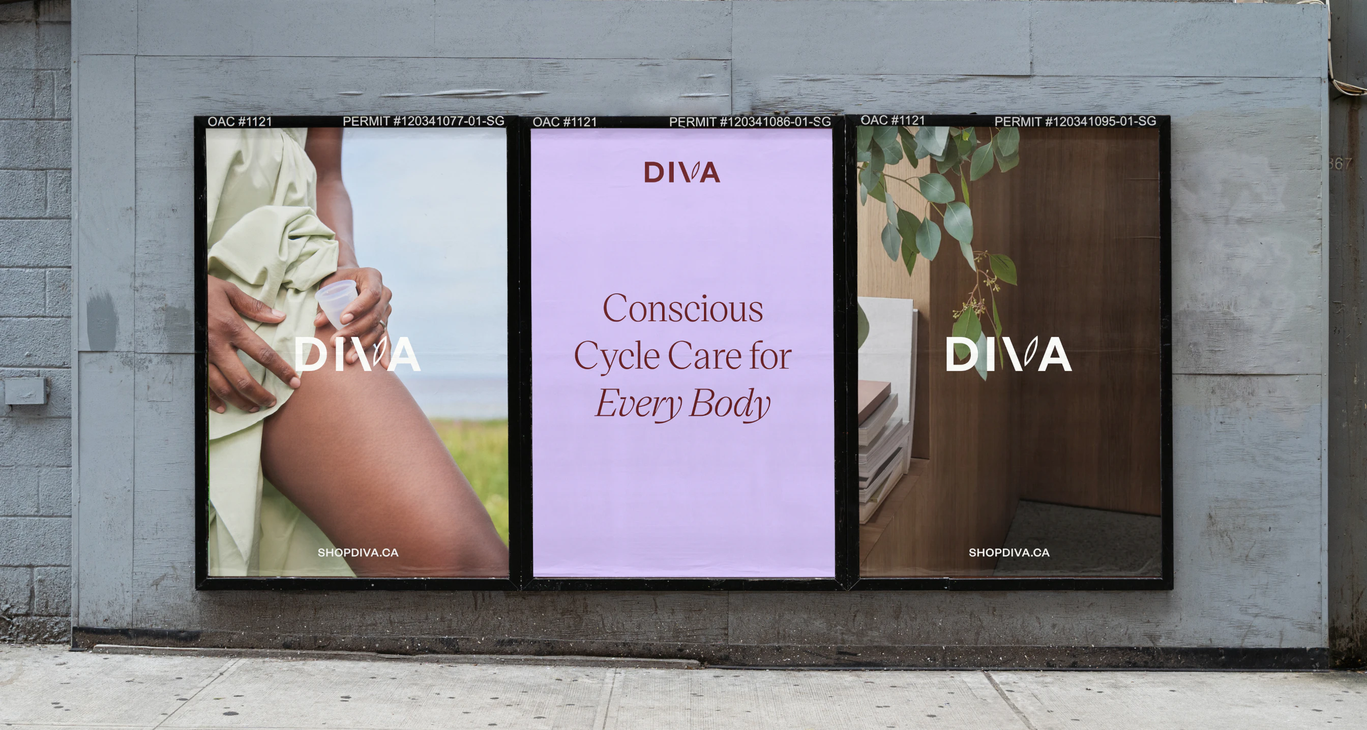
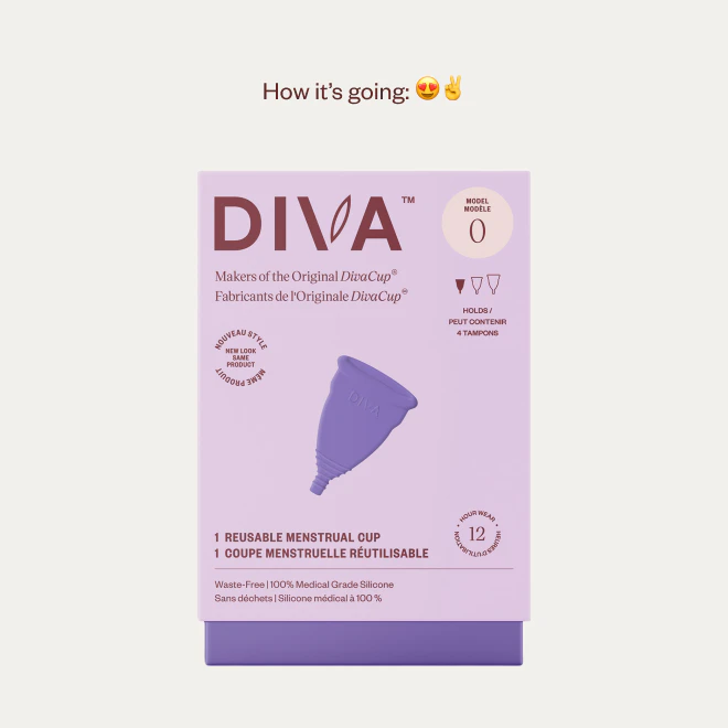
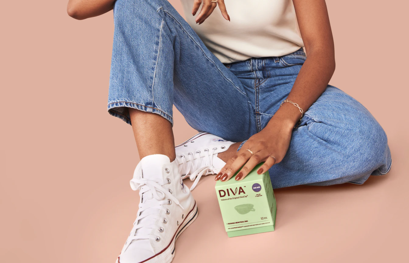
The updated brand identity highlights the voices of their community and focuses on Diva's values, claiming their stance as the conscious cycle care partner. The visual identity is clean and more gender-neutral, with colours associated with lightheartedness and optimism. Diva consolidated their various sites into one centralized ecomm platform to ensure a positive experience throughout their offerings.
Diva
acknowledges
the
challenges
that
come
with
modern
cycle
care
and
embraces
transparency
to
provide
our
community
with
knowledge
and
confidence
to
live
worry-free.
Kudos to
Project Manager / Aurelie Saïz
Strategy / Kathrine Elvira Boysen
Strategy / Sofia Gruchalla-Wesierski
Strategy Lead / Nicolas Abou
Lead Design / Alexandre Lee
Design / Sasha Ng
Development / Anna Chowattanakul
Development / Pedro Padron

