DEA
Website and brand refresh
Client: DEA
Key Focus: Web & Brand
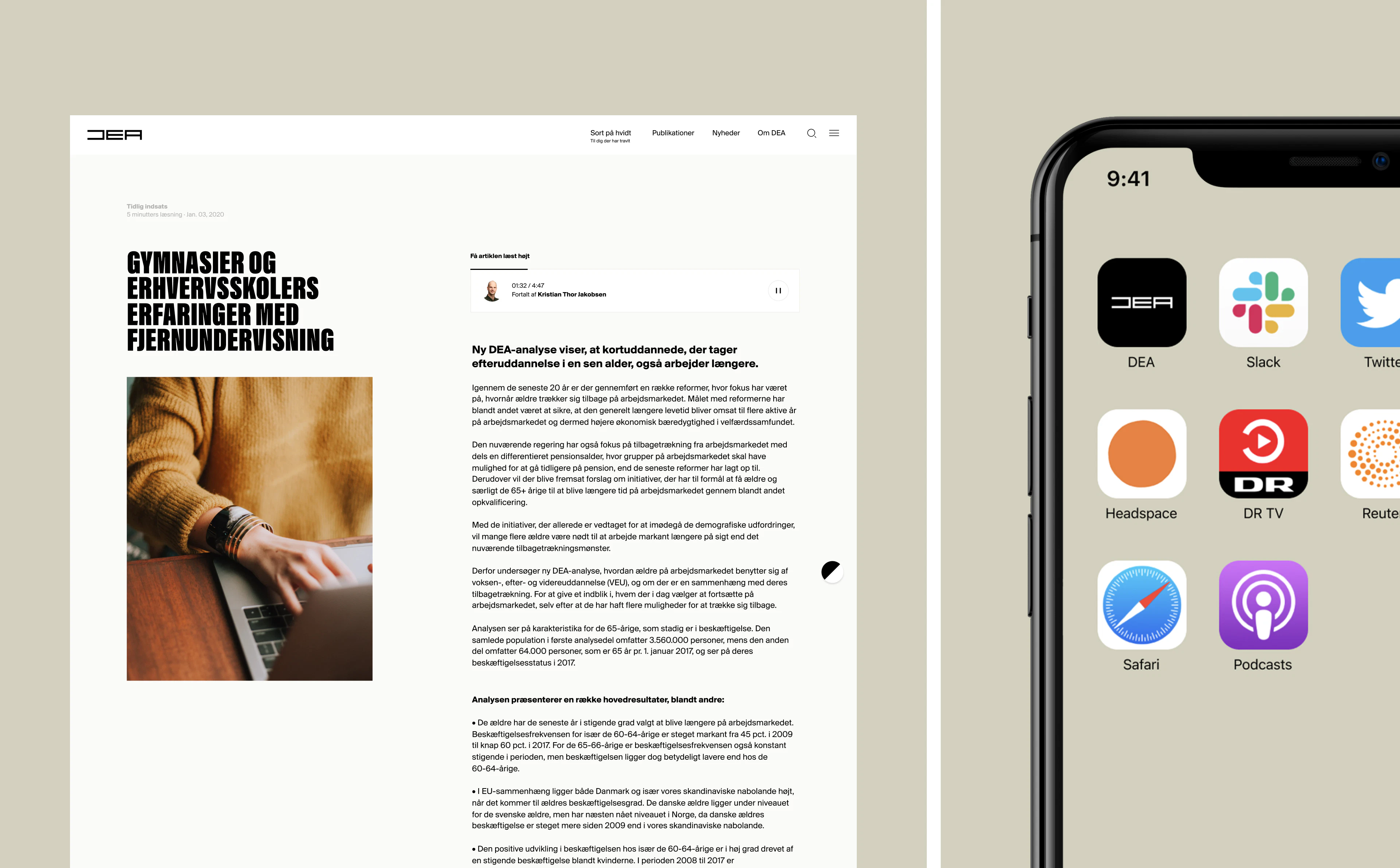
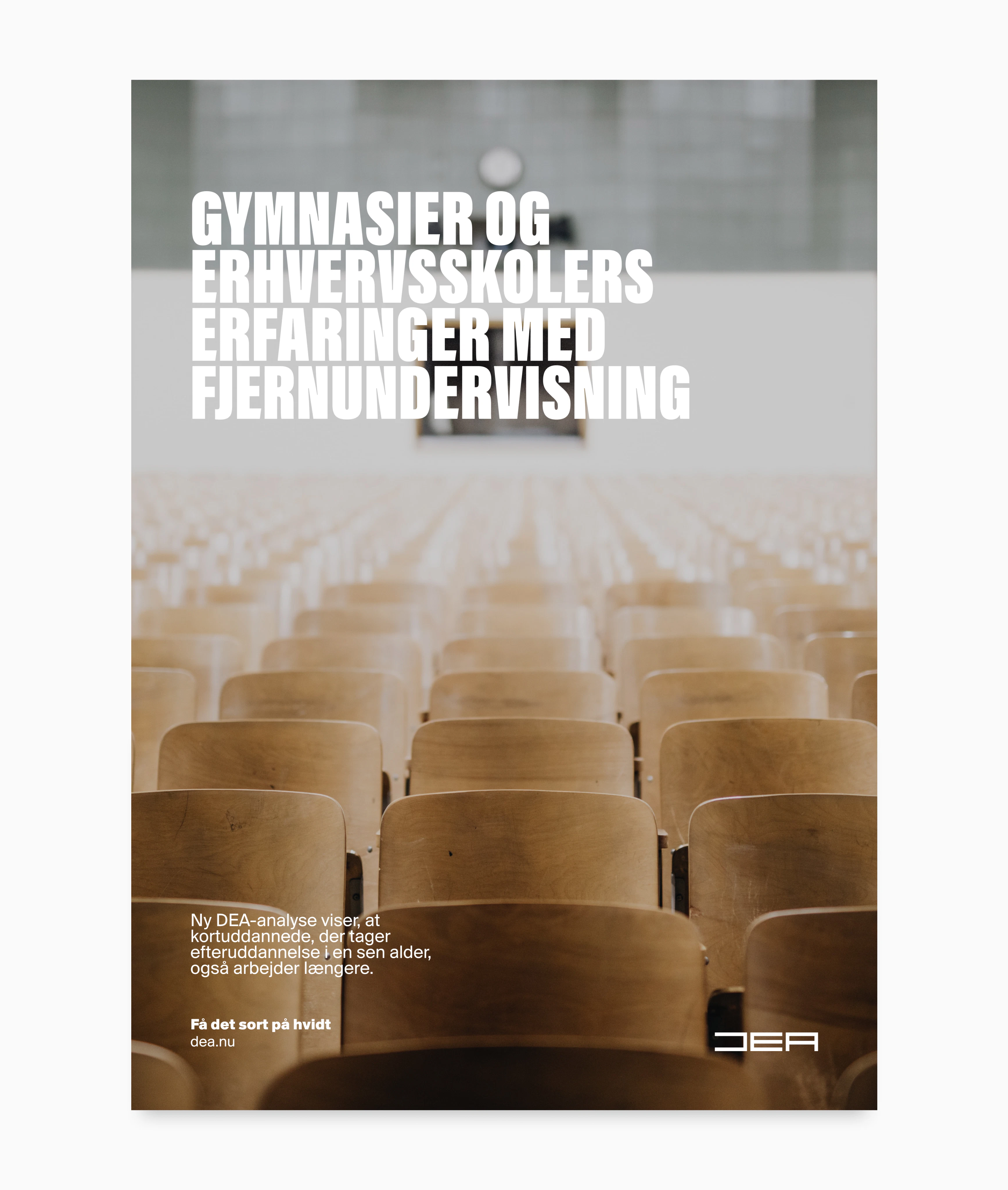
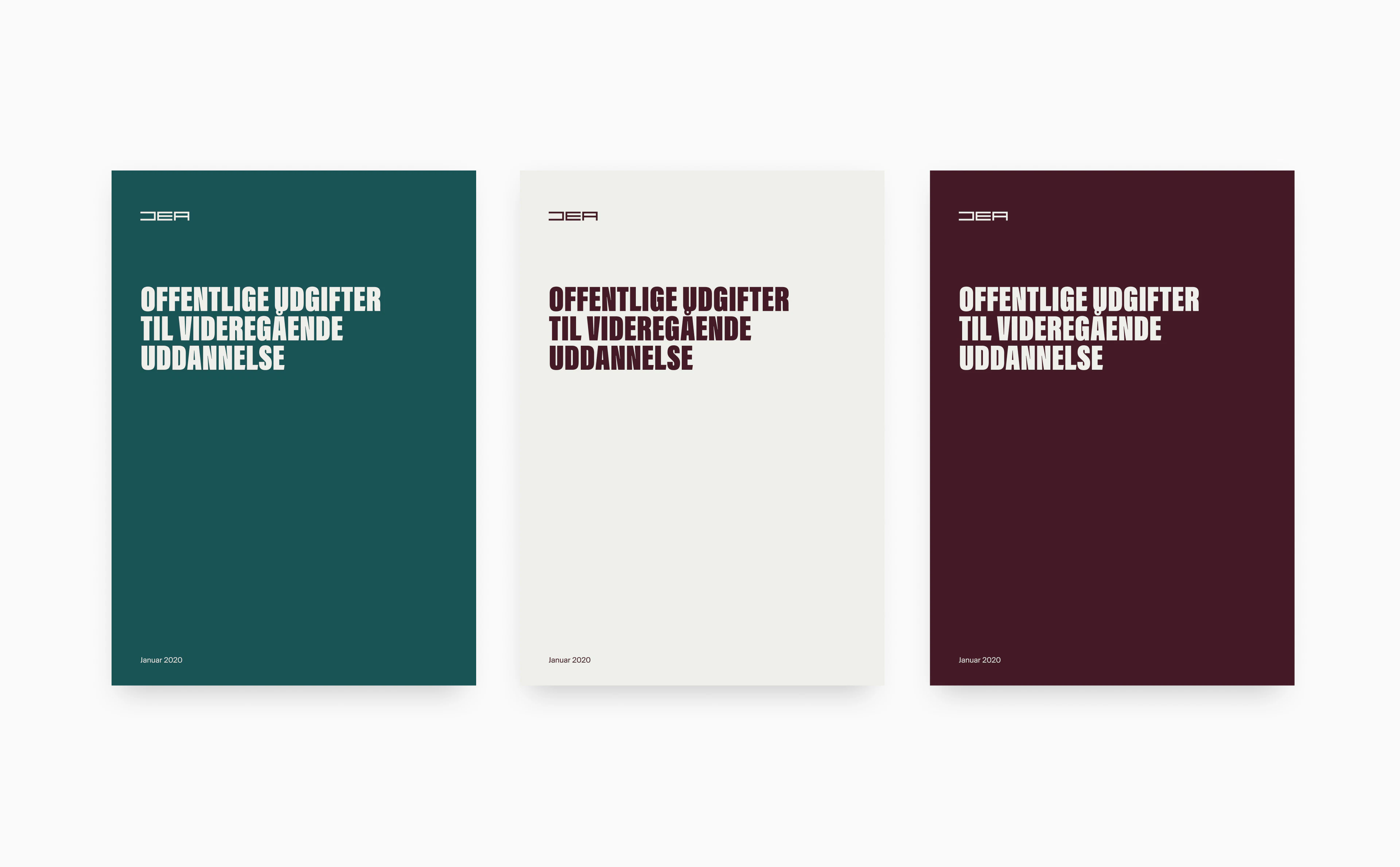
DEA is an independent, non-profit think tank based in Copenhagen. Since 2010, they've produced work advocating for the prioritization of early learning, education, research, and innovation. Their deep analysis is often showcased through long, detailed papers - with page counts upwards of 80 pages.
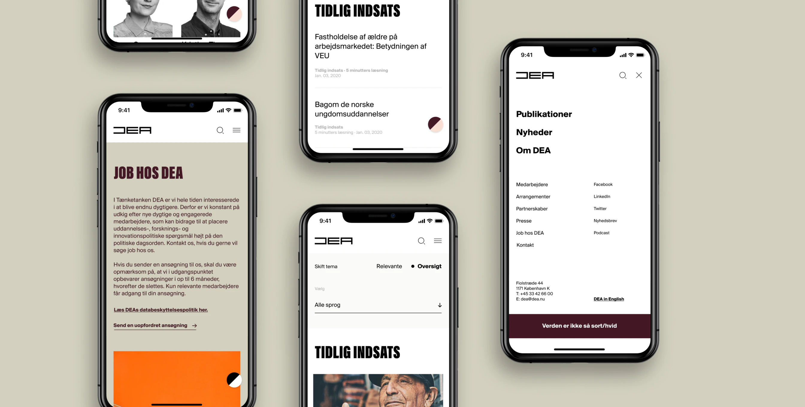
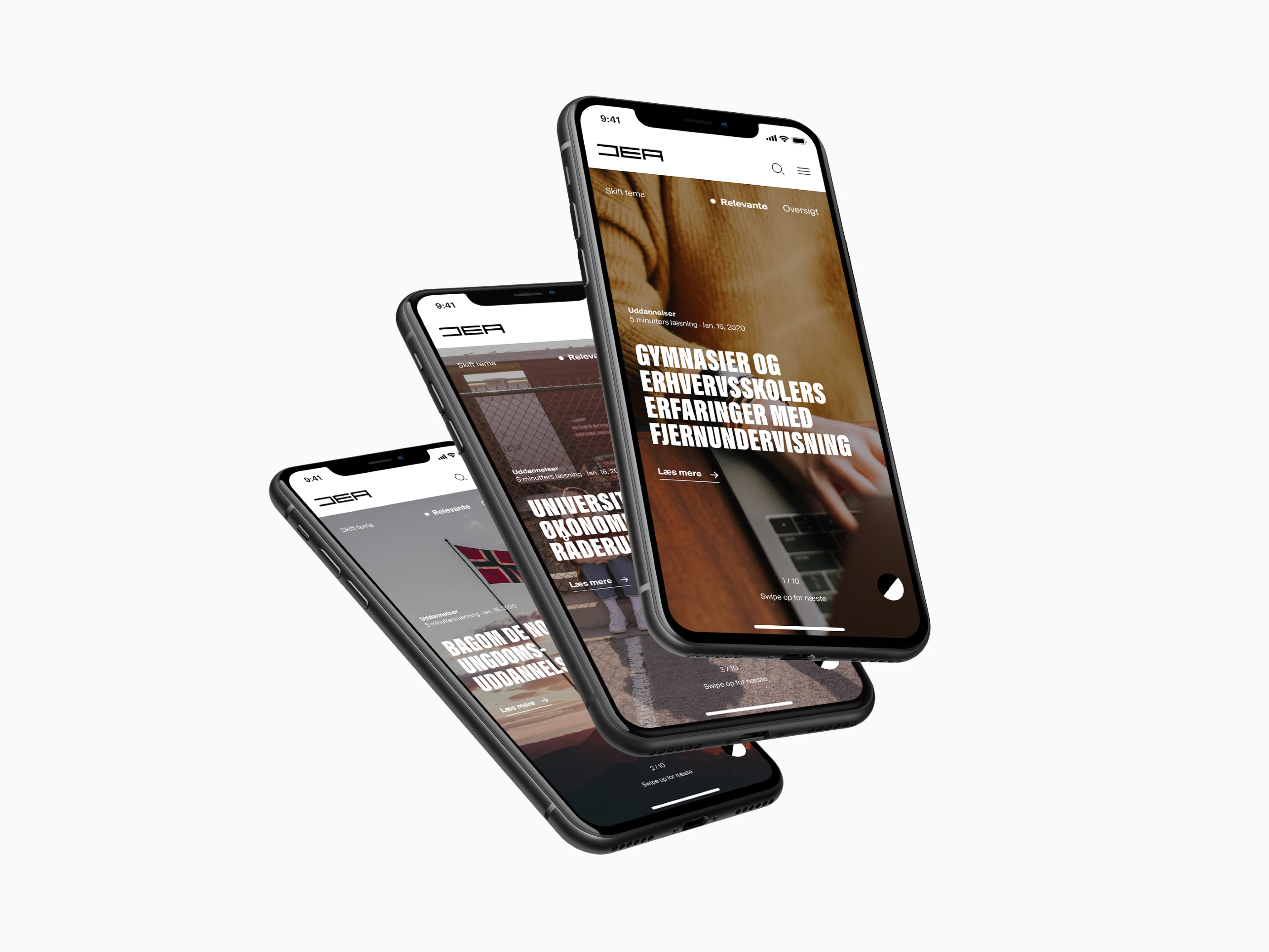
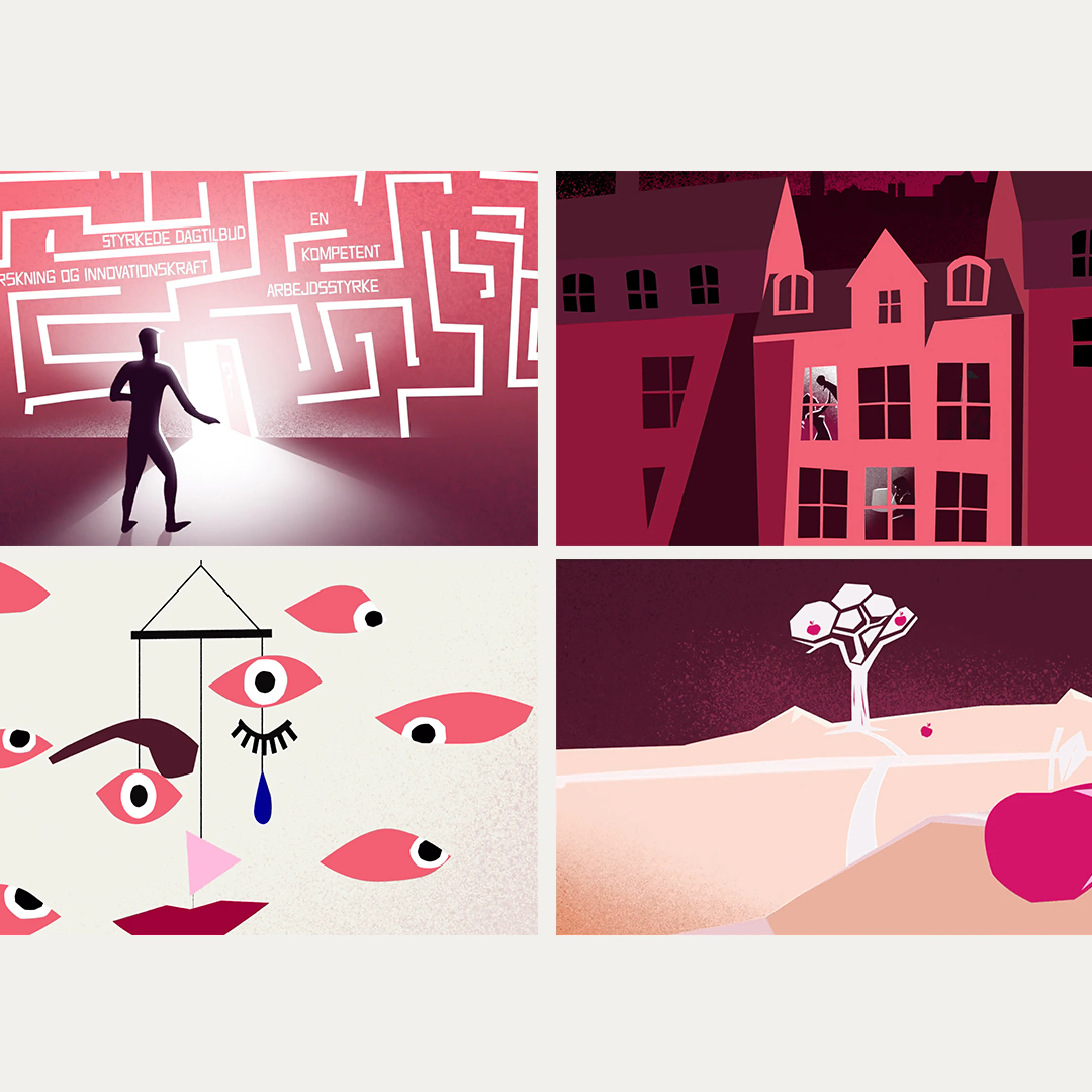
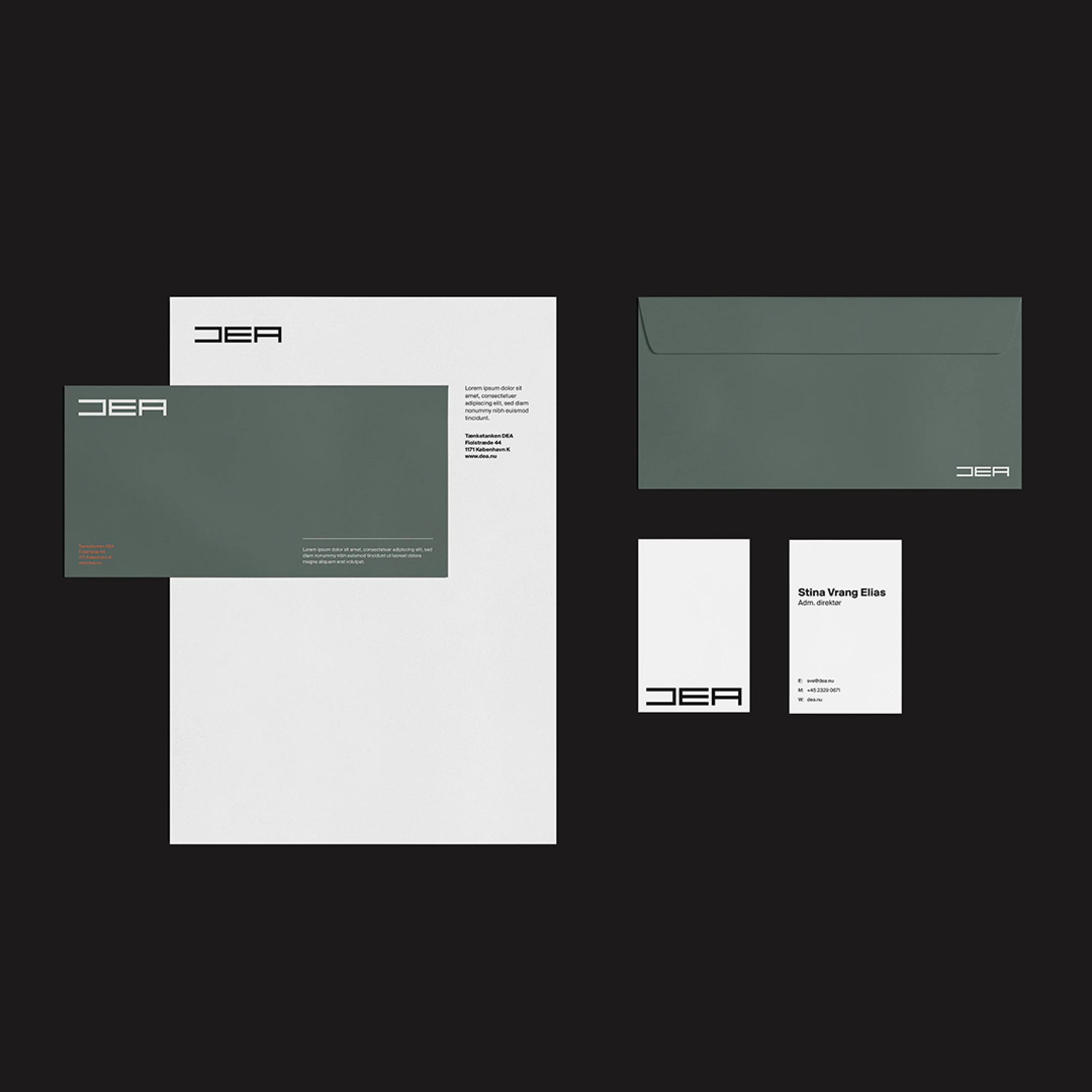
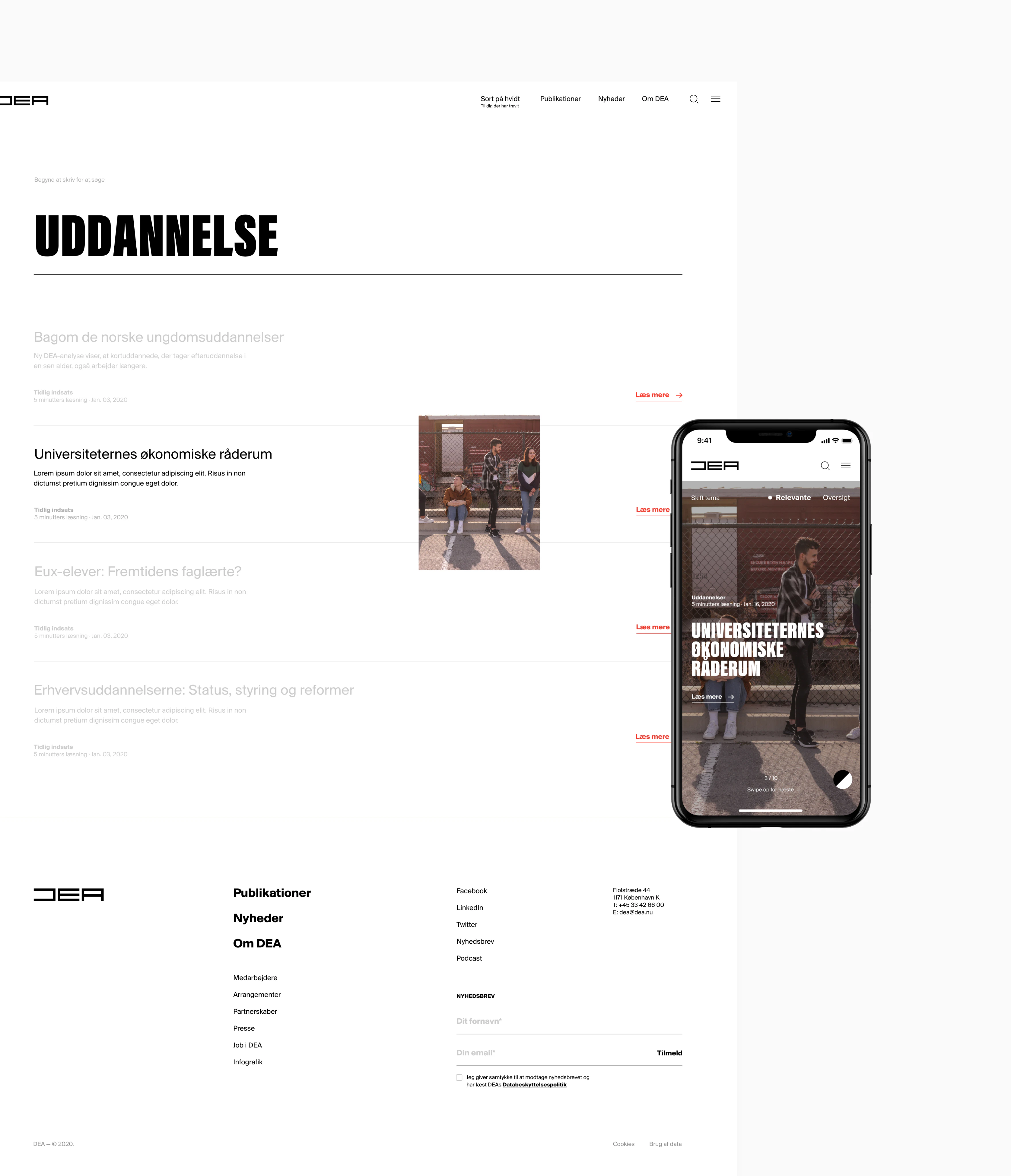
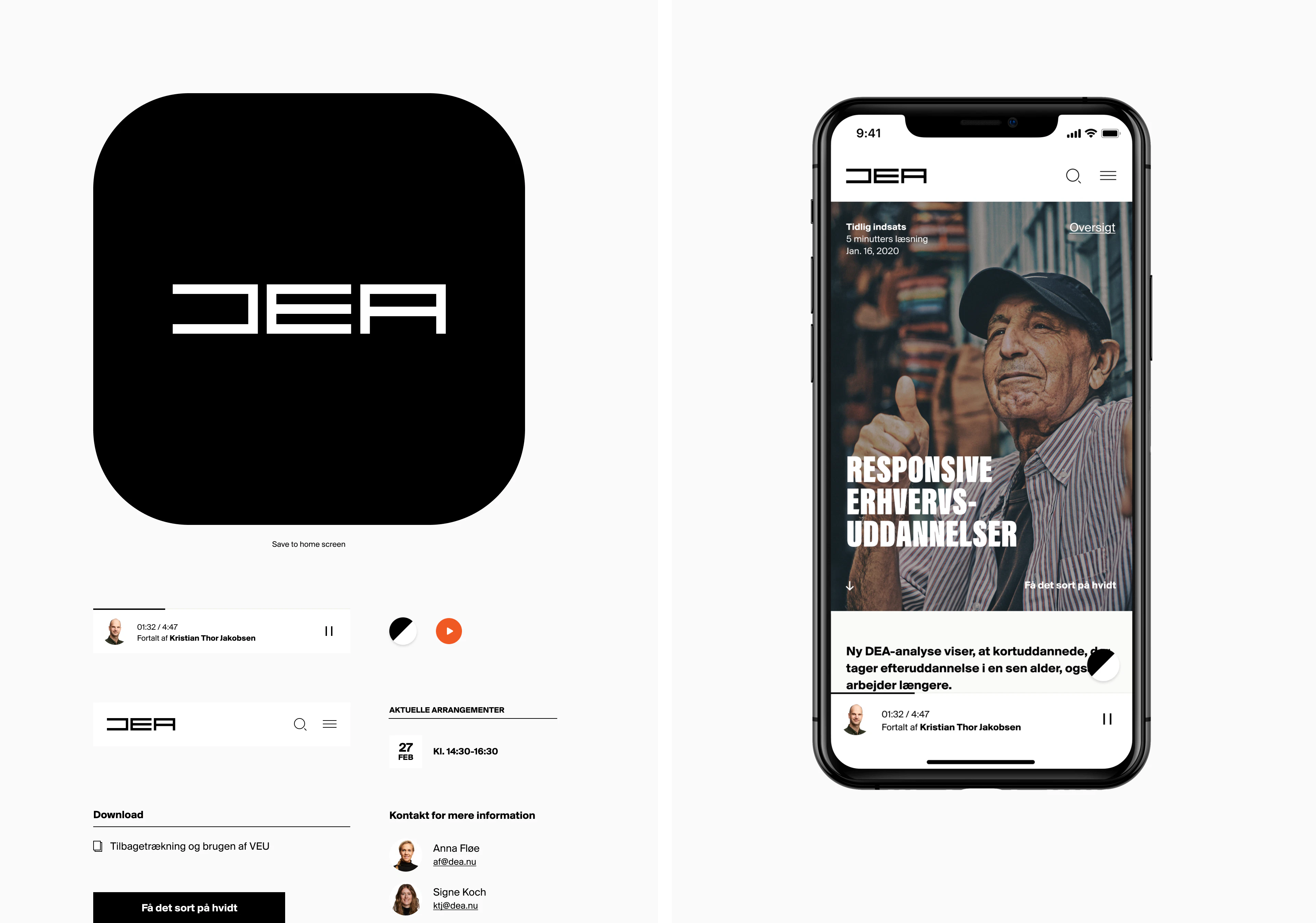
However, DEA's audience of politicians and journalists don't always have the time to read through their long-form research. To address this discrepancy, we clarified their profile through a series of workshops, developed a new visual identity, and produced a two-sided website: one in black-and-white for busy readers to catch the key takeaways; and one dripping with color to highlight their nuanced, detailed work. The result was a sharpened external identity that gave a beautiful and user-friendly experience and also optimized their internal processes.
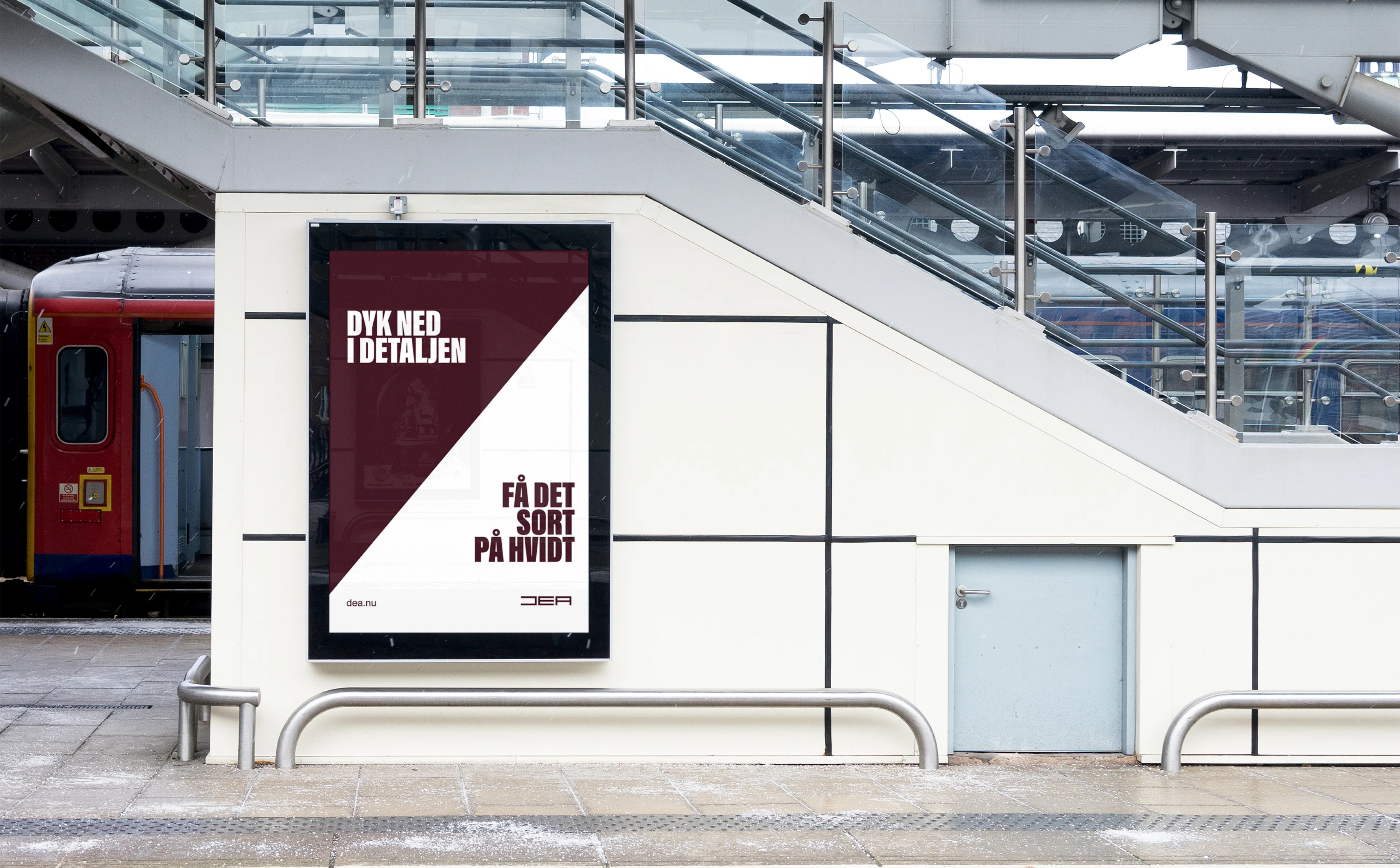
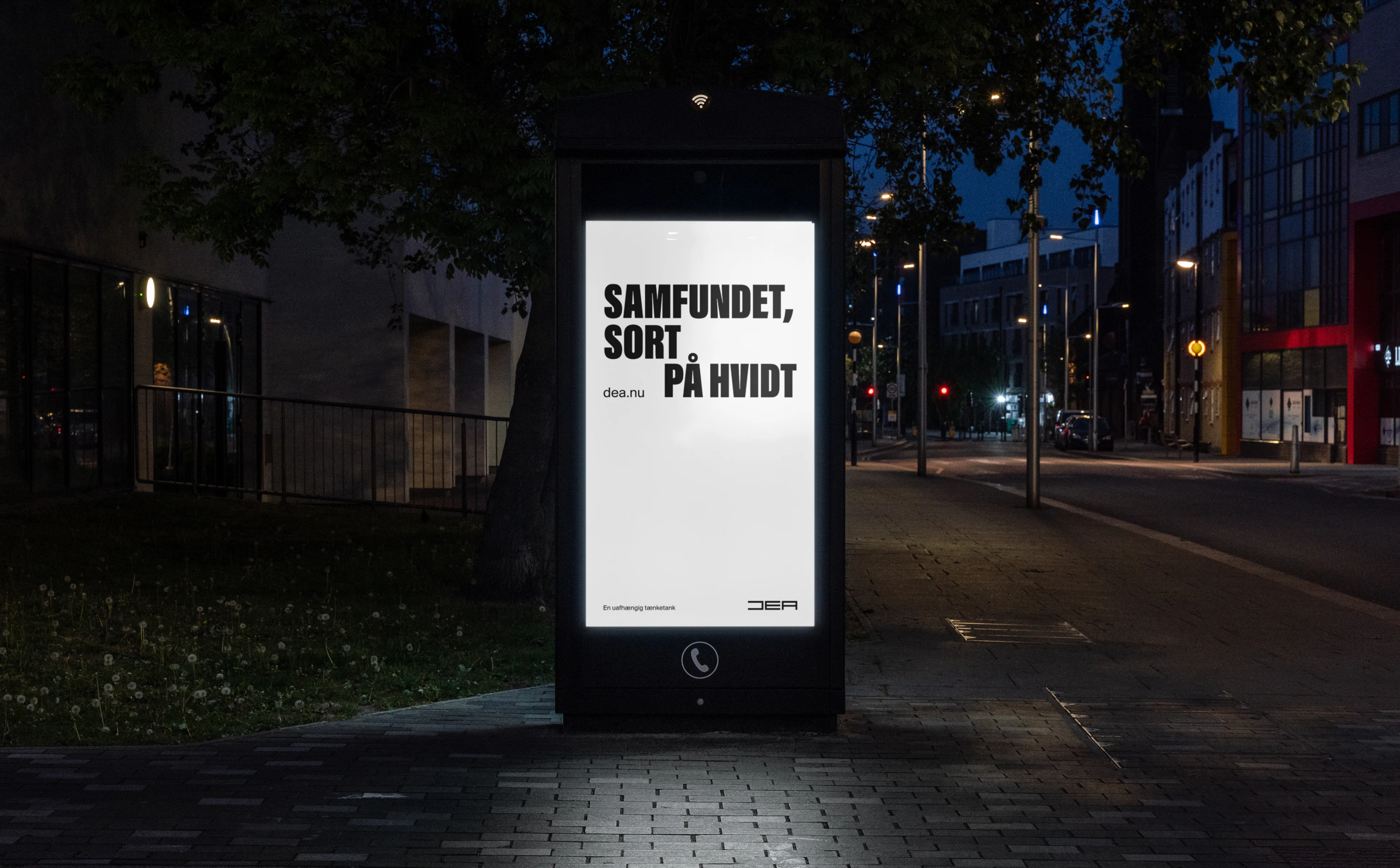
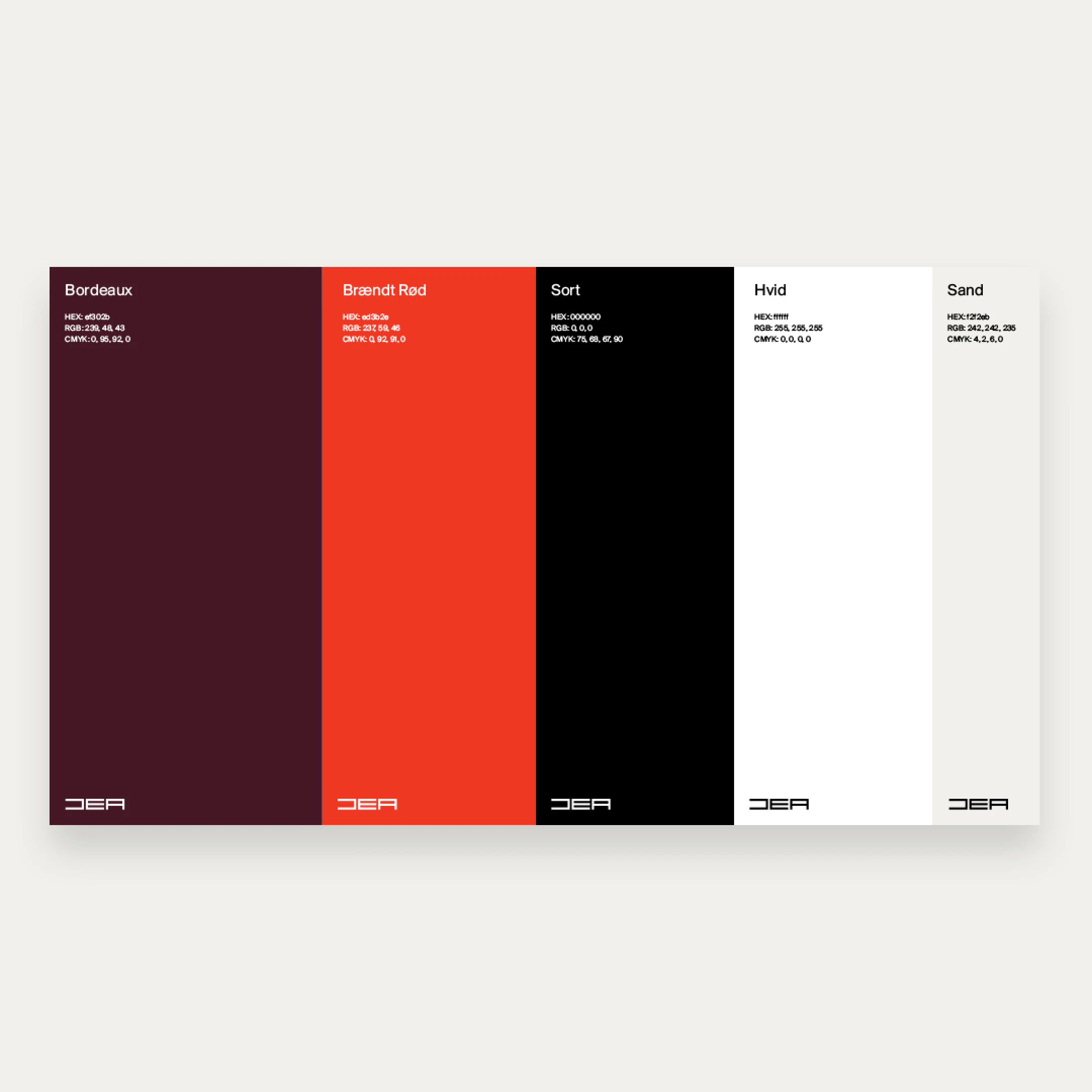
Two color universes
Novel two-sided web design created a beautiful, user-friendly digital experience
Updated relevance
Clarified profile helped identify their market edge
Internal optimization
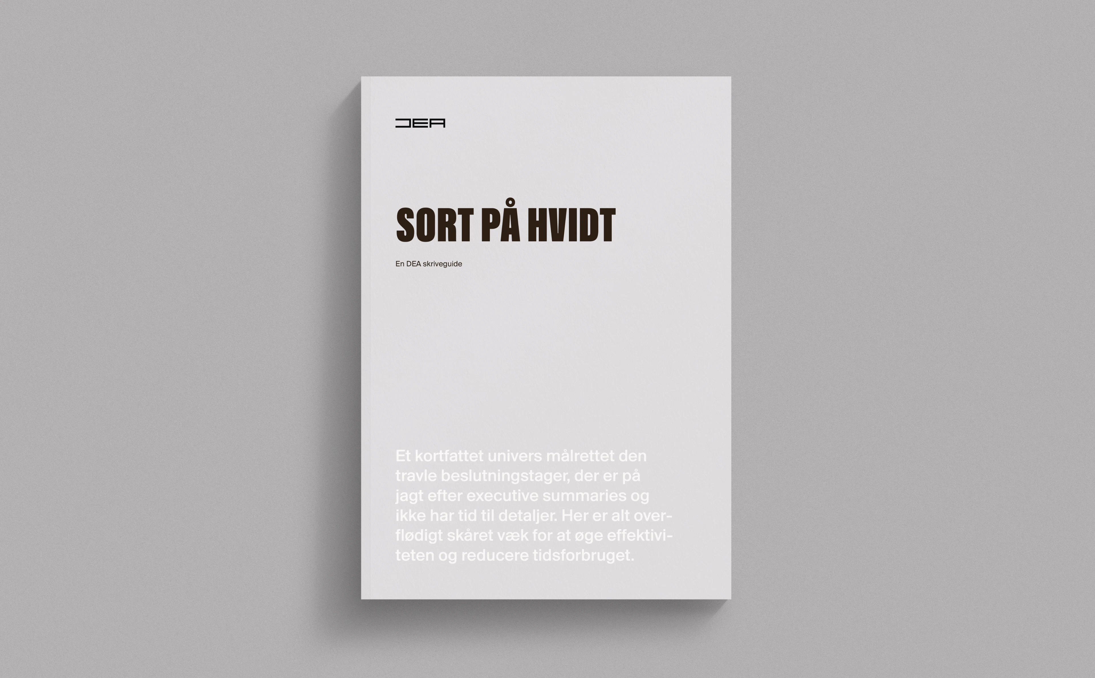
Writing workshops and new web layout updated their internal working processes
Kudos to
Project Manager / Sara Friis Bache
Strategist / Malthe Mogensen
Designer / Martin Balle
Developer / Phillip