Colibri
Complex Tech Distilled Into Clear Design
Client: Colibri
Key Focus: Branding
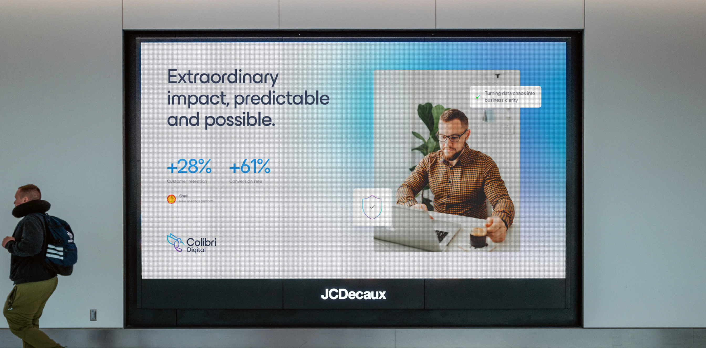
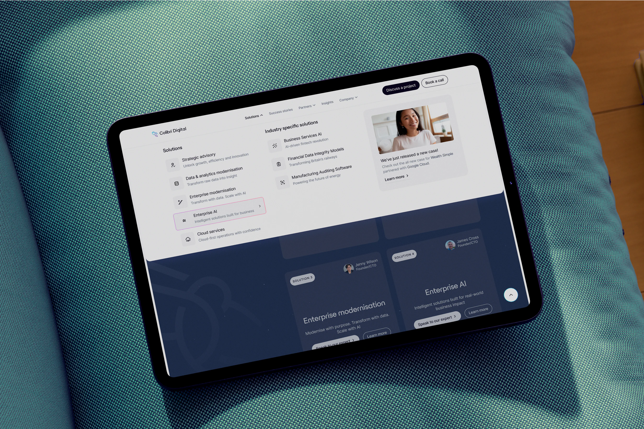
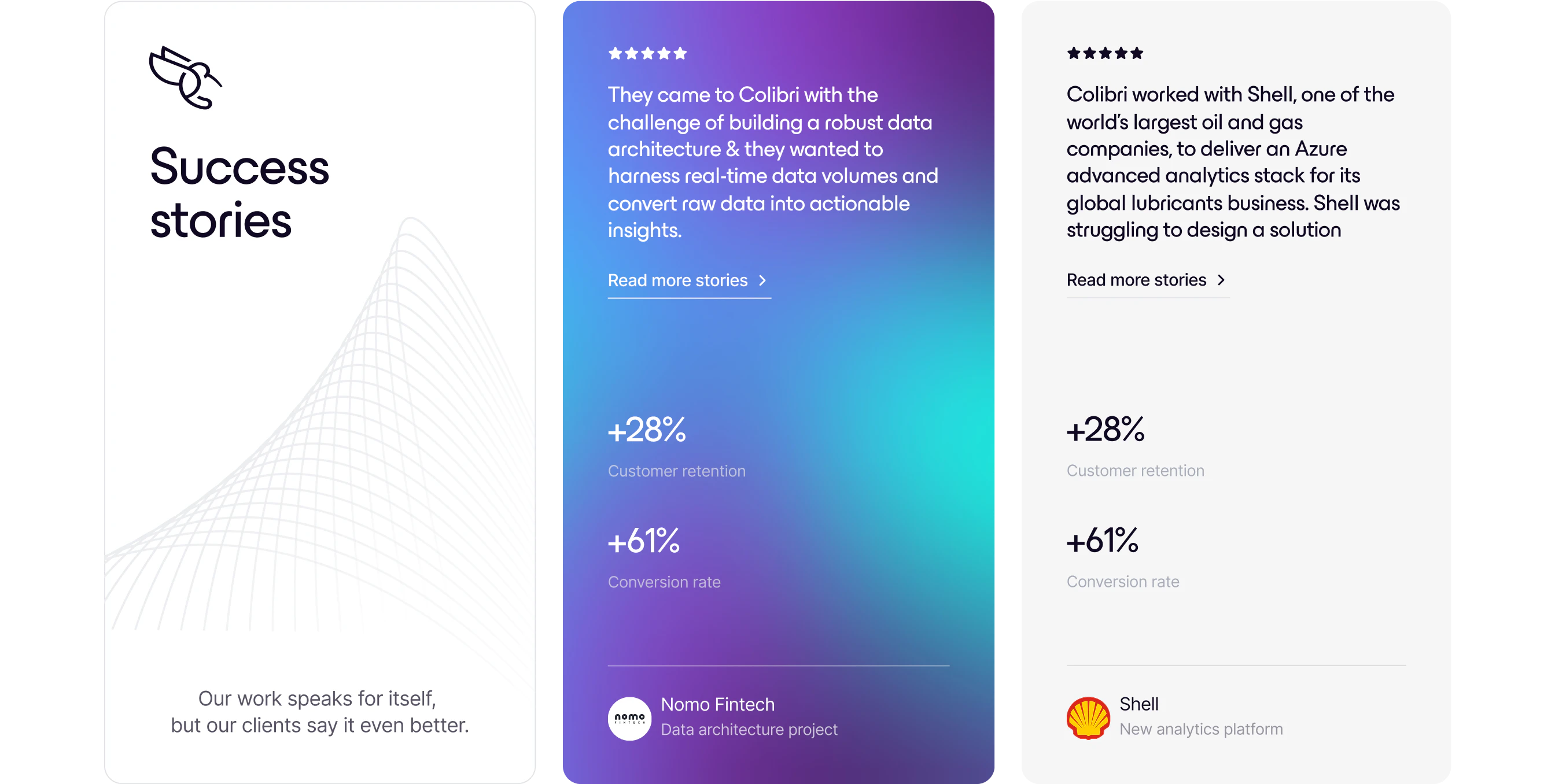
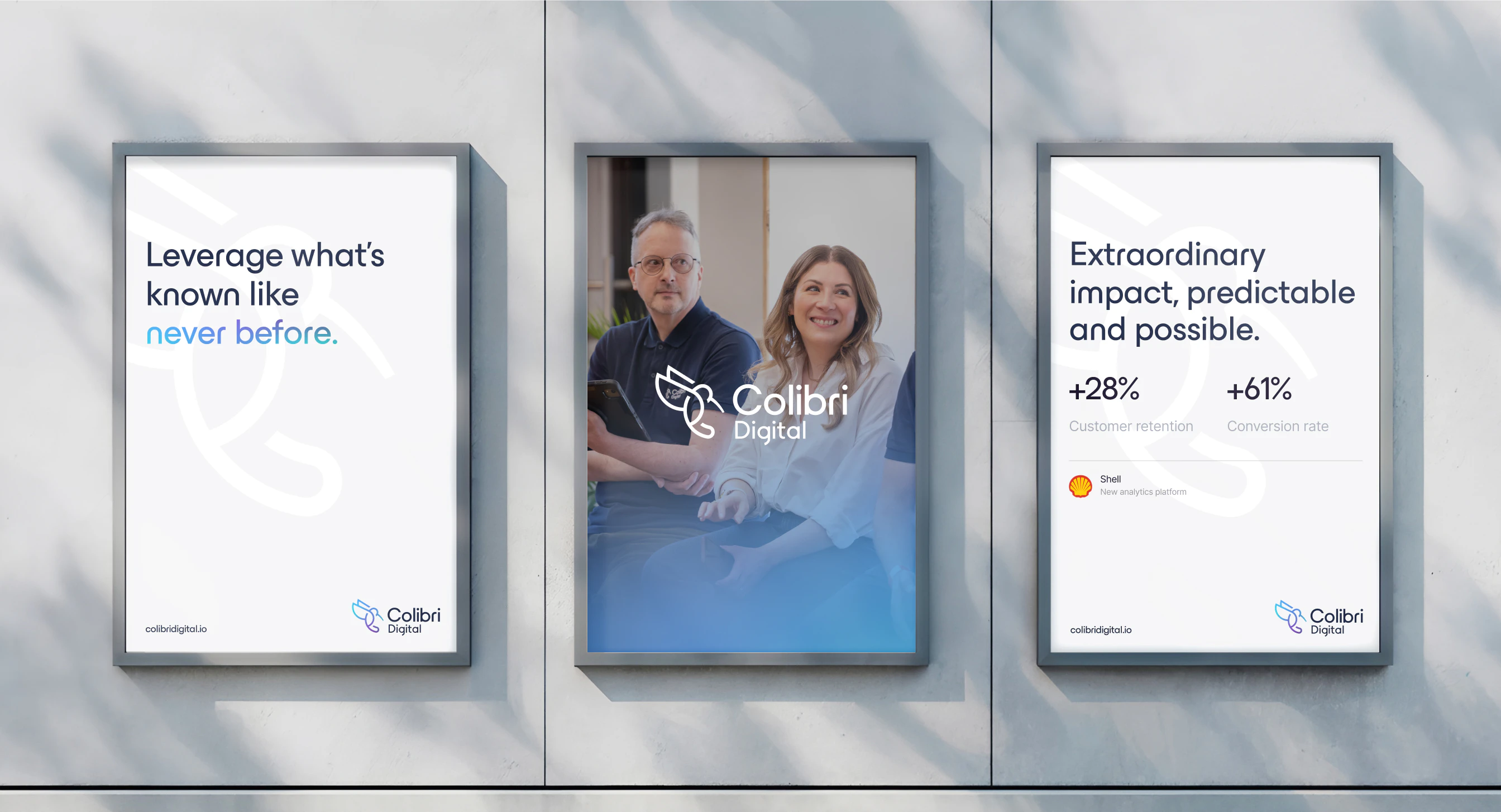
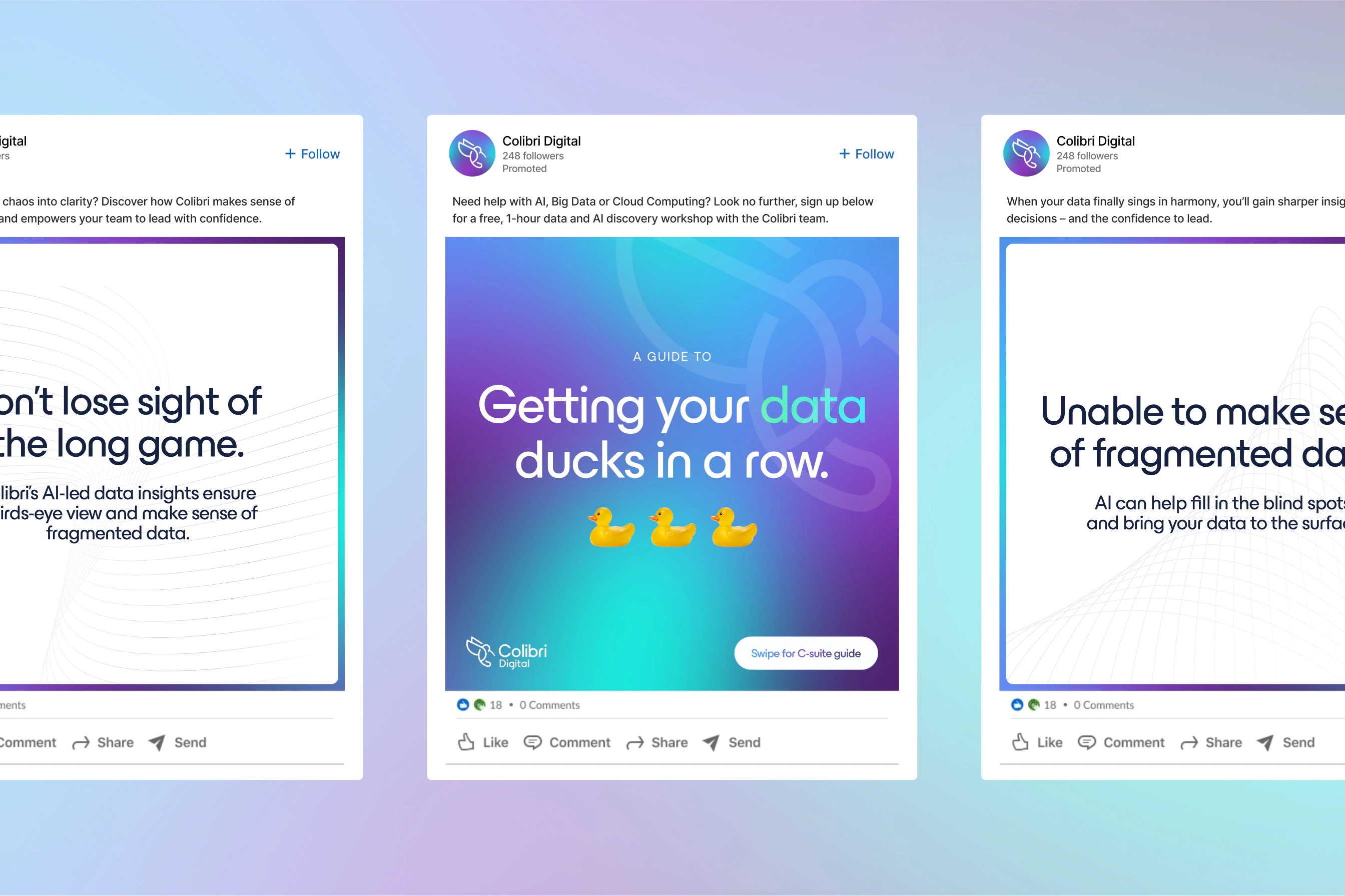
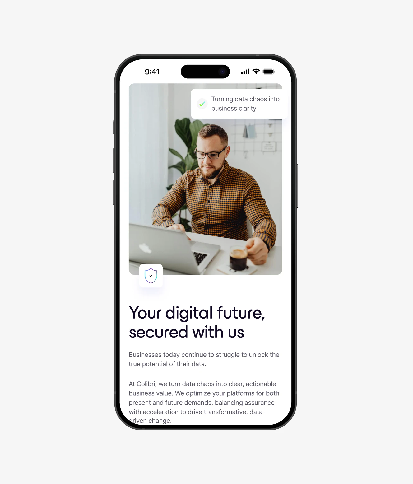
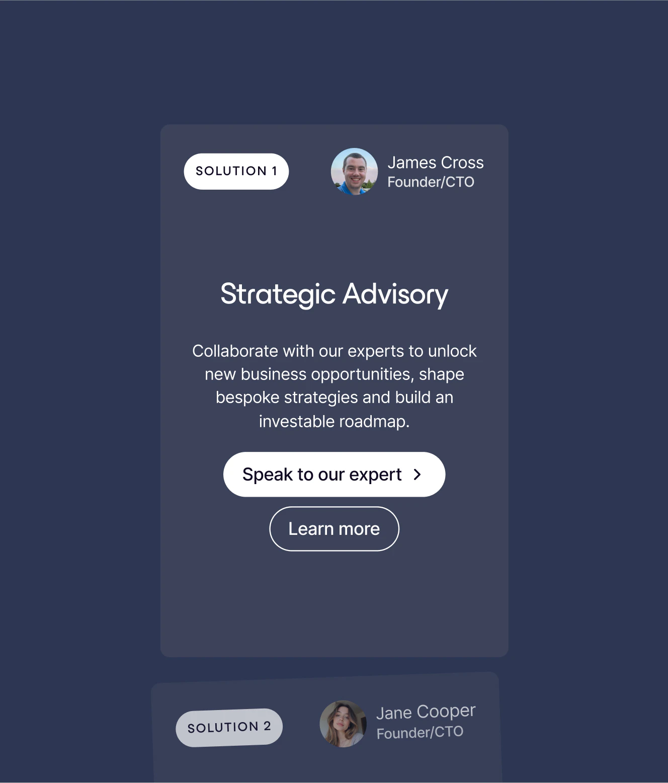
Colibri Digital, as part of Nasstar group, operates at the centre of the complex world of emerging technologies, harnessing tech solutions to help businesses move forward, one data point at a time. Because of its position as a leading specialist provider, Colibri wanted a visual identity that reflected its established reputation. Say goodbye to the logo made out of PowerPoint ten years ago, and instead welcome the result: a smart and modern re-branding that still maintains the same feel (though looks better, if we do say so ourselves…).
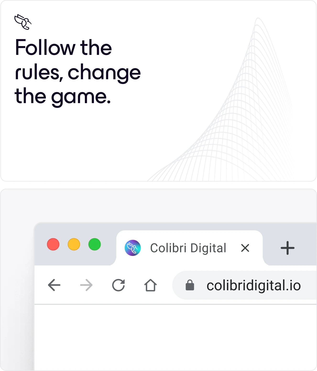
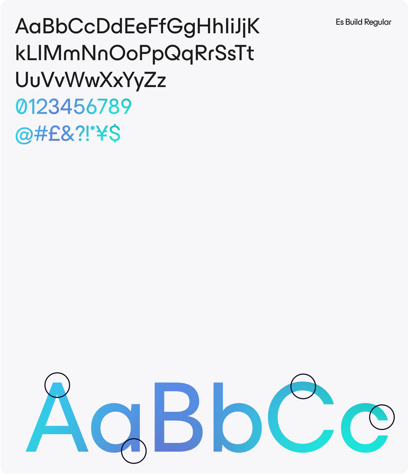
The updated design highlights the cutting-edge specialist services provided by Colibri, whilst still emulating its playful side through the vibrant colours and hummingbird logo. The hummingbird was an aspect that Colibri was keen to preserve, highlighting the company’s agility, speed and precision. As a result, the updated logo reflects a more streamlined, calculated representation, consistent with the brand identity.


Kudos to
Client Lead / Dženita Džindo
Strategist / Anthony Cheung
Strategist / Sofie Henriksen
Designer / Christopher Ashton
Creative Specialist / Lukas Gottlieb
Junior Strategist / Gul Cheema
Junior Strategist / Ellie Valentine
Consultant / Ben Travis
Developer / Kenan Yigitoglu
Growth Consultant / Alexandra Berry
Designer / Hakim Hasni
Videographer / Lukas Gottlieb